Who represents us in the United States Congress? And how can we show it?
UPDATE March 18, 2026: Senator Markwayne Mullin (R-OK) has been nominated as the head of the Department of Homeland Security, and Representative Kevin Kiley (I-CA-3) has changed his party affiliation from Republican to Independent.
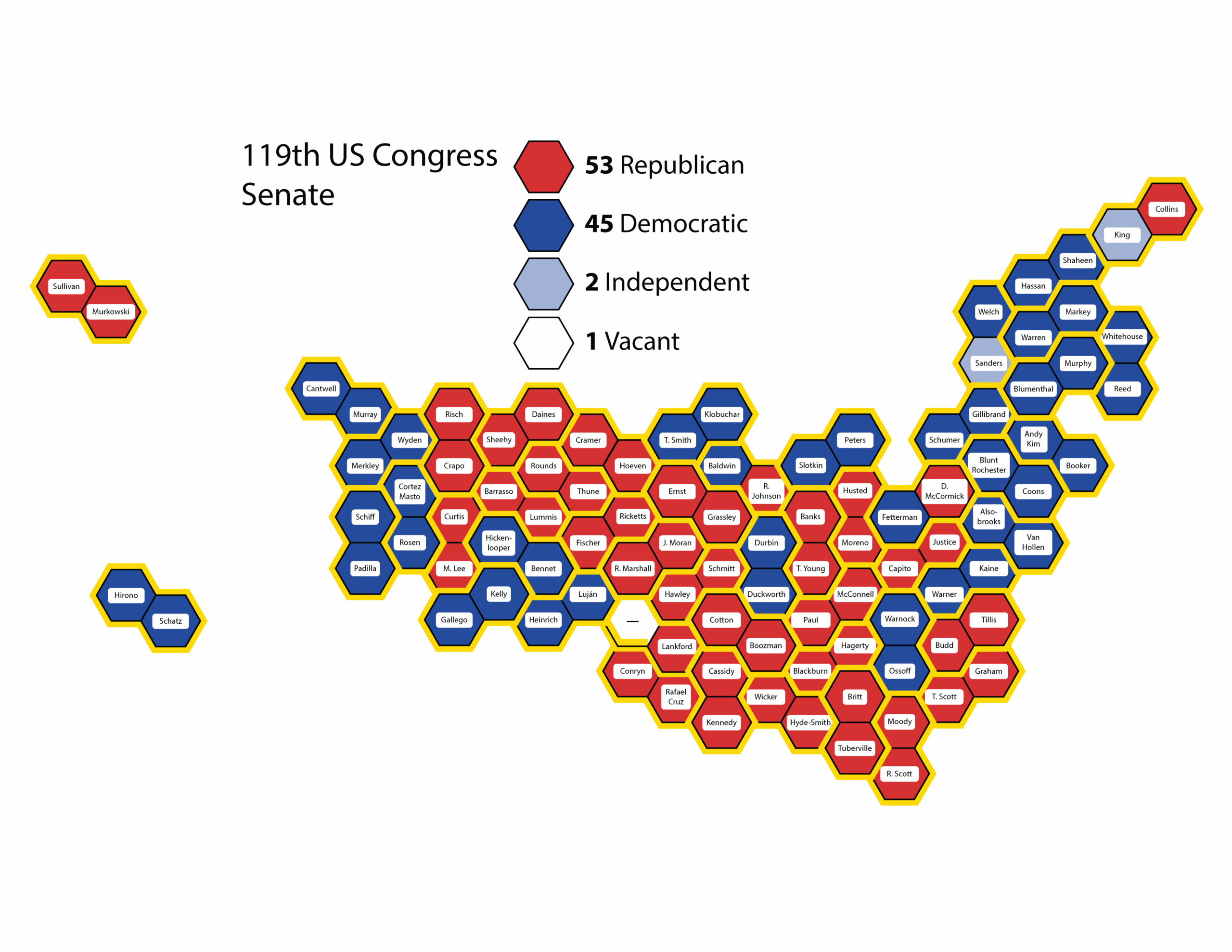
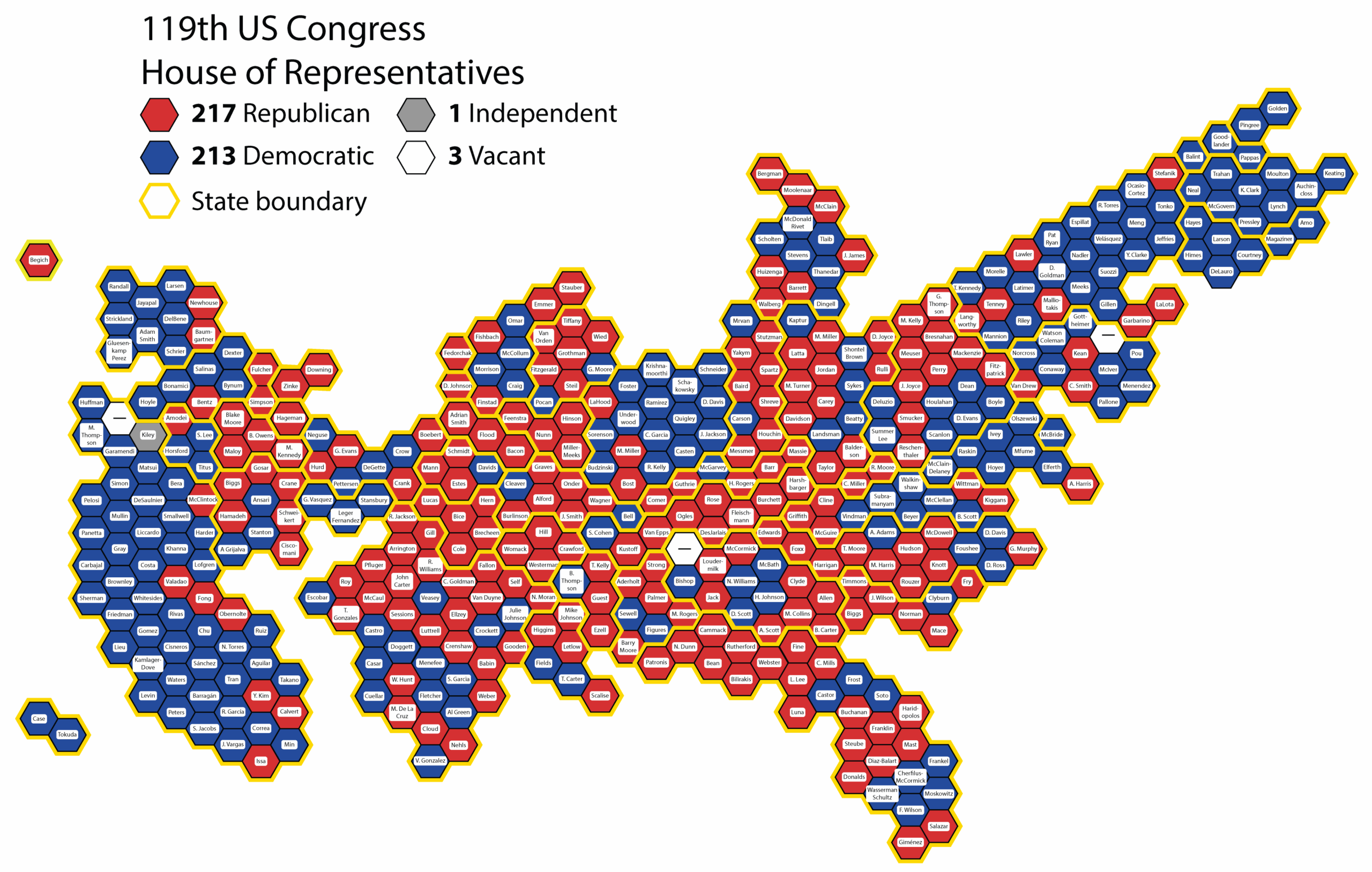
Instead of showing a traditional map that massively distorts the apparent legislative power of large-area states and large-area congressional districts, I made each seat the same size. And because many House districts have completely ridiculous shapes, I displayed each district as the same shape – a hexagon, for easiest tessellation.
The result is two maps – one for the U.S. Senate and one for the U.S. House of Representatives – that show the distribution of political power in the U.S. legislature as it really is. From there, it’s easy to add the names and political parties of each representative to give a comprehensive picture of the legislature.
So how does it look now?
Take a look at the maps below, one for the Senate and one for the House of Representatives. Congresspeople are shown by name in the approximate location of the state they represent, color coded by party. Red means Republican, blue means Democratic, and light blue means Independent Senators who have joined the Democratic Caucus. Currently vacant seats are white.
First the Senate:
and now the House of Representatives:
I’ll update these maps when things change – when a member resigns, retires, or dies, and especially after the next legislative branch election on November 3, 2026.
Last updated: January 19, 2026