Land doesn’t vote, people vote: Virginia 2025

Every election, conservatives struggle to understand the simplest, most fundamental principle of our Democracy: Land doesn’t vote, People vote. And so it was again with the 2025 Virginia Governor election. Threads user stvo0311 posted this map with the caption “Tell me that Virgina wanted a Dem as Governor. These elections need to be scrutinized more”:

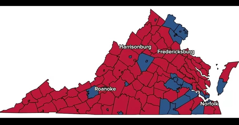
The map shows Virginia’s 95 counties and 38 independent cities. Red represents Republican candidate Winsome Earle-Sears and blue represents Democratic candidate Abigail Spanberger. Sure, this map gives the visual impression that Virginia wanted a Republican governor. But remember: Land doesn’t vote, people vote.

What would happen if you followed the “people vote” principle and scaled the map so that the area of each county was not determined by its land area, but by the number of people who voted? Here is what the map looks like:

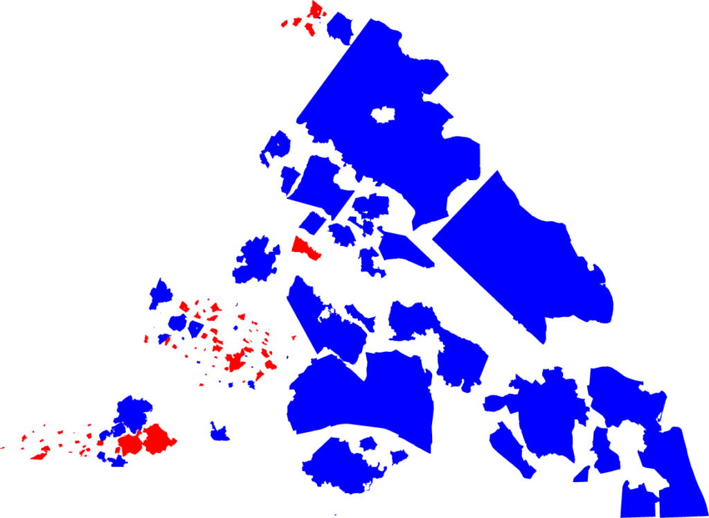
This kind of map, where size is determined not by real-life size but by population or some other variable, is called a “cartogram.” It is a much fairer representation of what voters want for the Governor of Virginia.

It’s not perfect – remember that counties don’t vote, people vote. The map is all-or-nothing, ignoring all votes for Earle-Sears in blue counties and all votes for Spanberger in red counties. Elections are all or nothing, but they are all or nothing at the state level, not the county level. A better representation would show counties in shades of purple corresponding to the percent vote for either candidate. And I might make that map someday. (Also, the counties are not in their true positions – I just moved them around in an effort to make the graph look roughly like Virginia.)

But this map gives a clear answer to the question “Did Virginia voters want to elect a Democratic governor?” And the answer is Hell Yes.

How did I do it? See the code I ran to generate the map. The code outputs an .svg file. The file has many counties overlapping, so I used Adobe Illustrator to move the counties around until they were all visible.

Want to do it yourself? Create an account on SciServer, the science platform that allows you to upload, analyze, and visualize data in a web browser (and which is my day job). Email me your username and I’ll help you access the data. You can get the code from my election cartograms GitHub repository.

The Flood

It’s hard to even imagine the devastation visited on the city of Derna, Libya this week by flooding and resulting dam burst. This report from the BBC includes some drone footage that might hint at what people there are going through:

The upper estimate for the number of people killed in the dam burst catastrophe in Derna, Libya is 20,000 people. For comparison, that’s about the size of Westminster, Maryland or Maitland, Florida.

Imagine Westminster or Maitland suddenly wiped off the map, washed out to sea by a hundred-foot wall of water.


Postscript: some other places with a population of approximately 20,000 that you might be more familiar with:

Where It All Began

A blue sign saying 'Wuhan South China Seafood Market' in Chinese above a gate and parking sign
The Wuhan South China Seafood Market as seen from the street

Three years ago, right about this time, a killer was beginning to kill. We had no idea at the time, but our lives were about to change forever.

Word began to spread on December 31st, 2019. That day, the Municipal Health Commission of Wuhan, China told the World Health Organization (WHO) that a cluster of pneumonia cases of unknown cause had been observed in the city. That cause, of course, would turn out to be the new disease now known as COVID-19. Disease detectives from WHO and other organizations began to trace the contacts of people who had been infected. And their search led them to the one place that nearly all patients had visited:

The Huanan Seafood Wholesale Market

The map above shows the Huanan Seafood Market (in Chinese, 武汉华南海鲜批发市场, Wǔhàn Huánán Hǎixiān Pīfā Shìchǎng) was a market at 207 Fa Zhan Da Dao in the Jiangshan District in the city of Wuhan, in east-central China. It appears to have been torn down, but this Google Earth historic image shows what it looked like from space in October 2019, right around the time the virus likely arrived there:

The Huanan Seafood Market from space in October 2019 (from Google Earth)

And of course the photo at the top of the post shows what it looks like from the street.

Wuhan is huge – home to 12 million people – nearly twice the population of New York City. And Huanan Seafood Market was the largest market of its kind in the city. It frequently gets described in English-speaking media as a “wet market,” but I don’t actually know what that means, so I’ll just call it a market.

The market sold mostly fish and other seafood, but one section specialized in wild game – what in Chinese is called 野味 (Yěwèi), meaning “wild taste.” Wild game can mean just about anything; an old South Chinese saying is that “Chinese people will eat anything with four legs except a table.” Although the wild ancestor of the human SARS-CoV-2 virus has its reservoir in bats, genetic evidence suggests that it passed through another organism before arriving in humans. The most likely culprit is the pangolin, a small, endangered, adorable mammal native to south China, and formerly a popular wild game animal until its consumption was banned in China in mid-2020.

From bats to pangolins to the seafood market to a few unknown humans, the virus began its spread around the world, as I had tracked for quite a long time on this blog (like this just one of tragically many updates).

As the virus spread around the world, so too did false conspiracy rumor about the spread of the virus. One of the most powerful and lasting has been the rumor that the virus was genetically engineered by humans, either as a bioweapon by the Chinese government or escaped in a lab accident. The rumor started in February 2020, spread quickly online and in person by many well-meaning people and… not well-meaning people.

If the mountains of epidemiological and genomic evidence isn’t enough to convince any of the well-meaning people who have shared this rumor, this probably won’t be either. But for what it’s worth…

I recently saw an Internet Opinion Piece asking: how likely is it that the outbreak started at the market rather than at the virology lab LESS THAN ONE MILE AWAY???!!!1!!??

Surely the Internet wouldn’t lie about such an easily verifiable fact, right? lol

From Google Earth: the Wuhan Institute of Virology is 7.5 miles (12 km) away from the Huanan Seafood Market, across the Yangtze River
The distance between the Wuhan Institute of Virology and the Huanan Seafood Market: 7.5 miles

Conspiracy rumors and false information rely on passive consumers who don’t even bother to check whether what they are reading is true. Always check!

In Russia, Buddha meditates on you!

The world’s most unexpected Buddhist temple:

This is the Golden Temple of Elista, the capital of the Russian Republic of Kalmykia, on the western shore of the Caspian Sea in European Russia. The Kalmyks migrated here in the 1600s from what is now Mongolia.

Kalmykia is thus the only place outside Asia where the predominant religion is Buddhism.

Explore it yourself!

Bonus entertainment: a full-on flame war in reddit’s r/buddhism: “You must be new here. You don’t want to try to debate with me… You are not an awakened being.”

What’s North of South Dakota?

ndsd
What’s North of South Dakota? SURPRISE!

The answer is mostly obvious: North Dakota. But there is one tiny, bizarre exception, which I found through Google Earth.

The world is full of amazing and beautiful surprises, and I’m pretty sure that over the years I have spent more time playing with Google Earth than with any actual computer “game.” The browser-based Earth-in-Google-Maps interface is easy to use, but the downloadable Google Earth Pro has clearer images and additional tools like distance measurements and geotagged forum posts.

One day I was looking up the Sanford Underground Research Facility in western South Dakota, and decided to scroll around for a bit. I discovered, to my great suprise, that the borders of Montana and Wyoming don’t quite line up – leaving a less-than-one-mile-long anomaly in the South Dakota border. This means that if you drive north on Albion Road outside of Belle Fourche, you will cross the border into Montana.

And here it is, with the border clearly marked:

A satellite image of the short South Dakota-Montana border

At first I thought it was a copyright trap, but Google Earth came to the rescue by showing that someone had taken a photo of a “Welcome to Montana” sign just over the border. Sadly, the photo was hosted on the now-defunct Panoramio site, so it’s gone. But you can still see the shadow of the border sign in the close-up satellite image:

A closeup image of the border, showing the shadow of the Welcome to Montana sign

Bonus awesomeness: Driving north on Albion Road also takes you past two derelict nuclear missile silos from the Cold War. And also two other sites that are clearly still in use but completely unlabeled. See if you can find them!

If you’d like to explore for yourself (and you should!), here is the direct link in Google Maps – or download Google Earth Pro, turn on the Borders layer, head northwest from Belle Fourche, South Dakota.

Happy virtual travels!