Graphs day 321, pandemic day 328, day 400 since the first cases were diagnosed. That’s right, it has now been 400 days since Dr. Li Wenliang officially diagnosed the first few cases of the new disease now called Coronavirus Disease 2019 (COVID-19). Just over a month later, Dr. Li had died of the disease.
Today’s sad totals:
Total cases of COVID-19 diagnosed worldwide: 102,579,774
Total deaths: 2,206,445
Remember how we said a few months ago that as we get better at diagnosing less severe cases, the case fatality rate (CFR) would get closer to the biological value, which was likely around 2 percent? The case fatality rate is currently 2.2 percent.
Here are the usual graphs, with countries divided into the same categories as on Tuesday. Countries are color-coded and labeled by name. The thickness of the lines and the sizes of the labels correspond to the case fatality rate in the country – thicker lines and larger labels indicate countries where a larger percentage of COVID-19 cases have led to death. Click on any of the images for a larger version.
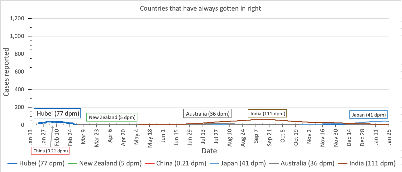
Countries that have consistently gotten it right
These countries have consistently kept their per-capita cases of COVID-19 at very low levels.
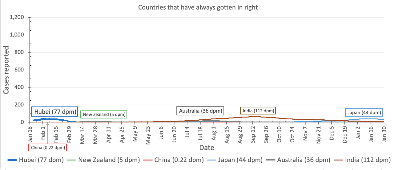
When we last checked in last Tuesday, Japan seemed to be in a phase of an increased number of cases. Today, it is much clearer that cases are once again declining in Japan, after having peaked at 40 new cases per million people per day about two weeks ago.
Plenty of people have told me they do not believe the case and death numbers coming out of China. That’s fair enough; there are lots of reasons to not believe China.
But do you believe the case and death numbers coming out of New Zealand, Australia, India, and Japan?
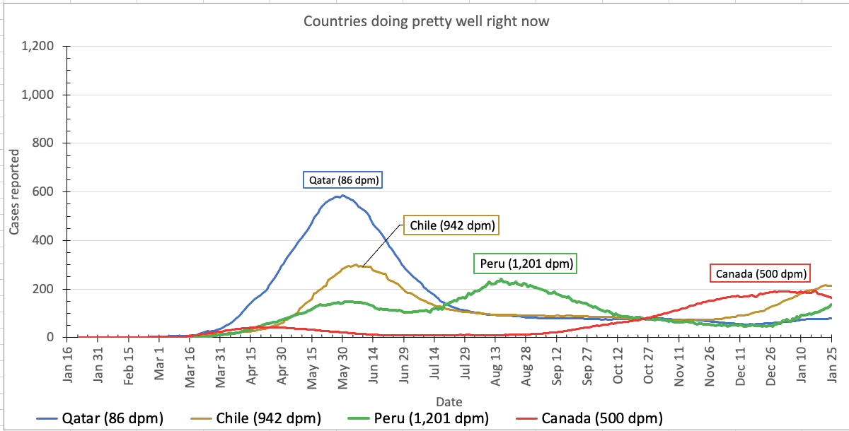
Countries where COVID-19 is currently under control(-ish)
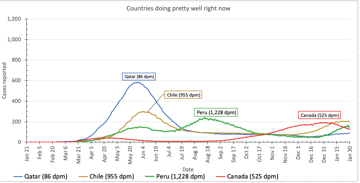
When we looked on Tuesday, there seemed to be a slight increase in Chile, Peru, and Canada. The daily case load definitely seems to have decreased in Canada, and seems to be leveling off in Chile and Peru.
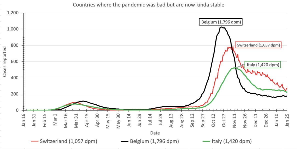
Countries moving in the right direction(-ish)
These countries, all in Europe, experienced nightmarish COVID-19 disease waves in the fall – some of the worst in the world – bur fortunately for now have seen cases stabilize at a lower level.
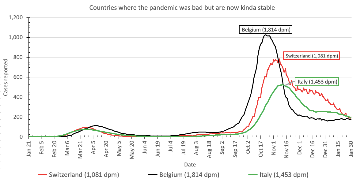
The good news is that these three European countries seem to be doing well. Cases continue to decrease in Belgium, Switzerland, and Italy.
The bad news is that Italy is experiencing a wave of sometimes-violent protests against the necessary restaurant closings. If the current protests lead to an increase in COVID-19 cases and deaths in Italy over the next two to four weeks. Obviously I hope they will not, but nature cares not for our hopes. I’ll let you know how it goes either way.
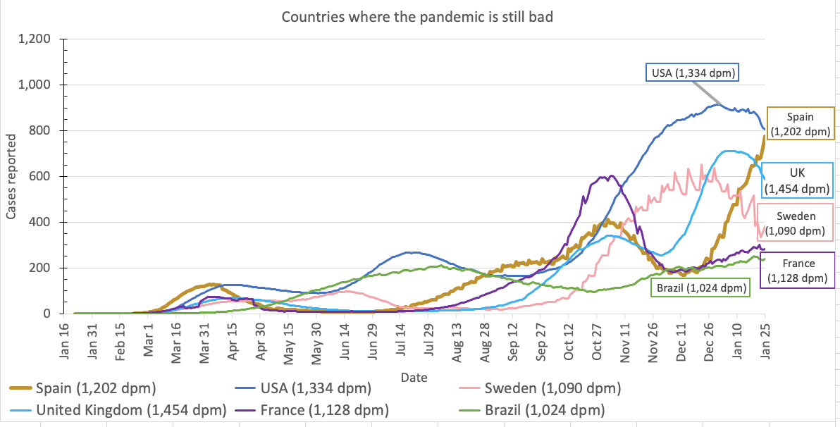
Countries where the pandemic is still awful
Lastly, the countries where the pandemic is still infecting and killing lots and lots of people: Spain, the United States, the United Kingdom, France, Sweden, and Brazil.
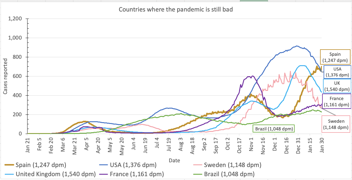
Fortunately, even in these countries, cases are beginning to decrease; although in the meantime, Spain has moved ahead of the U.S. into first place on this graph in terms of cases per day.
Methods
Sadly, Corona Data Scraper has stopped reporting data in the way I was using it, so I have gone back to using the data from the JHU Coronavirus Resource Center. You can download the data from their GitHub repository. You are welcome to use my Excel spreadsheet (version 9.2).