Join the Defense

This one goes out to everyone, all over the political spectrum. Progressives, conservatives, liberals, Marxists, libertarians, moderates, anarchists, and whatever else I might have forgotten. I have friends of all these ideologies (I work hard to keep them) – and chances are, you identify more or less with some of these. This one’s for you.

By now I’m sure you have heard the story of the defenders of Snake Island.

Ostriv Zmiinyi (Ukrainian for Snake Island) is a tiny island in the Black Sea, just off the coast from the Danube Delta. See the satellite image below, from Google Maps. In normal times, the island is home to about 30 people who work at either at a scientific research station.

Snake Island, Ukraine (from Google Maps)
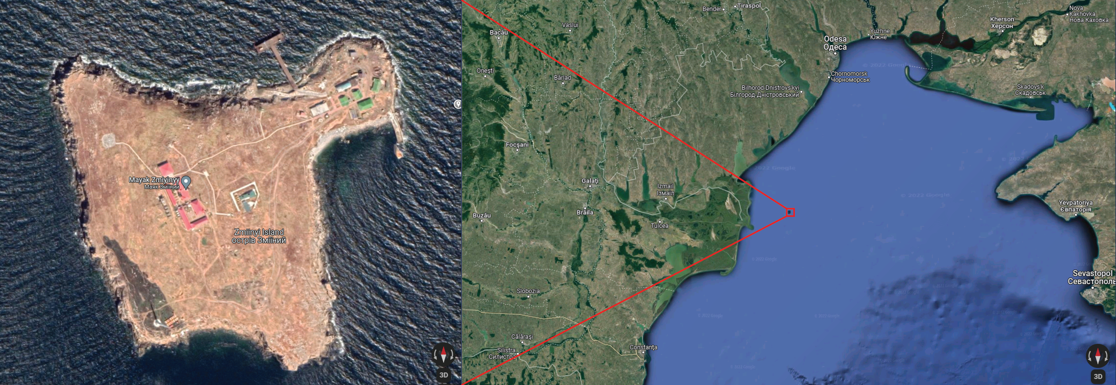
Click on the image for a larger version, or view the island in Google Maps

But these are not normal times. When Russia invaded Ukraine last Thursday, the island was occupied only by thirteen border guards – not professional soldiers. That day, at around 6 PM local time (1600 GMT), the Russian missile cruiser Moskva approached the island. The ship radioed to shore and the following conversation ensued, livestreamed by one of the guards (whose name has apparently been withheld, but if it gets releases, I’ll add it here):

Moskva: This is Russian warship. Russian warship to Zmiinyi Island, this is Russian warship. I propose to lay down your arms and surrender to avoid bloodshed and needless casualties. Otherwise we will strike. Zmiinyi Island, this is Russian warship, I repeat. I propose to lay down weapons, surrender, otherwise you will be bombed. Do you read?

Border Guard (to fellow guard): Well, fuck these too, right? Just in case…

Border Guard (to Moskva):

Russian warship, go fuck yourself!

Something about that line… it stuck. Maybe it was the contrast between the formal language of “Russian warship…” and the defiant message of “…go fuck yourself.” A meme was born, and a rallying cry. What “Remember the Alamo!” had been to the Texas Revolution and “¡No Pasarán!” had been to the Anti-Fascists of the Spanish Civil War, “Russian warship, go fuck yourself” had become to the defense of Ukraine.

And, against all odds, the defense of Ukraine seems to be working. As it continues, “Russian warship, go fuck yourself” will embed itself deeper and deeper into the public consciousness. And that brings us back to the purpose of this post.

Even if the defense of Ukraine succeeds and the Russians fuck themselves all the way back to Moscow, that’s not going to be the end of this. Vladimir Vladimirovich Putin will remain firmly in charge in Russia, arresting and murdering opponents with impunity. Russia still has a powerful disinformation campaign to influence public opinion to its cause.

Kim Jong-Un (left) and Xi Jinping (center) arrive in Moscow for a summit with Vladimir Putin (right)

And, most worryingly, authoritarianism is taking hold all over the world. Politicians in multiple countries – even here in the United States – are saying that they can fix the world’s problems if you only give them more power, and are talking openly about ignoring the results of elections.

And then there’s China.

The danger posed by authoritarianism is bigger than it has been any time since at least the end of the Cold War.

That’s why I am asking everyone, of all the political stripes I mentioned above: please, let’s set aside our differences and fight the shared threat that authoritarianism represents. Because if we don’t, our differences will no longer make a damn bit of difference. We won’t get to debate how to run the world, and we won’t have the option of making our voices heard through our votes and our advocacy. All decisions will be made by leaders that we did not elect and cannot speak out against.

Please, let’s set aside our differences, and all shout together:

Authoritarianism, go fuck yourself!


Authoritarianism didn’t work out so well last time either.
Read more about it at 11:11/11+100: A Snapshot in the Family Album.

There I fixed it: Ungerrymandering Montana

Continuing our gerrymandering series with the the sideboob of the Rockies, the state that’s all up in Idaho’s personal space:

Suggested new Congressional Districts for Montana (red and green), along with the boundary between the official new districts (white). Click for a larger view.

Montana has major reason to celebrate this year. For the past 30 years, they have had only a single representative in the U.S. House, currently Republican Matt Rosendale. Their population has increased enough that they now get a second.

Two Congressional districts means they have to draw them on a map, and mapping districts means the potential for gerrymandering. And the potential for gerrymandering means the potential for me to do it better.

Except I don’t think I did this time. Montana was the easiest state for my arranging of proposed districts; I was able to do it all at the county level. I divided Montana into a western District 1 (red) and an eastern District 2 (green). About 60 percent of the way down the boundary, my District 1 juts to the left, just south of Montana’s capital city of Helena. Helena, and all of Lewis and Clark County, is in District 2 – but Jefferson County immediately to the south is in District 1.

Montana, like Idaho, has a bipartisan independent redistricting committee. Their results are shown with the white dividing line in the image above, with District 1 on the left and District 2 on the right. Notice how their line gives much more space around Helena – I think they did a better job drawing districts than I did.

Don’t worry, that’s unlikely to happen again.

There I fixed it: Ungerrymandering Idaho

Continuing our series on gerrymandering and its effects: last time I announced my ambitious project to fix the 435 U.S. House districts, one state at a time. Today is where things get interesting. Who da ho?

Suggested new Congressional Districts for Idaho (red and green), along with the boundary between the official new districts (white). Click for a larger view.

Idaho has two House districts to plan. The map above shows both the districts I came up with (red is District 1 and green is District 2). The white line shows the boundary between the new districts that were approved by Idaho’s independent, bipartisan redistricting commission in a public meeting on November 5th, 2021.

I made my “there I fixed it” map without consulting the official new districts set by the redistricting commission, because I wanted to get a fresh and independent look at the solving the problem of dividing up the state into reasonable electoral districts. My approach, as I outlined on Monday, is to start with the largest metropolitan area in the state and move out until I fill up one district. In the case of a state like Idaho that has only two districts, that’s all I need to do: filling up one district will automatically set the other, which will include all census tracts not selected.

There is only one reasonably large metropolitan area in Idaho: Boise. The 2010 Idaho Congressional Districts map annoyingly split the city of Boise, so I wanted to make sure to keep the Boise metropolitan area as part of the same district. I kept it all in District 1. I ended up having to put the dividing line across the Twin Falls metropolitan area – and indeed, the city of Twin Falls (Idaho’s eighth-largest city). But I managed to put most of Twin Falls into District 1, with only the northeastern edge in District 2.

What about the actual map that will be used for Idaho’s House elections from 2022 to 2032? It’s not too bad. It’s actually a big improvement over the 2010 edition, which split the city of Boise. The new map features almost all of Boise in District 2, except for a small area in the southwest in District 1.

Montana is creepy

So that’s one more state ungerrymandered. Including Idaho with the six one-district states means that we are now at seven down, forty-three to go.

Up next: Idaho’s frenemy, Montana.

There I fixed it: Ungerrymandering America

Recently we’ve been looking at gerrymandering, the practice of drawing the borders of legislative districts for the benefit of a political party or some other group. So far, we have looked at the history of gerrymandering, introduced a simple measure of how gerrymandered a district is, and mapped and measured all the House of Representatives electoral districts across the United States.

You might wonder why I am discussing gerrymandering now, and you might already know the answer to that question: states are right now in the process of redrawing their Congressional districts to reflect the composition of the U.S. as measured by the 2020 Census.

Just Say No to salamanders!

In some states, independent commissions draw the boundaries; in others, state legislatures do. Because state legislatures are controlled by one or the other of the USA’s two political parties, this provides an excellent opportunity for the parties that control state legislatures to draw districts to their advantage. Redistricting won’t happen again until the results of the 2030 Census are released in summer 2031 – meaning that the districts being planned right now are the districts that will be used in the next five house elections, thus shaping American democracy for an entire decade.

Now is the time to talk about gerrymandering because now is the time for gerrymandering.

We’ll return to the main post series soon, to look at some of the strategies these legislatures are using, and which party will benefit most from the upcoming changes. But today, we’ll start a new series that answers the question that state independent commissions ask, and state legislatures should ask: how to we draw districts fairly?

I’m here to find out.

I am at a major disadvantage compared to the state legislatures and independent redistricting commissions that are actually doing the redistricting. They have proprietary mapping software and highly-paid consultants to deliver the desired result; I’m just Some Guy on the Internet. But I have two major advantages. First, I have access to a virtual supercomputer through my institute’s flagship product, the SciServer Science Platform (and so do you – it’s free to everyone online!). Second, I am very, very stubborn.

I retrieved the 2020 reapportionment data from the U.S. Census Bureau’s website. This is exactly the same data that the redistricting commissions and state legislatures are now using to plan their new districts for 2022-2032. It’s important to note that I don’t have to download the entire 23 Gigabytes of data to my laptop – I can transfer all the data by FTP or Globus and store it all in the Terabytes of temporary space available in SciServer Compute. If I don’t use the data in 30 days, it will be automatically deleted; but that’s no problem, I can just transfer the data again, free.

Once I get the data, what do I do with it? I’ll go into much more detail later, but basically, I start with whatever is the largest and/or most centrally-located city of the largest metropolitan area in the state. That’s the center of a district. I assign that district a number, usually the district number of that city had in the 2010 district map (for example, downtown Miami is currently District 27, so I assign downtown Miami as District 27 and go from there). I choose census tracts for that district until I reach the target population for each district (which is published as part of the Census data). I continue until I have covered the entire metropolitan area with districts. Then I move on to the next-largest metropolitan area in the state, then the next, and so on. At some point, I run up against either a nearby metro area or the edge of the state and I start filling in a new district there.

This is mostly a manual process, and it’s a bit time-consuming, but I’ve got scripts to automate the parts that can be automated, and it’s kind of fun. I’ll go through each state, one state at a time, to show you the following three maps:

  1. What the state’s Congressional districts look like now (based on results of the 2010 Census)
  2. What the state’s new Congressional districts look like, if the state has finalized them; if not, what the proposals are
  3. What the state’s Congressional districts should look like from my method

We’ll start with the easy ones: Alaska, Delaware, North Dakota, South Dakota, Vermont, and Wyoming have one seat each. Thus they have one Congressional district, and the boundaries of the district are the same as the boundaries of the state.

Six down, forty-four to go.

Next up: Idaho

Gerrymandering Part 3: I’ve been everywhere, man

Welcome to part three of our continuing series on gerrymandering: or, the subtle art of screwing over your political opponents through the power of MAPS!

Yes, this is actually what the map of Ohio’s Congressional districts looks like. Like srsly?

Gerrymandering happens when the boundaries of legislative districts are planned with the goal of benefiting some group, often a political party. It’s one of the most infamous dirty tricks in politicians’ dirty tricks playbook. It can make the difference between a legislature that reflects the true intentions of its voters and a legislature that will pass policies that a majority of voters find abhorrent.

And remember, it’s always the same voters – the only thing that has changed is how you draw lines on the map.

In Part 1, we looked at what gerrymandering is, learned how it got its name, and looked at some of its most ridiculous results.

In Part 2, I introduced a measure of how gerrymandered a legislative district is: the Polsby-Popper (PP) score, essentially a measure of how much the district resembles a circle. The lower the PP score, the more gerrymandered the district. (The post also features a math mistake that I haven’t corrected yet – see if you can spot it!)

Today, let’s combine both approaches for a nationwide look at how legislative districts look in the United States. Gerrymandering is by no means an exclusively American phenomenon, but it was invented here, and its effects have been better studied in the U.S. than in other countries.

First, what does it look like? What happens when you look not just at a single district (like we did with Texas’s 33rd district in Part 1), and look at all U.S. House districts at once?

Here’s the map:

The current U.S. House Districts

This map will make more sense when we look at it state-by-state, which we will do over the next few months. But for now, take a look at the map (click on it to see a larger view). You should be able to get a sense of which districts are more or less gerrymandered.

What happens when we Do the Math and look at the PP score for each district?

It would be easy enough to show a table of districts and their PP values, maybe sorted from lowest (most gerrymandered) to highest (least gerrymandered). But there are 435 districts to consider – a table with 435 rows won’t be useful for getting the story of what’s going on. It’s simply too many numbers for your brain to construct a story. We need a picture.

The traditional way to show this kind of data – data showing the same numerical measurement for many different units of analysis – is with a histogram. A histogram shows the range of values in the horizontal direction (x-axis), and the number of times that value appears in the vertical direction (y-axis). When the measurements can only take on discrete values (like 1, 2, 3…), this kind of graph is easy to make. When the measurements are continuous and can take on any value within the range, histograms require some judgment calls by the person presenting the data.

The judgment comes in how to bin the data – how many data points to show together in a single bar. With 435 districts, there are many possible options.

Here is what the histogram of PP scores in all US House districts looks like when dividing the data into 17 bins. The PP score decreases to the right, indicating increased gerrymandering.

A histogram of PP scores of U.S. House Districts, divided into 17 bins

and here is a histogram of the same PP scores for all the same districts, dividing into 85 bins:

A histogram of PP scores of U.S. House Districts, divided into 85 bins

Notice how the story looks similar across the two histograms, but the two graphs emphasize different parts of the story. The first histogram (blue) shows the overall picture clearly, while the second histogram (red) shows some of the variation in district shapes from state to state.

These maps and graphs give you a good overview of what gerrymandering looks like across the entire United States at once. But it leaves a lot of important questions unanswered. How did the districts get that way? Who made them, and what strategies did they use? And maybe most importantly, how can we do better?

Gerrymandering Part 2: The Shape of You

Maryland-3, the most gerrymandered district in the USA

On Monday, we began a deep dive into gerrymandering – the practice of designing electoral districts to provide an advantage of some political party or other group. We looked at a few districts with particularly crazy shapes, including the salamanderiest district in the entire United States – Maryland’s 3rd Congressional District. But how can we say which districts are more or less gerrymandered?

There are multiple ways to measure how gerrymandered a district is, and we’ll explore several of them over the course of this series. But we’ll start here with one of the simplest, a method that requires only the shape of the district: the Polsby-Popper (PP) score.

The Polsby-Popper score was invented in 1991 by American law professors Daniel Polsby and Robert Popper, although it is closely related to concepts known to mathematicians for decades (the coastline paradox) or millennia (the isoperimetric inequality). The PP score works not just for electoral districts, but for any shape. The formula is simply the area of the shape divided by the perimeter (the distance around) squared, all multiplied by 4π.

Essentially, the PP score measures how circle-like a shape is. Some examples will help make sense of what the formula measures – and only the most high-tech mathematical figures will do here.

Calculating the PP score for a circle

The first figure shows an imaginary district that is a perfect circle. The area of a circle is π times the radius; the perimeter (circumference) is 2π times the radius. Going through the formula, the radius cancels out, leaving 4π / 4π, which is 1. There are two extremely important points here. First, the PP score for a circle is 1, which is the highest possible value. The PP score will always be a number between 0 and 1. The more gerrymandered a district is, the lower the PP score.

Second, since the radius cancels, the size of the circle doesn’t matter. The circle in question could be a fly’s egg, or the Sun, and it wouldn’t matter, the PP score is the same. And it turns out that is the size of the district will always cancel.

Calculating the PP score for a square

What about other district shapes? What is the PP score for a square? Take a look at this illustration plus equations. If x is the side length of a square, the perimeter of the square is 4x; the area is x2. And so the PP score for a square is π/4, approximately equal to 0.78. That makes sense – a square is not as round as a circle.

Calculating the PP score for a 3×1 triangle

Let’s try one more shape – a triangle that is three times higher than it is wide. Before I show the math, make a prediction: will the 3-by-1 triangle have a higher or lower PP score than the square?

The math is in the image, but the answer is about 0.51. That is less than either the square or the circle.

So what are the PP scores for the actual shapes of actual U.S. Congressional districts? This was the time I was going to tell you…. but I realized I made a mistake with the calculations. I calculated the PP scores in geographic latitude/longitude coordinates, which assume that the shapes are on a flat plane. But the Earth is not a flat plane; the districts sit on the surface of a sphere. It might not make a difference, but it might. More on Friday.