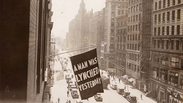
At the end of my previous post, I asked a question: what’s worse than being burned at the stake?
This.
On May 8, 1916, Lucy Fryer was found dead in her Robinson, Texas home. She had been killed by blunt force trauma to the head. Suspicion immediately fell on Jesse Washington, a 17-year-old illiterate black boy with an intellectual disability who the Fryers hired as a farmhand. County police arrested Washington the same night and interrogated him without a lawyer present. Washington confessed and signed a statement admitting to the murder.
Washington’s trial was on May 15th. More than two thousand local residents (nearly all white) attended, spilling out of the courthouse onto the adjacent streets. The trial lasted less than an hour. The jury deliberated for only four minutes before returning a guilty verdict. Sentencing was scheduled for the next day – but never got to that point. As sheriff’s deputies approached Washington to return him to county jail, the crowd surged forward, grabbed Washington, and dragged him out the front door. Washington tried to fight back, but was quickly overpowered and beaten. The crowd stripped off all his clothing and someone attached a chain to his neck.
The crowd used the chain to drag him by the neck all the way from the courthouse to Waco city hall, where another group had already prepared a bonfire next to a tree. At some point he was castrated. Jesse Washington was already beaten and bloody when he was doused with oil and hoisted on to a tree branch above the fire.
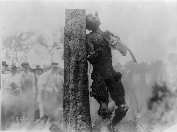
Here’s where it gets hard to read. He was repeatedly lowered into the fire, then raised again. Members of the crowd took turns removing Washington’s fingers, toes, and teeth – some of which were sold as souvenirs weeks after the lynching. His body was raised and lowered over the flames for more than two hours before he finally died of smoke inhalation and/or burning. Click on the moose photo below to see the result.
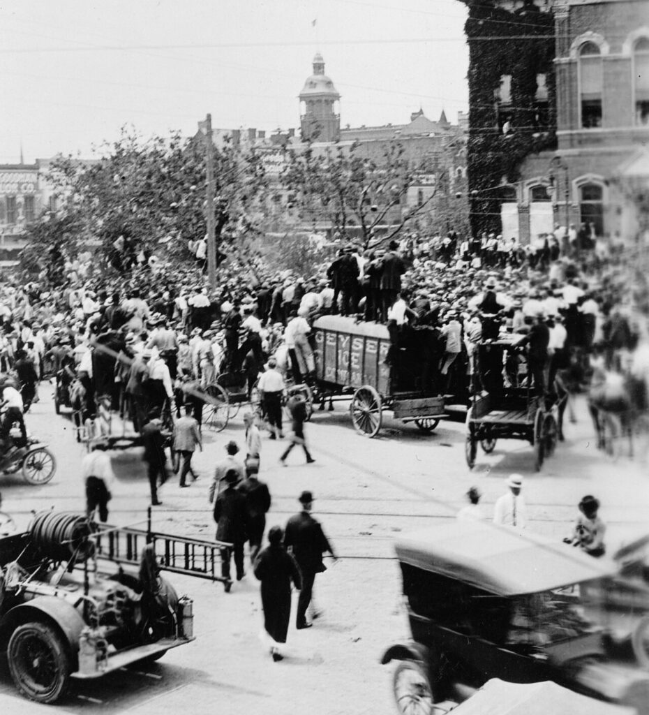
As the hours of Jesse Washington’s suffering passed, the crowd grew. The relatively new invention of the telephone helped spread the word as people called their friends to join. At the peak, the crowd was estimated at 10,000 people – in a city of only 30,000. Children were let out of school early to join the crowd. The photo below shows the assembled crowd – you can see the tree but Washington is hidden behind the crowd.
Three things made Jesse Washington’s lynching distinct from the thousands of other lynchings that occurred all over the American South. First, its sheer brutality, which earned the incident the nickname “The Waco Horror.” Second, the fact that Waco at the time was seen as a progressive city, home to several colleges and anti-lynching activists. If such an evil act could happen in Waco, it could happen anywhere.
Third, the entire process was documented in a way that few other lynchings were. Fred Gildersleeve, a professional photographer living in Waco, arrived at the bonfire just as Jesse Washington did. Gildersleeve recorded the whole process, and took the two photos that I have used in this post. Gildersleeve’s photos were used in postcards that were sent all over the world. The postcards made him a rich man.
Let’s address the moose in the room: did Jesse Washington kill Lucy Fryer?
I don’t care.
We have a legal system for a reason, and in this case, the legal system didn’t get a chance to rule. The people of Waco took that away from us.
So, does this mean that all lynching victims were found guilty of crimes – or even accused of crimes? As we’ll see in the next post – far from it.
Other posts in this series:
Strange Fruit