Graphs day 154, pandemic day 161, day 231 since the first cases were diagnosed. Today, let’s go back to the data from the JHU Coronavirus Resource Center and look at national-level graphs (since my version 7 spreadsheet has a template already set up for that).
Total cases of COVID-19 diagnosed worldwide: 21,879,368
Total deaths: 773,781
Happy Independence Day to two countries today: Indonesia (the world’s fourth-most-populous country) and Gabon (a country of two million people in central Africa with one of the world’s coolest national anthems). We’ll include lines for both countries in today’s post.
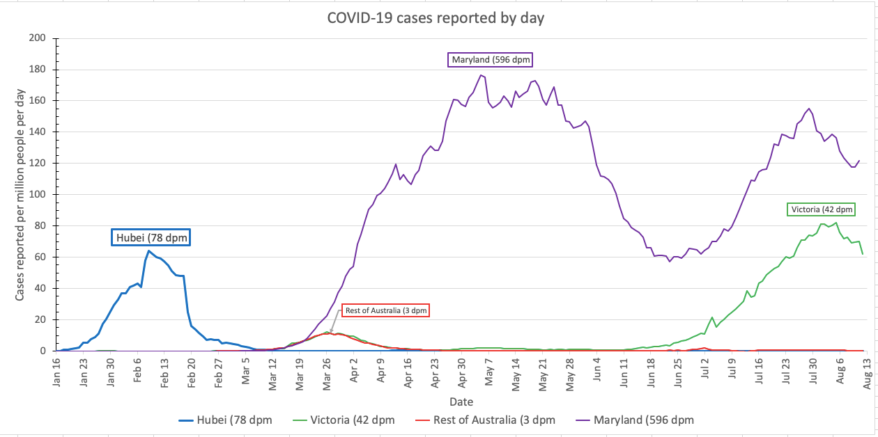
Usual graphs and labels for all five categories today. All five graphs are in the usual styles. The main graph is on the regular scale, from zero to 200 new cases diagnosed per day per million people – with the exception of the “getting worse” graph, which runs from zero to 300. Where there are smaller inset graphs, they are on the “Qatar scale,†which runs from zero to 700 cases per million people. Each country gets a unique color in each graph (although the colors can repeat across graphs). Line labels show the name of the region, and also the mortality rate (cumulative deaths per million people) in the region – cumulative because the dead stay dead. The thickness of the lines and the size of the labels depend on the cumulative case fatality rate – the number of people who died divided by the number diagnosed.
Regions where COVID-19 was quickly contained
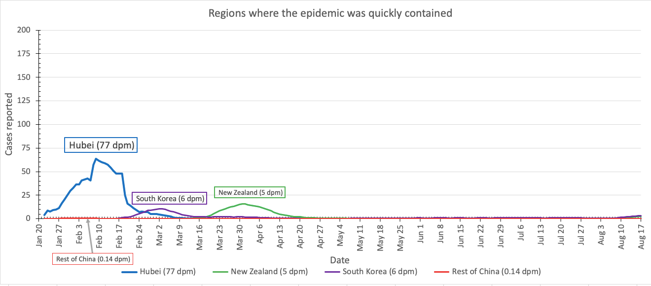
After 101 days with no local transmission of COVID-19, New Zealand experienced its first local case on day 102. There’s a very slight uptick in cases there and in South Korea, but keep it in perspective: the total number of cases in both places is still very low.
Regions where COVID-19 is currently under control(-ish)
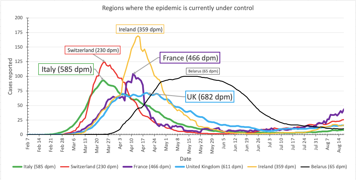
France is still ticking depressingly upward. If cases in France reach 52 per million people per day – half of their peak in mid-April – I will sadly move them into the Second Wave category.
Regions moving in the right direction(-ish)
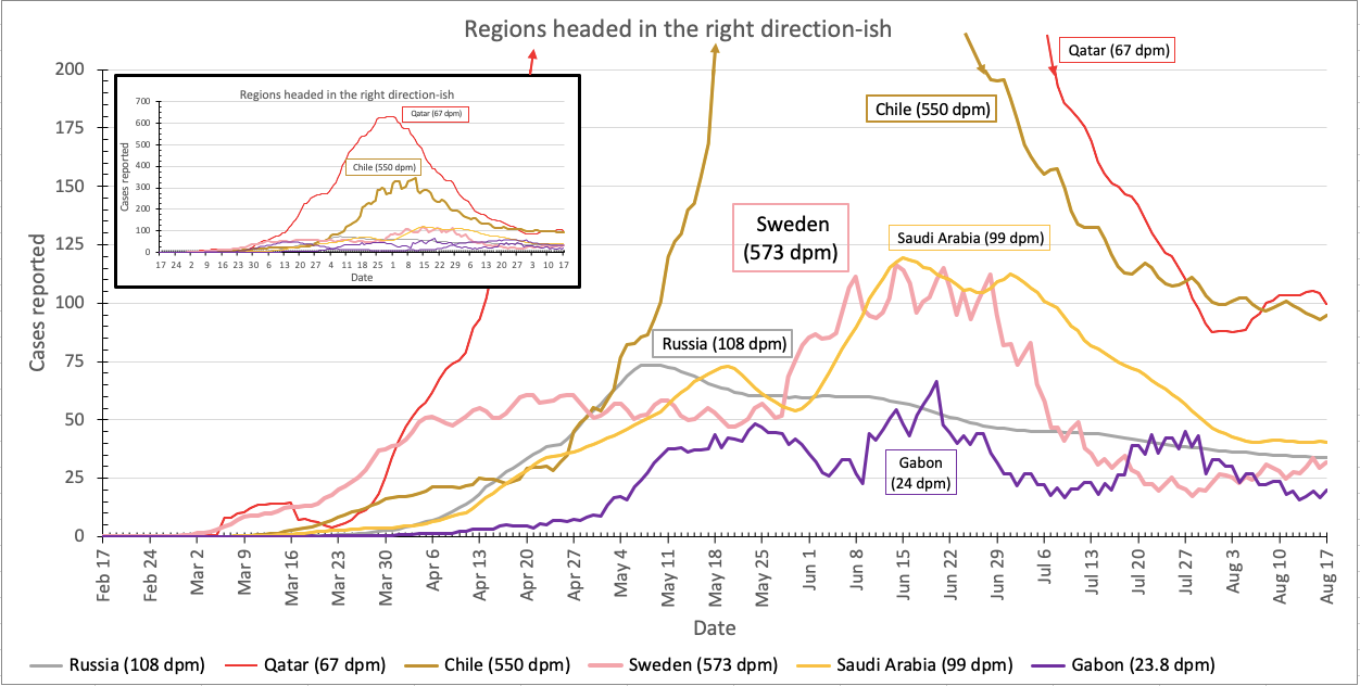
Gabon is on this graph (purple line). Reported cases have gone up and down somewhat, but never above 75 cases per million people per day. Qatar had a bump within the past two weeks, but it appears to have passed for the moment. And unfortunately Sweden seems to be on an uptick again, but it’s still too early to tell if it’s a real increase or just random variation. Antlers crossed that Sweden’s herd immunity strategy is working, but it’s really not looking good at the moment.
Regions experiencing a second wave of COVID-19 cases
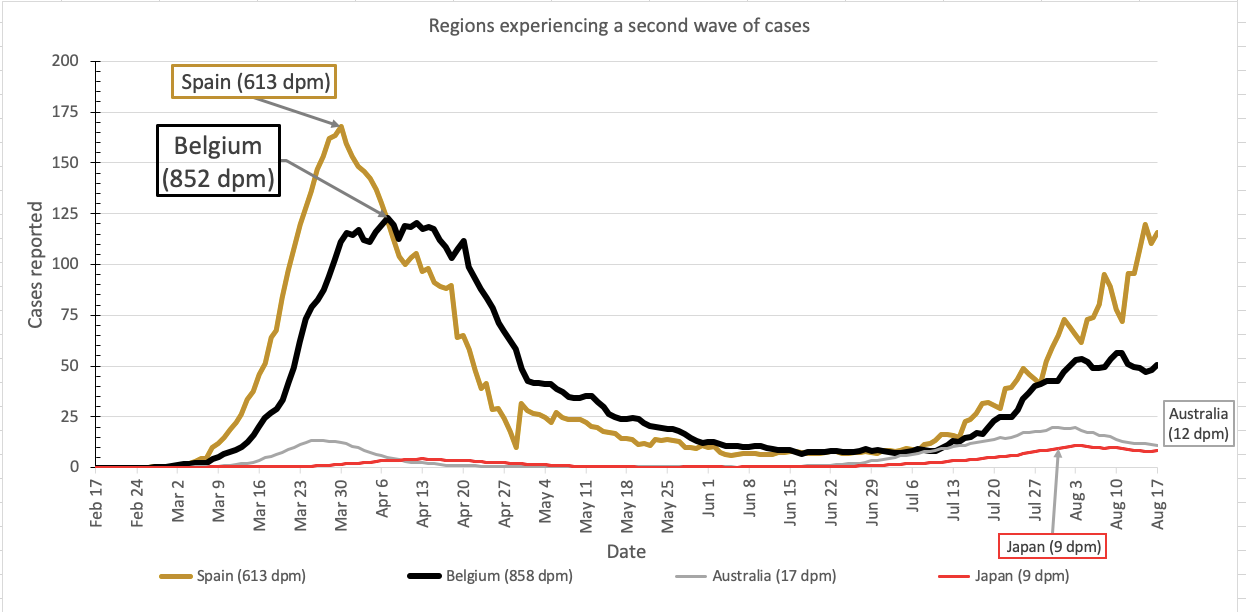
The second wave is maaaybe over in Australia, but keeps getting worse in Spain.
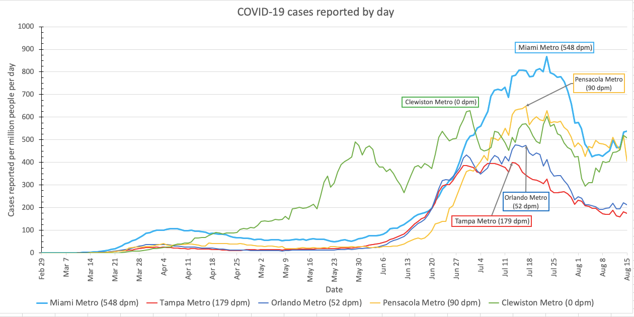
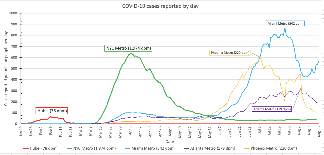
Regions where the first wave of COVID-19 continues to get worse
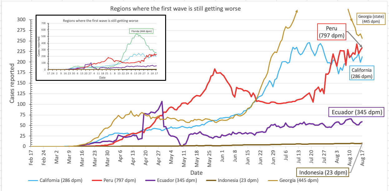
I showed some different regions today. I’m showing Georgia on the main graph, but I forgot to swap them in for Florida on the Qatar scale inset, so you get a bit of both today. This is where Indonesia goes also. Cases are clearly increasing in Indonesia, but they are increasing very slowly and are still at a quite low level.
Coming up tomorrow: a break from the COVID-19 graphs and a return of the series about people and things who are Not What They Seem: enjoy a new episode of Except They Weren’t.
Want to give these graphs a try? Please do! Here is version 7.3 of my spreadsheet, which is just like version 7.2 but is now updated with data up to yesterday.
Pandemic updates tomorrow, and every day until the pandemic ends or I do.