Democracy in the United States is not what it first appears.
Last week, we looked at how maps of the U.S. Senate can mislead, and I showed a new map that visually reflects the reality of state-by-state Senate representation, and also leaves room for additional information.
Today, we’ll the same thing for the more complicated example of the U.S. House of Representatives.
Don’t worry, I’ll explain this later in the post (click to open a larger version in a new tab)
Unlike the Senate, where each state is represented equally by two Senators, representation in the House is based on population as recorded in the once-a-decade national census. The United States is divided into 435 Congressional Districts, and with a 2010 U.S. population of about 310 million, each House member represents about 700,000 people.
Districts are set and voted on at the state level, which means no matter how few people live in a state, that state is guaranteed to have at least one House member. The number of House members per state varies from one each in the lowest-population states (from Alaska to Montana) to 53 in California. The boundaries of each district are set by the state legislature or an entity they assign. Districts must be contiguous (no enclaves or exclaves), but other than that anything goes. This opens House representation to all sorts of partisan strategic fuc kery – but much more on that later.
The question here is: how can we visualize U.S. House membership in a way that fairly shows the distribution of power, and also leaves room for other information? I’ll follow the same approach I used to visualize the U.S. Senate.
Most depictions of the House of Representatives that I have seen fall into one of two categories.
This:
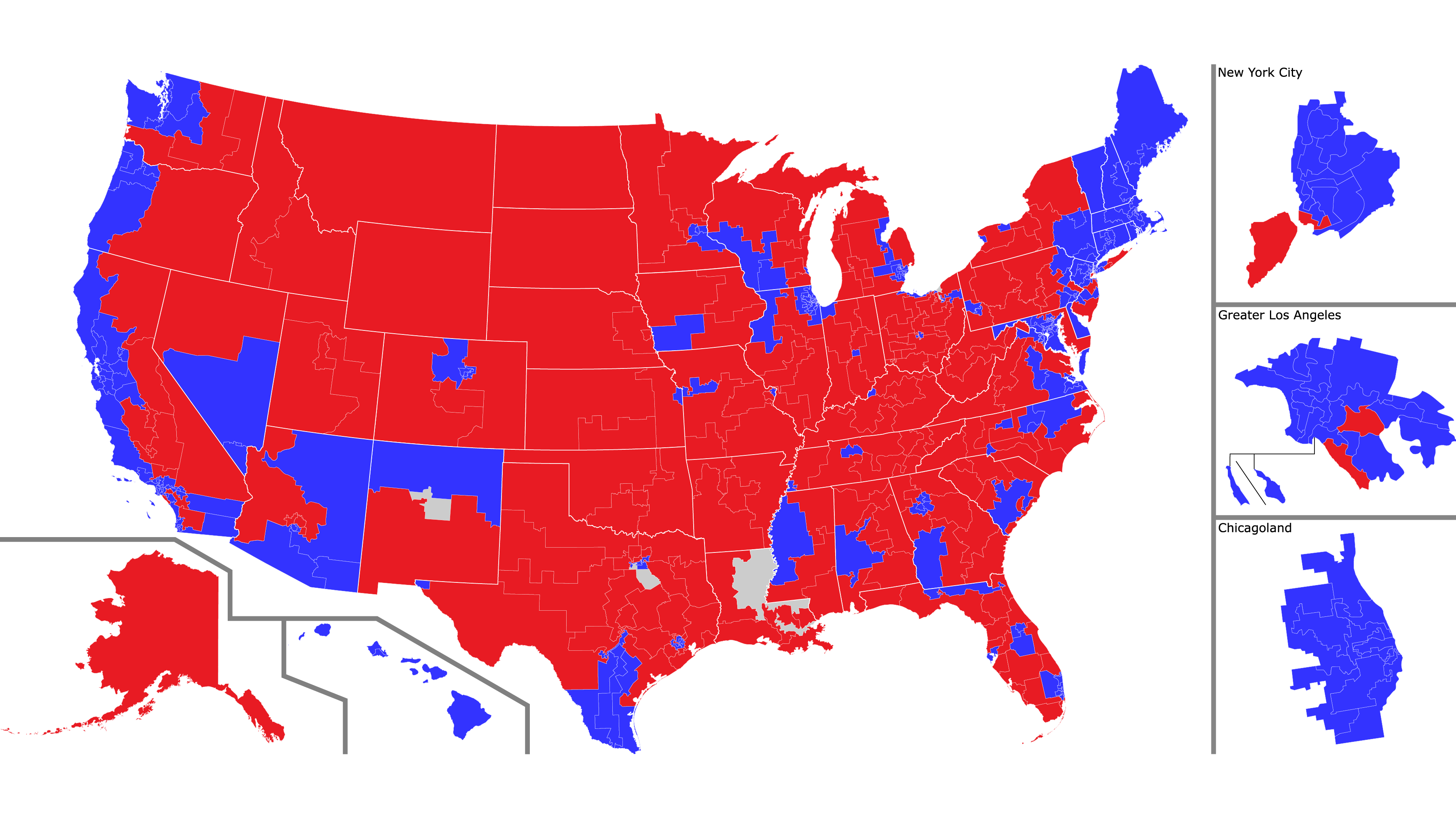
A map of U.S. House of Representatives districts with accurate borders. The main map shows the entire U.S., with side maps for: Alaska, Hawaii, New York City, greater Los Angeles, and greater Chicago.
Click to open a larger version in a new window.
or this:
A more abstract map of the House: one dot equals one representative. Red = Republican, blue = Democratic, gray= currently vacant
Click to open a larger version in a new window.
As we saw with the Senate, each of these views has advantages and disadvantages. The map view makes a clear connection with U.S. geography and shows district borders accurately, but the vastly different sizes of the districts make it look like a vast sea of red, when in reality the House has a Democratic majority. The dot view makes it clear that all districts enjoy equal representation, but at the price of making an abstract visualization that looks nothing like the United States.
And as with the Senate, why not combine the advantages of both, and add some more information to the visualization?
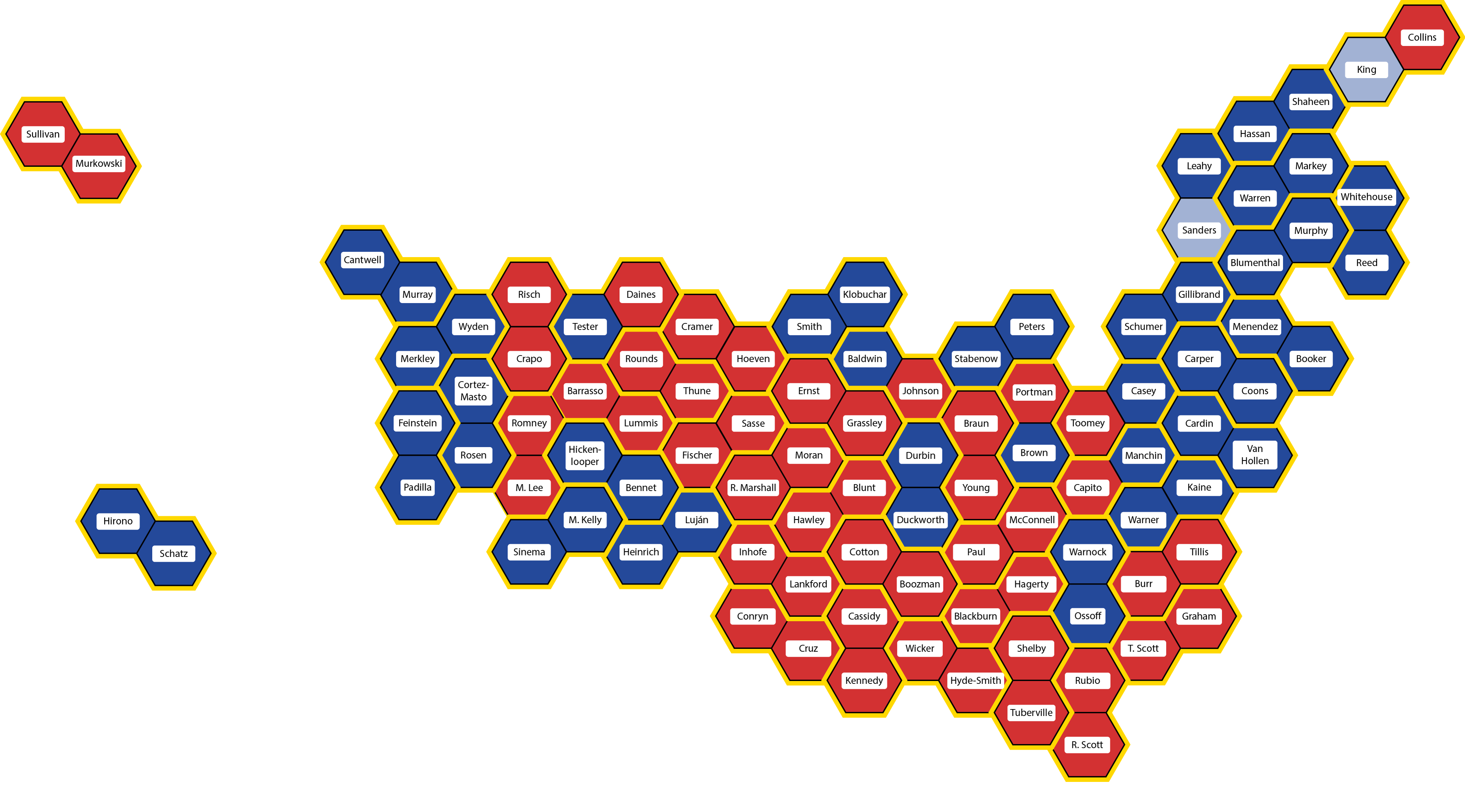
Like this (click to open a larger version in a new window):
Each hexagon represents one U.S. House member. States are in their approximately correct geographic positions, outlined in yellow, and each district is in approximately its correct place in the state. The colors are the same as before, and each hexagon is labeled with the name of that district’s representative.
Click on the map for a larger view – especially recommended this time so you can read the names of all the representatives
Each hexagon represents a single representative. The hexagons are color-coded, blue for Democratic, red for Republican, and white for vacant (Louisiana-2 is blue because the seat will be filled in a runoff special election on April 24th, but both candidates are Democratic).
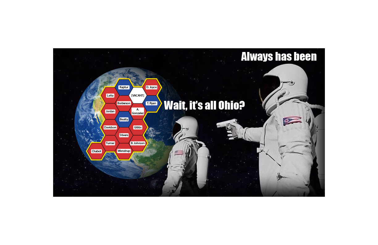
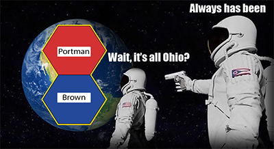
It’s all Ohio: Ohio’s 16 congressional districts (click for a larger meme)
As usual with images on this blog, you can click on the image to see a larger view, and in this case, I would definitely recommend it so you can read all the names. The linked image is quite large (3600 x 1996 pixels), so it may take time to load and you may need to scroll to see it all.
From now on, whenever I talk about the House, including in posts about future elections, I will use this map. I have some ideas about how to improve the map, and I’d love to hear yours.
So what’s next? As I alluded to above, real congressional districts are not hexagons. They are usually designed by state legislatures – and because state legislatures are partisan, districts can be drawn in a partisan way. And they are.
Democracy in the United States is not what it first appears.
There are many reasons for this, of course, but I am convinced that one of the reasons is that the maps we use to understand are democracy are misleading. Consider the U.S. Senate: two senators per state. Most depictions of the Senate that I have seen fall into one of two categories.
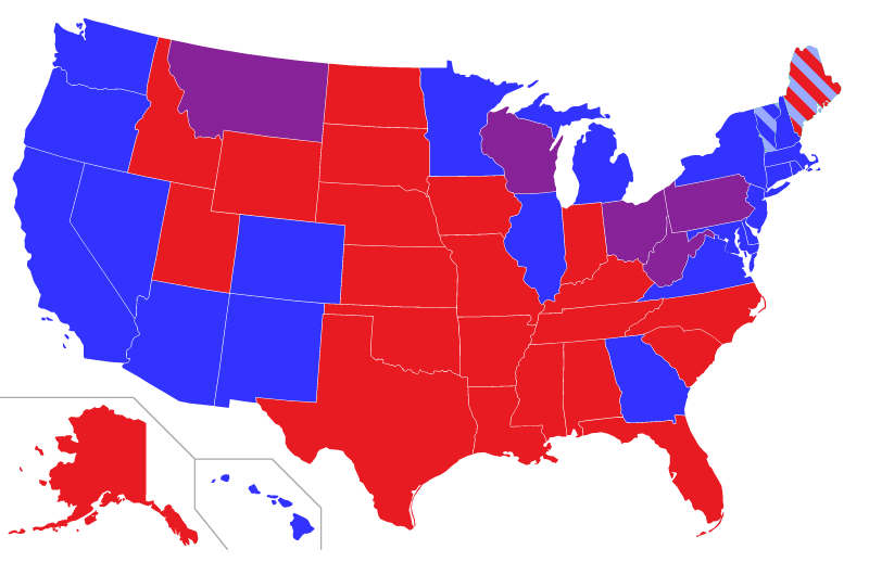
This:
Senators by state: blue = two Democratic Senators, red = two Republican Senators, purple = one of each The light blue in Vermont and Maine stands for Independent Senators who work with the Democratic caucus
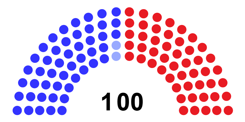
or this:
A more abstract map of the Senate: one dot equals one Senator. Red = Republican, blue = Democratic, light blue = Independent caucusing Democratic
Each of these views has advantages and disadvantages. The map view makes a clear connection with U.S. geography and shows which parties represent which states, but it the different sizes of states obscure the fact that each Senator, regardless of how much land area the state takes up, gets exactly one vote. The dot view makes it clear that states are equal, but at the price of making an abstract visualization that looks nothing like the United States.
Why not combine the advantages of both, and add some more information to the visualization?
Like this (click to open a larger version in a new window):
Each hexagon represents one senator. States are in their approximately correct geographic positions, outlined in yellow. The colors are the same as before, and each hexagon is labeled with the name of a Senator.
Click on the map for a larger view – especially recommended this time so you can read the names of the Senators
Each state, no matter how large or small, no matter how many or few people live there, is represented by two Senators. So in this visualization, each state has a yellow outline, and is placed approximately in its appropriate position and orientation. Maine is the tip of the mammoth’s trunk, Florida is its front hoof, Washington state is its tail, and so on.
Each state consists of two hexagons, one per Senator. Hexagons are color-coded by party: blue for Democratic, red for Republican, and light blue for the two Independent Senators who have joined the Democratic caucus.
And that’s another advantage of this map compared to the first: Ohio is not represented by a Senator from the Purple Party, it is represented by Democratic Senator Sherrod Brown and Republican Rob Porter. Lastly, each hexagon is labeled with each Senator’s name.
All Ohio: Senators Sherrod Brown (D-OH) and Rob Portman (R-OH)
As usual with images on this blog, you can click on the image to see a larger view, and in this case, I would definitely recommend it so you can read all the names. The linked image is quite large (3600 x 1996 pixels), so it may take time to load and you may need to scroll to see it all.
From now on, whenever I talk about the Senate, including in posts about future elections, I will use this map. I have some ideas about how to improve the map, and I’d love to hear yours. And if you know anything about American democracy, you can probably guess what’s next.
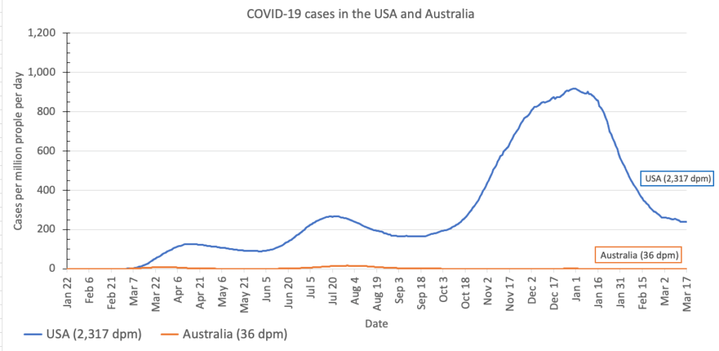
What has the state of the pandemic been like in Australia and in the United States? As always, a graph is worth a million words:
Newly-diagnosed cases per million people per day in the USA (blue line) and Australia (orange line)
The graph shows why Australians are beginning to get back to their normal lives, even though the vaccination rate in Australia is still lower than the vaccination rate in the U.S.
The short answer is that nearly everyone had the common sense, personal responsibility, and basic human decency to follow public health guidelines: stay home whenever possible, and when that is not possible, keep a 6-foot or 2-metre distance from others and wear a cloth mask over both your nose and mouth.
Of course, the vast majority of Americans have the common sense, personal responsibility, and basic human decency to follow the same public health guidelines – but one major lesson we have learned from this pandemic is that even “the vast majority” is not enough. It takes nearly everyone, no exceptions. (I’d love to be able to say something more quantifiable here, and I’m doing some research. As I learn more, I’ll add it here.)
But you might say, what about TEH ECONOMY (TM)? Has Australia sacrificed economic growth, and therefore livelihoods, by adhering too strictly to public health guidelines? Maybe yes, maybe no.
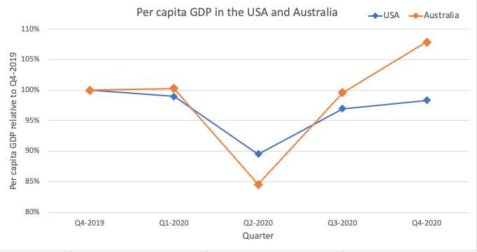
The graph below shows the quarterly per capita gross domestic product (GDP) in the U.S. and Australia, relative to the fourth quarter of 2019 before the pandemic reached either country.
Gross Domestic Product in US Dollars for the US and Australia, relative to Q4-2019 values
All the social distancing did indeed cost the Australian economy – the economy contracted more than the US economy did in quarter 2 of 2020, at the height of the pandemic.
But here’s the thing: the pain was temporary. By the third quarter of 2020, Australia was already outperforming the US, and now the Australian economy is stronger than it was before the pandemic began.
Adding up all quarters, it’s not entirely clear whose economy has been healthier overall. But the more football tickets Australians buy and Americans don’t, the more clear it would become that Australia would come out on top.
And – let’s not focus on the economy so obsessively that we lose sight of actual human lives – it’s absolutely clear and obvious that in terms of lives lost to the pandemic, Australia is the clear and obvious winner.
If you’re going to say that the U.S. can’t learn from Australia, or you that can’t compare two different countries, I’m going to say: well, why?
Why is a constitutional federal republic of states with a bicameral legislature and a fiercely independent frontier spirit where the most popular sport is football so massively different from a constitutional federal republic of states with a bicameral legislature and a fiercely independent frontier spirit where the most popular sport is football?
For sports fans, it’s the most wonderful time of the year: the first week of the NCAA men’s basketball tournament!
This year’s NCAA men’s basketball tournament bracket – click for a larger version
Last night, the qualifying teams were announced, along with their matchups in the first round. And here it is – click for a larger version that you can read.
That means that today, millions of people in the U.S. and around the world are carefully studying this bracket, trying to pick the winners of each game in each round, for fun and profit. And so a question that often comes up this time of year is this:
What are the chances of picking a perfect NCAA bracket?
That is, what is the probability of correctly predicting the winner of every single game, from the first first-round game through to the championship?
Seemingly simple games can produce absurdly large numbers quickly, as we saw earlier with a simple deck of cards. March Madness doesn’t produce numbers quite that absurd as the cards did, but still so absurd that it’s hard to wrap your mind around just how large the number is.
Miracles do happen: (16) UMBC 74 (1) Virginia 54 in 2019
Let’s ignore the play-in games on Wednesday night, since those exist only to confuse and annoy. That leaves 64 teams, which means that to crown a champion it will take 63 games. Assume that in each game, each team has a 50-50 chance of winning, meaning you can flip a coin to predict the winner. (This is not a realistic assumption, since for example, the 1-seed has won 139 out of 140 games – but since miracles can happen, let’s go for it.)
That means that the probability of getting every game right is 1 in 263, which is
1 in 9,223,372,036,854,775,808
That’s one correct choice out of 9 quintillion 223 quadrillion 372 trillion 36 billion 854 million 775 thousand 808 possible combinations.
What kind of divine being would be annoying enough… oh, right. Never mind.
How absurdly huge is this? See below for the calculations, but in short, let me put it this way.
Let’s say that some really annoying divine being decided they wanted to cheat by getting humans to pick every possible bracket. They would have to kidnap every human on Earth – all eight billion of us – and endow us all with eternal life and super-speed to pick brackets.
Then they would magically transport us back to the year 1983, just in time to watch one of the most famous moments in college basketball history:
Then we would get to work – all eight billion of us – picking one possible NCAA bracket per second. No stopping to eat or sleep, just filling out March Madness brackets once per second, all day all night all year. It could have happened earlier, but in the worst case it would be just about now – after about 38 years of work – that someone, somewhere would get a perfect bracket. And that’s just for this year; picking next year’s bracket could keep us busy until the year 2060.
But take heart – you don’t have to get them all right to win your office pool. As they say, you and your friend are being chased by a bear, you don’t have to outrun the bear. You just have to outrun your friend.
Replace the bear in that analogy with the laws of probability, and good luck with your picks this year!
The (highly approximate) calculations
There are 263 possible combinations, which is about 9 x 10¹⁸
There are 8 billion people on Earth (8 x 10⁹)
So everyone picking one bracket per second is 8 x 10⁹ brackets per second
There are about 30 million seconds in a year (3 x 10⁷)
So every human picking one bracket per second for a year multiplies to about 2.4 x 10¹⁷ brackets
9 x 10¹⁸ brackets divided by 2.4 x 10¹⁷ brackets per year is about 38 years
Take a deck of cards. Give it a good shuffle, and then lay the cards out one by one, like the picture below. Here’s the question:
How many possibilities are there for which cards will go where? And how many times will you likely have to deal to get the same arrangement of cards again?
Fortunately my spouse is a huge nerd and has Lord of the Rings playing cards
To deal a pack of cards, start with the first card. There are 52 possibilities; I got the 7 of spades. Once the first card is dealt, you have 51 cards left, so there are 51 possibilities for what the next card will be. The next card could be one of 50 possibilities, the one after that could be one of 49, and so on – until the last card, which can only have one possibility. To find the total number of possible orderings, multiply out all the possibilities to get:
52 x 51 x 50 x 49 x ………… x 3 x 2 x 1
Math has a special name for this operation: factorial, symbolized with an exclamation point (!). The factorial of a number is equal to that number times the previous number, times the number before that, and so on all the way down to 1. The exclamation mark is an appropriate symbol, because the factorial can get shockingly big shockingly quickly.
The first few:
1! = 1 2! = 2 x 1 = 2 3! = 3 x 2 x 1 = 6 4! = 4 x 3 x 2 x 1 = 24 5! = 5 x 4 x 3 x 2 x 1 = 120 6! = 6 x 5 x 4 x 3 x 2 x 1 = 720 7! = 7 x 6 x 5 x 4 x 3 x 2 x 1 = 5,040 8! = 8 x 7 x 6 x 5 x 4 x 3 x 2 x 1 = 40,320
That means that if you deal seven cards, you have 5,040 possibilities for their order. If you deal eight cards, you have 40,320 possibilities for their order.
What about for the full 52 cards – what does 52! equal?
That means that when you shuffle and deal a deck of cards, there are 80 unvigintillion 658 vigintillion 175 novemdecillion 170 octodecillion 943 septendecillion 878 sexdecillion 571 quindecillion 660 quattuordecillion 636 tredecillion 856 duodecillion 403 undecillion 766 decillion 975 nonillion 289 octillion 505 septillion 440 sextillion 883 quintillion 277 quadrillion 824 trillion different possibilities for how the cards could fall.
How big a number is that? It is unimaginably, unfathomably, amazingly huge. To call this number “astronomical” would be an insult to astronomy.
To get a sense for exactly how huge this number is, let’s consider the second half of the question I asked above: how many times would you have to deal before you could expect to see the same arrangement of cards again?
Because the cards are shuffled anew each time, every deal is independent of those that came before and after, and thus there is no definitive way or predicting the answer. It could happen again pretty soon, or it could never happen again for the rest of the history of the Universe.
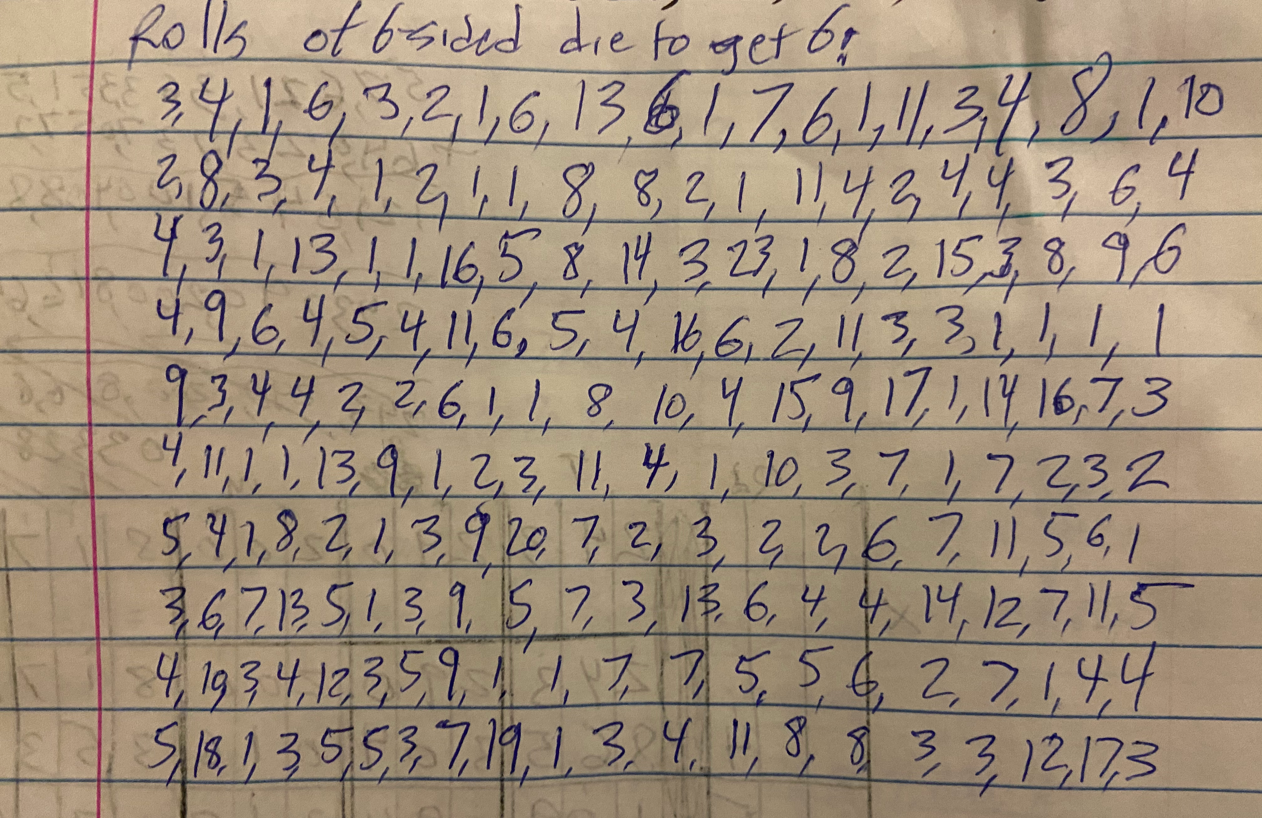
But we can get some insight into the question by considering another random chance event that is much, much more likely: rolling a die. On average, how many times do you have to roll a six-sided die before you might expect to roll a 6?
How many times did I need roll a 6-sided die to get a 6? Yes, I really did roll a die this many times. I am committed to my art.
If you know enough statistics to know that recurrences occur in a geometric distribution (and if you know why it depends somewhat on what you mean by “you might expect,” you can skip to the answer – but it’s always more fun to figure it out. So I did an experiment. I rolled a die, and kept rolling until I got a 6. I wrote down the number of rolls that it took. And then did it again, and again, a total of 200 times.
Over those 200 trials, the average (mean) number of rolls required to get a six was 6 rolls. I tried again with rolling an 8-sided die, and over 50 trials it took on average 8 rolls to get an 8. And it sort of makes sense that the number of trials you need to get a specific outcome should be roughly equal to the number of possible outcomes.
Which means that for dealing cards, where there are 80,658,175,170,943,878,571,660,636,856,403,766,975,289,505,440,883,277,824,000,000,000,000 possible outcomes, you should expect to have to deal out the deck 80,658,175,170,943,878,571,660,636,856,403,766,975,289,505,440,883,277,824,000,000,000,000 times before getting the cars in the same order again.
How many times is that? Here’s a way of thinking about how big that number is, adapted from an essay by fellow data scientist Scott Czep.
Stand in the middle of Times Square in New York City. Deal out deck of cards and note the arrangement. Put the deck back together, shuffle, and take a step. Repeat: deal, shuffle, step. Deal, shuffle, step. Continue until you are standing on the beach in Los Angeles, California. But you’re not done yet. Far from it. Turn around and deal, shuffle, step, all the way back to New York. Then turn around and do the same thing: deal, shuffle step back to LA.
Now take an eyedropper and remove one drop of water from the Pacific Ocean. You’re there anyway. Turn around and deal, shuffle step back to New York, then back to LA. Then remove another drop from the Pacific Ocean.
Continue doing this until the Pacific Ocean is empty.
You’re still not done, though. Magically refill the entire Pacific Ocean, and then remove a pebble from the top of Mount Everest. Turn around and deal, shuffle, step back to New York. Deal, shuffle, step, New York, deal, shuffle, step, LA, drop, New York, LA, drop, New York, LA, drop, ocean empty, pebble off Mount Everest.
Continue until you have removed all of Mount Everest.
Congratulations! You have removed Mount Everest once, after having emptied the Pacific one drop at a time one billion billion times, while walking back and forth between New York and LA between drops, dealing and shuffling cards each time. To celebrate your accomplishment, lay a piece of paper on the ground. Magically refill the Pacific, magically rebuild Mount Everest all the way to the top, and repeat.
Deal, shuffle, step, New York, LA, drop, deal, shuffle, step, New York, LA, drop, ocean empty, pebble, deal, shuffle, step, New York LA, drop, ocean empty, Mount Everest gone, add a sheet of paper to the stack, repeat, keep stacking.
Continue until the stack of papers reaches the Sun.
After all this – countless pieces of paper on the stack, countless countless removals of Everest, countless countless countless emptyings of the Pacific, and countless countless countless countless hands of cards, are you done? No.
Repeat this entire process 66 more times. Sometime during your 67th trip, you reach the number of deals at which you might expect to see the same layout you saw on your first deal, back in New York so long ago.
Think about this next time you see a pack of cards: enormous complexity can hide in the simplest things.
Postscript: The Numbers
Doing these calculations was way easier because Scott Czep did most of the work in his essay about 52 factorial, I just changed a few things. If you see any errors, they are mine rather than his, and please let me know in the comments! And definitely check out Scott’s essay and the rest of his blog.
52! in scientific notation is about 8 x 1067, so that is the number we are aiming for.
An average person has a stride length of a bit less than one meter, but let’s round up to 1 meter to make the calculations easier. It’s one hand of cards per step.
The distance from New York to Los Angeles is 4500 km, so back and forth is 9000 km = 9 x 10⁷ meters. At one step per meter and one hand of cards per step, that’s 9 x 10⁶ hands. (Note: we’ll ignore the initial New York to LA walk since it will make so little difference with the number of times we’ll have to do the round trip.)
Current total: 9 x 10⁷ hands dealt
There are about 20 drops of water per cubic millimeter
The Pacific Ocean contains 700 million cubic kilometers of water (7 x 10⁸ km3 = 7 x 10²³ mL = 1.4 x 1025 drops
Current total: 1.2 x 1033 hands dealt
Assume a pebble weighs about 1 ounce.
Mount Everest weighs 357 trillion pounds = 5.7 x 10¹⁵ ounces = 5.7 x 10¹⁵ pebbles.
Current total: 6.8 x 1048 hands dealt
A sheet of paper is about 0.1 mm thick
The distance from the Earth to the Sun is 150 billion km = 1.5 x 1017 mm = 1.5 x 10¹⁸ sheets of paper
Current total: 1.2 x 1066 hands dealt
Repeat the entire cycle 66.7 times to get to the target of 8 x 1067 hands


