Presidential election prediction 2: still too early, but less misleading

Two trains headed for a head-on collision, with a man standing in front
The two candidates take the stage in front of moderator Chris Wallace

Twelve days ago, I launched my first prediction of the results of the 2020 U.S. Presidential election, far too early, before even a single debate had happened. Last night, we had our first debate (pictured to the right). I have downloaded a transcript of the debate (sixty-five single-spaced pages, so help me God). I’ll have a lot more to say about it over the next few days – but for tonight, it’s time for another premature prediction.

Usual disclaimer for all my election predictions: I know who I am going to vote for and I don’t see any reason to keep that secret – but I’m not a pundit, I’m a scientist, and this isn’t a blog about my opinions, it’s a blog about scientific thinking. So I’m trying my best to stay objective and predict who will win, not who I think should win.

But before I get to the premature predicting, I’ve been thinking a lot about how to visualize these predictions for you. The thing that matters in these predictions is what candidate, if any, reaches the magic threshold of 270 electoral votes to be elected President. Showing the states on a map helps give you a sense of what candidate is likely to win, but ultimately the specific states don’t matter – only the total count matters. And here’s an illustration of that.

Use the slider below to compare two states from my previous prediction map, each of which I cut out and de-labeled. I was careful to show the states on the same scale at exactly the same size.

Think fast – which state is worth more electoral votes, red or blue?

MontanaRhode Island

The states, of course, are Montana and Rhode Island, worth three and four electoral votes respectively. Showing their shapes makes it appear that Montana is far more important – but remember, specific states don’t matter, only electoral votes matter. Even if you know that Montana is worth three and Rhode Island is worth four, it’s hard to look at the map and not feel like Montana must be more important. Look, it’s so much bigger!

A map to tell a clearer story would show the sizes of each state based not on their land area, but on the number of electoral votes they offer to the candidate who receives the most votes from those states. Like this – again, the images are exactly the same size and you can swipe to compare them.

Three connected Hexagons for MontanaFour connected hexagons for Rhode Island

The best map to tell this story, then, would have every state sized according to its number of electoral votes, from the eight with three electoral votes each to California’s fifty-five. And ideally it would do this while preserving the outline and position of each state so that the map is still recognizable as a map of the United States. Many other people have created such maps (examples from Engaging Data and Daily Kos and Medium and FiveThirtyEight), but I wanted one that I could freely use and easily modify. So, armed with my data visualization skills and considerable stubbornness, I made my own.

And behold, my current-as-of-today prediction for the 2020 U.S. Presidential election, presented on my shiny new electoral college map. Click on the picture to go to a more traditional view at 270towin.com, which you can then use to build your own prediction.
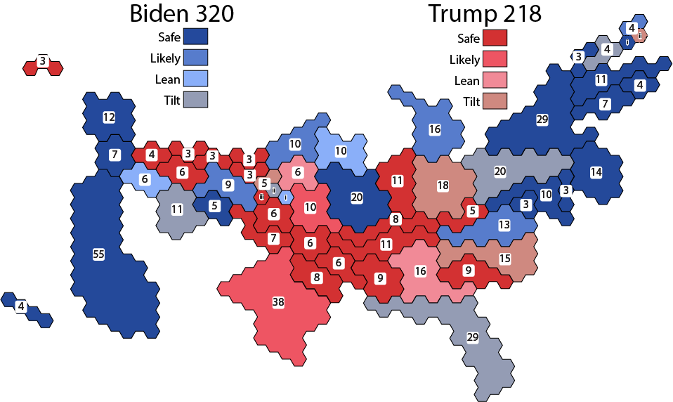
Electoral vote map of my predictions of the 2020 U.S. presidential election results, as of right now. Predicted final score:
Biden 320
Trump 218

I could go on for pages and pages about how I created the map and the various decisions that went into it, but I’ll save that for another time and just explain the prediction. As usual, states marked in blue are the ones I am predicting will vote for Biden and states marked in red are predicted for Trump – although never forget that those colors are completely arbitrary. Darker shades of either color indicate I am more confident about the prediction for that state. Oh, and the map also includes the malarkey in Maine and Nebraska.

I’ve made a few changes from my last set of predictions, nearly all in Biden’s favor.

  1. I can no longer ignore the latest polls in Arizona that show Biden holding steady with a 2 to 3 percentage point lead. It’s too narrow a lead to be very confident, but I think it’s clear that I have to declare Arizona a tilt for Biden rather than a tilt for Trump. If that prediction is right, adding Arizona’s 11 electoral votes to the ones he has already would give Biden a commanding lead.
  2. The same with the polling for the 3 electoral votes in New Hampshire and the one in Nebraska’s second district, only more so.
  3. I almost can’t believe I’m saying this, but I’ve moved Virginia from lean Biden up to likely Biden, because he is holding steady with a 5 to 12 percentage point lead in statewide polling. We may be seeing the end of Virginia as a swing state, just as we saw Missouri go from swing to solidly Republican between 2004 and 2016.
  4. The race has tightened considerably for the 15 electoral votes in North Carolina, enough that it’s basically a 50/50 tossup. I still think Trump will do well there, but the race is close enough that I’ve moved North Carolina from Leans Trump to Tilts Trump.
  5. Trump is toast, covered with green chile, in New Mexico. I’ve moved New Mexico from Likely Biden to Safe Biden.
  6. The move in Trump’s direction is in Indiana, which I moved all the way from Leans Trump to Safe Trump. I think I was distracted by Obama winning the state in 2008 and forgot to think about the actual polling data. Given how much the political landscape has changed since then, that might as well be when dinosaurs roamed the Earth.

So here are the predictions again, shown on my new electoral college map – which I am damn proud of creating. Click on it to go to a more traditional map from 270towin.com. Click on that 270towin map to try it yourself!

Electoral vote map of my predictions of the 2020 U.S. presidential election results, as of right now. Predicted final score:
Biden 320
Trump 218

What do YOU think the final results will be? Let me know in the comments!

Except they weren’t: R.O.B.

The hottest toy of the 1985 Christmas season was an Extraordinary Video Robot that could play games through your television.

Except it wasn’t.

The “robot” in that 1985 commercial was R.O.B. (Robot Operating Buddy), which shipped with early copies of the Nintendo Entertainment System (NES) to test markets in New York and Los Angeles. The NES proved to be a big hit in those test markets, and so the console rolled out throughout the U.S. over the next year – but without R.O.B. Why?

The best way to explain R.O.B. is to show him in action. It’s a collector’s item today, available on eBay for anywhere from $20 to $500 depending on its condition. To use R.O.B., power it on, plug in the second NES controller into the base unit, and load onr of the two games that works with it, Gyromite or Stack-Up.

The youtube channel videogamecollector shows what it looks like running, and it’s very cool:

R.O.B. in action

…but beneath all the spinning and blinking and robot noises, here’s what R.O.B. was really doing: pressing the select button on the second controller. Which means that you could play the same two games much more easily without R.O.B., simply by pressing the select button on the second controller.

Why would Nintendo design something so complicated and so utterly pointless? It wasn’t a robot, it was a trojan horse. R.O.B.’s entire purpose was to hide the fact that the NES was a video game system.

And why would Nintendo of America want to hide the fact that their beautifully designed video game system was a video game system? Remember that this was fall 1985, before the wild success of the NES. But for a full answer, we need to look back even farther into the history of video games.

The first commercially successful video game was Pong, released in 1972 and still bizarrely addictive today. Following Pong, many other of these new “video games” were released to the new video arcades that were springing up all over the United States. As arcades became more and more popular, video game makers began to wonder how to bring the experience into their customers’ homes. After a few false starts, the first massive hit was the Atari 2600, released in 1977.

Manufacturers created hundreds and hundreds of games for the Atari system – and that was the problem. With so many titles clogging store shelves, and with a medium so new that there were not yet any reviews, customers had no way to tell good games from bad games.

The final indignity was the officially licensed E.T. video game, released in time for Christmas 1982. Atari spent millions to acquire the rights to what was at the time the highest-grossing movie of all time, and millions more on marketing, but left the game to a single developer to rush out in six weeks. The results were famously terrible:

A playthrough of the famously terrible E.T. game for the Atari 2600, from J.C.’s Channel on YouTube

Millions of American children woke up on Christmas morning to a shiny new copy of Atari’s E.T., only to have their joy turn to despair within minutes of starting up the boring, bug-filled mess above. Word quickly spread, sales dried up, and retailers were stuck with millions of unsold copies sitting on shelves. They sent the cartridges back to Atari, who had no choice but to take the loss and bury them in a New Mexico landfill.

It wasn’t just E.T.; every other game and even every other video game system completely dried up. Atari nearly went bankrupt, staying in business only by reorganizing and selling off its software division. Industry analysts declared that the fad was over; there was no more consumer demand for video games. That state of affairs continued for years. And that was the situation that Nintendo of America found itself in in fall 1985.

Nintendo had good reason to believe that video games would take off again – there was no video game industry crash in Japan, and their Famicom system had sold steadily there since 1983. And they thought they knew the cause of the crash and what to do about it. They would have strict quality control over all the games on their system, made possible by a licensing agreement and enforced by a lockout chip preventing unlicensed games from playing. They would create an in-house magazine to offer reviews, previews of future games, and strategy information to players. But even with all these efforts in place, they still had a major hurdle to overcome to get their new system to consumers.

This was 1985, years before online shopping was even a dream. To even get the chance to sell to customers, Nintendo knew it first had to sell to retailers who were understandably skeptical of video games after the crash of 1983.

So how do you sell a video game system to people who don’t like video games? Tell them it’s totally not a video game system! It’s an ENTERTAINMENT SYSTEM! And R.O.B. was a key part of that strategy. It looked like a toy, so retailers concluded that it must be a toy – and they marketed it like any other toy. Nintendo proved to be absolutely right about the NES. And as you can see below, thirty-five years later: the rest is history.

The new world speed record for completing Super Mario Brothers, 4 minutes 55.64 seconds, by YouTube’s Kosmic.

I need a better way (very brief daily COVID-19 data update CLXXXII)

A hamster running on a wheel very very fast
My Mac’s processor trying to keep up with the calculations required by my COVID-19 spreadsheet

Unfortunately, COVID-19 has affected so many people in so many places that my spreadsheet has gotten too big to work with. Going from the raw data provided by the Corona Data Scraper citizen science project to my graphs now literally takes about 4 hours of constant attention to Excel. I’ll have to rethink my approach.

Most likely I’ll do the preprocessing in Python, a simple but powerful programming language used by scientists all over the Universe. I’ll try to provide step-by-step instructions on how to how to run Python, and to document my programs extensively, so you can try them yourself. Even though Python can make graphs, I plan to continue making the graphs in Excel, because it’s a simple tool that so many of you already know how to use.

It might be a few days until my next COVID-19 update. In the meantime, I’ll keep posting other things on my usual Monday-Wednesday-Friday schedule, including something coming later today.

I took some time off. COVID-19 did not. (Daily COVID-19 data update CLXXXI)

A screenshot from the absolutely terrible film "Mac and Me" (1988) featuring a kid in a wheelchair and an alien something something adventures saving the world?
Mac and Me

Graphs day 181, pandemic day 188, day 258 since the first cases were diagnosed.

I took some time off to work on some other projects, including a very cool study of federal banking data with my JHU colleague and friend Mac McComas (you’ve heard from him here before). What’s the biggest factor in who gets loans in Baltimore City and who does not? Spoiler alert: it’s race.

But the virus never takes a day off, and since I made my last graph, another nearly 7 million people have been diagnosed with COVID-19, and more than 120,000 have died. We are rapidly closing on one million deaths. Not bad for a virus that we are pretty sure had not infected even a single human one year ago.

Total cases of COVID-19 diagnosed worldwide: 28,524,156

Total deaths: 902,224

I’m once again using data from the amazing online volunteer effort that is the Corona Data Scraper project. I explained how the project works in more detail in a previous post, but in short a worldwide team of volunteers has written a complex set of Javascript programs to automatically retrieve and process data from thousands of individual sources, primarily national, state, and local health departments. In other words, please don’t tell me it’s a conspiracy. It literally can’t be. At no point was all the data in the hands of any person or entity until it shows up on their website and I paste it into my template. And don’t tell me I’m the conspiracy – I have always been entirely transparent about what I do here, and I always will be, even though it costs me significant time and effort and even a little bit of money. As always, you can download the template at the bottom of this post and see for yourself.

It took me literally most of the day to get the data cleaned and into my template, so I don’t have any new graphs to show you today. But here is an updated version of one I posted recently, showing COVID-19 case rates in various metro areas in Florida. Usual graph styles apply.

COVID-19 cases in metro areas in Florida

There is definitely cause for cautious optimism from this graph, but with two caveats. First, the case rate is still ahead of where it was during the first peak of the Florida epidemic in late March. Second, schools are a savage vector for virus transmission, and schools in many parts of Florida have been open for a little more than two weeks. So if there is going to be a third wave of infection that results, we should start seeing it riiiiiiiiiight about now. Let’s hope we don’t.

I obviously haven’t been living up to my initial plan to post an update every day of the pandemic, but why not start now? Another update tomorrow.

Want to give these graphs a try? Please do! Here, for the first time, is version 8 of my template. Beware, it’s big, it will take several minutes per calculation. Be sure you have Excel set to manual calculations.

Pandemic updates tomorrow. And probably not literally every day until the pandemic ends? But the virus is tenacious, and so am I.