America still have a Legislative branch of government, and it still matters.
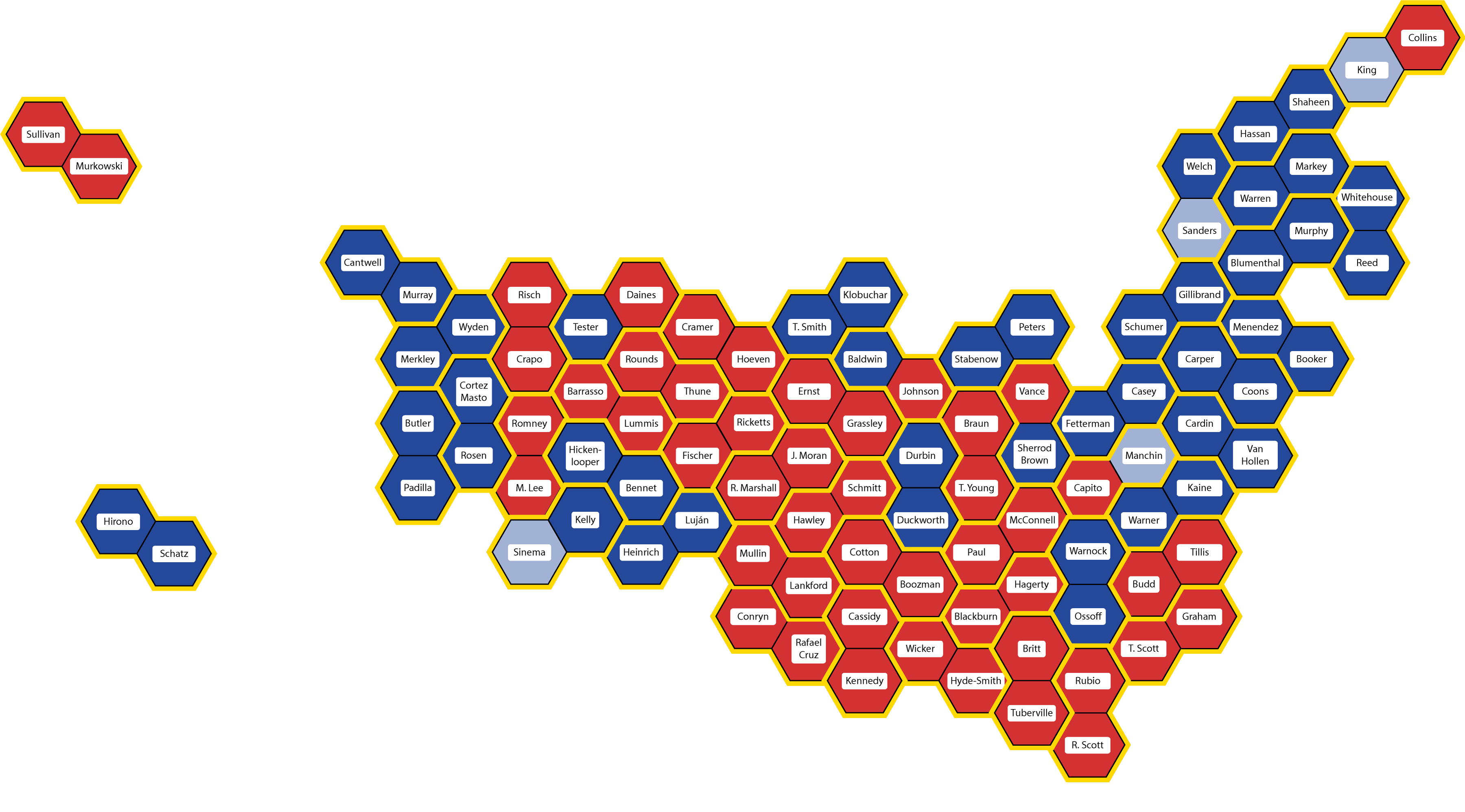
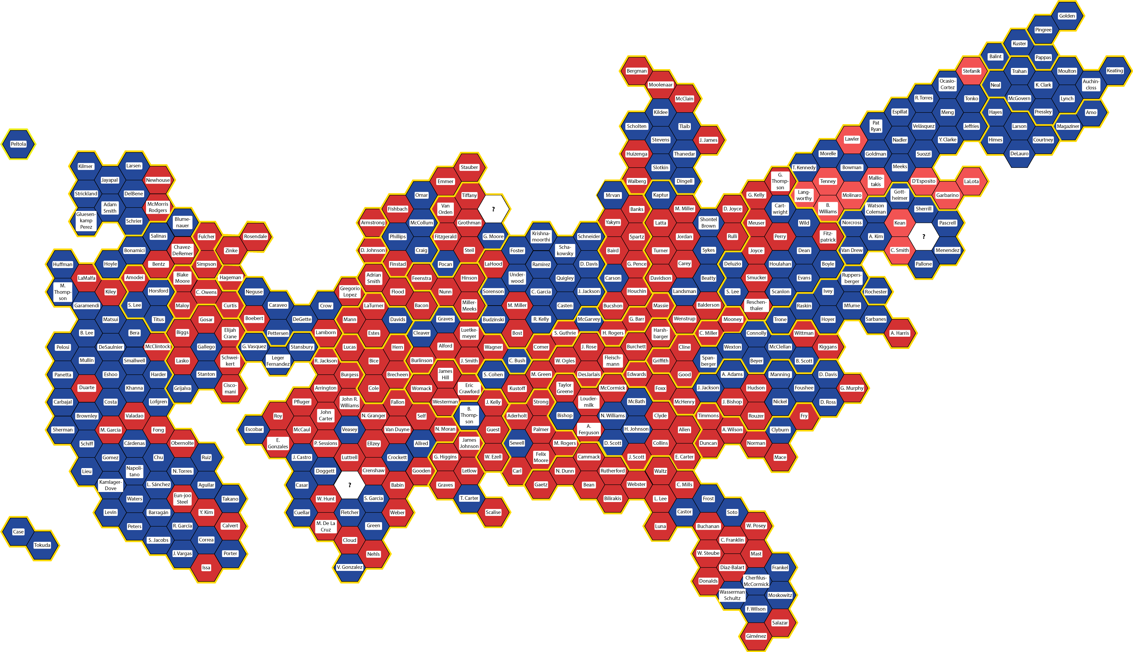
During the wild ride that was the 2020 election, I created a new way of visualizing election maps. I started by making a new electoral vote map to replace the one that gets shoved in our faces every four years, but it quickly became clear that my new style of map would be just as useful for showing the legislative branch.
Instead of showing a traditional map that massively distorts the apparent legislative power of large-area states and large-area congressional districts, I made each seat the same size. And because many House districts have completely ridiculous shapes, I displayed each district as the same shape – a hexagon, for easiest tessellation.
The result is two maps – one for the U.S. Senate and one for the U.S. House of Representatives – that show the distribution of political power in the U.S. legislature as it really is. From there, it’s easy to add the names and political parties of each representative to give a comprehensive picture of the legislature.
So how does it look now?
Take a look at the maps below, one for the Senate and one for the House of Representatives. Congresspeople are shown by name in the approximate location of the state they represent, color coded by party. Red means Republican, blue means Democratic, and light blue means Independent Senators who have joined the Democratic Caucus.
First the Senate:
and now the House:
What will these maps look like after the election on November 5th? Stay tuned!