Sarajevo, 1984. The Winter Olympics. The glamour event, as always, is the women’s individual figure skating competition. One of the gold medal favorites was Rosalynn Sumners of the United States. As they often do, American TV network ABC airs a profile of her. And here, in part, is what they said about her – and what she said about herself:
Is it any wonder that so many figure skaters and gymnasts at the time ended up with eating disorders?
I don’t blame Sumners, who won the silver medal at the event and went on to a successful career as a skating coach. I blame society’s expectations of young women at the time.
These weight-focused profiles are a thing of the past today. There is no question that the situation for young women in 2026 is better than it was in 1984. But how much better is it, really?
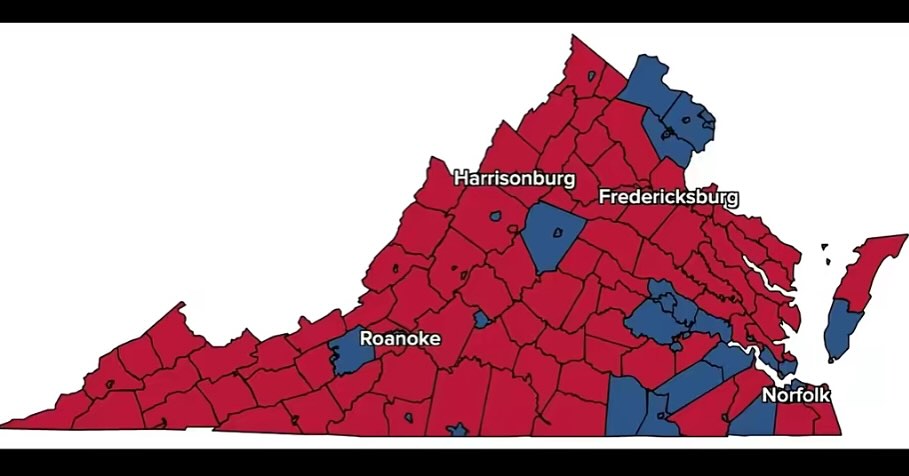
The map shows Virginia’s 95 counties and 38 independent cities. Red represents Republican candidate Winsome Earle-Sears and blue represents Democratic candidate Abigail Spanberger. Sure, this map gives the visual impression that Virginia wanted a Republican governor. But remember: Land doesn’t vote, people vote.
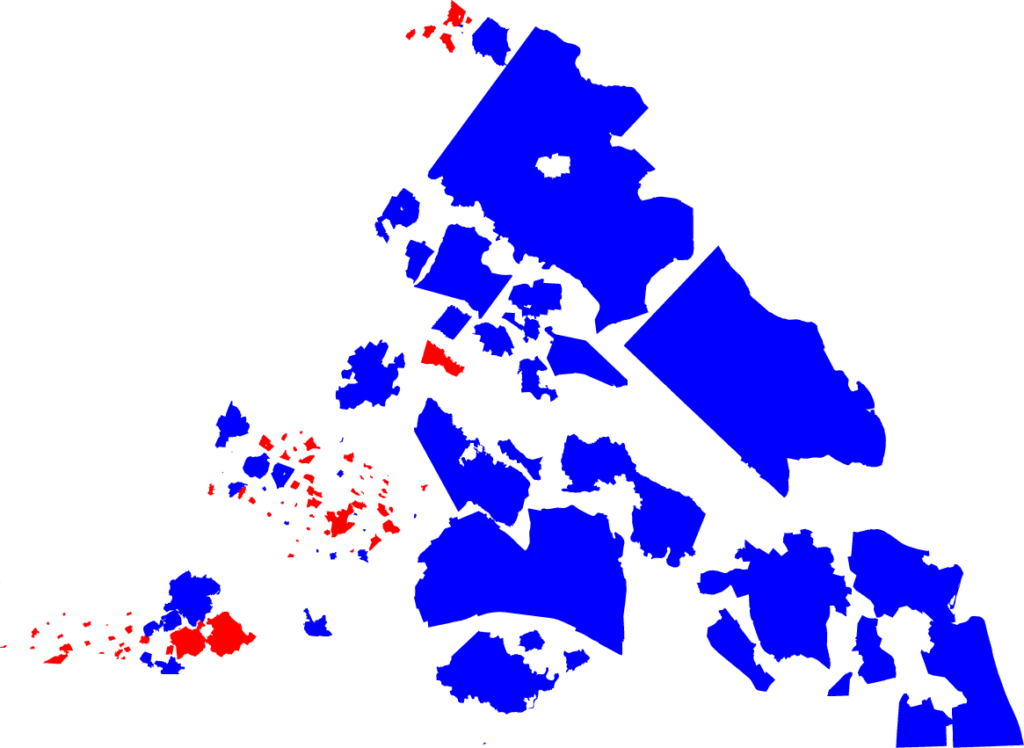
What would happen if you followed the “people vote” principle and scaled the map so that the area of each county was not determined by its land area, but by the number of people who voted? Here is what the map looks like:
This kind of map, where size is determined not by real-life size but by population or some other variable, is called a “cartogram.” It is a much fairer representation of what voters want for the Governor of Virginia.
It’s not perfect – remember that counties don’t vote, people vote. The map is all-or-nothing, ignoring all votes for Earle-Sears in blue counties and all votes for Spanberger in red counties. Elections are all or nothing, but they are all or nothing at the state level, not the county level. A better representation would show counties in shades of purple corresponding to the percent vote for either candidate. And I might make that map someday. (Also, the counties are not in their true positions – I just moved them around in an effort to make the graph look roughly like Virginia.)
But this map gives a clear answer to the question “Did Virginia voters want to elect a Democratic governor?” And the answer is Hell Yes.
How did I do it? See the code I ran to generate the map. The code outputs an .svg file. The file has many counties overlapping, so I used Adobe Illustrator to move the counties around until they were all visible.
Want to do it yourself? Create an account on SciServer, the science platform that allows you to upload, analyze, and visualize data in a web browser (and which is my day job). Email me your username and I’ll help you access the data. You can get the code from my election cartograms GitHub repository.
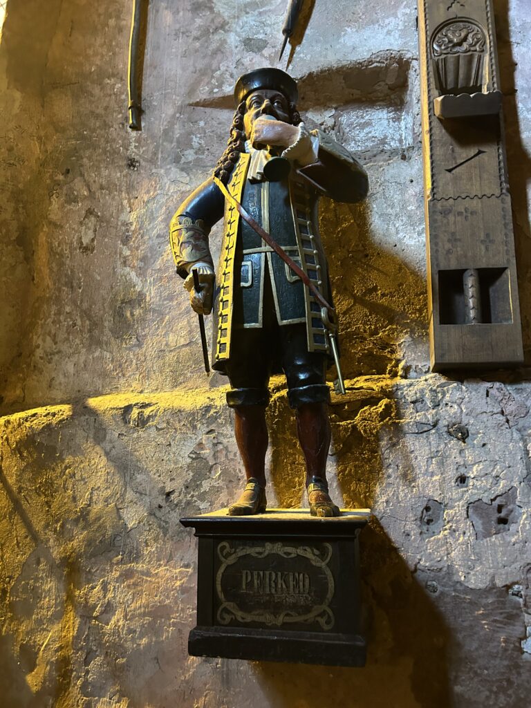
I’m fascinated by stories of weird folk heroes, and here’s a good one! Who is the person commemorated in the photo below?
In 1718, Count Charles III Phillip of Heidelberg visited the city of Salurn in the Principality of Tyrol, in what is now northern Italy. There he met a button maker named Giovanni Clementi. Clementi was a dwarf (what today might be called a little person), at a time when hiring dwarves as court jesters was big business. And he knew a business opportunity when he saw one: court jestering pays much better than button making. So when Charles invited him to come to Heidelberg, Clementi said yes.
Charles had another job in mind: Heidelberg Castle held the world’s largest wine barrel – the largest then, and the largest still today, 300 years later. Photo below, taken by me on a visit to Heidelberg. Charles gave Clementi the key to the barrel – and with it, a new identity.
The world’s largest wine barrel, at Heidelberg Castle (moose for scale)
The sight of a dwarf three feet high holding the keys to a wine barrel thirty feet high was wildly entertaining to people all over the city and surrounding lands. Clementi loved the fame, and loved the wine. When someone asked him if he wanted a glass of wine, he would respond in Italian, “perché no?,” meaning “why not?” The citizens of Heidelberg heard is as “Perkeo,” and a nickname was born. Italian button maker Giovanni Clementi became German court jester Perkeo, and a legend was born.
Perkeo stayed in Heidelberg the rest of his life, developing a reputation for his love of wine. On his deathbed, he asked for a glass of wine. A servant brought a glass of water instead. Perkeo took a sip and immediately died.
Unless you’re a penguin living on a deserted island, you’ve probably heard that Americans are now paying an extra 10 percent on goods imported from penguins living on deserted islands. And you probably have some questions.
1. Where are these deserted islands?
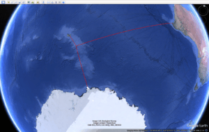
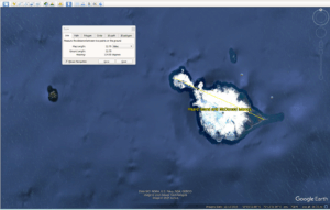
The import taxes (misleadingly called “tariffs”) apply to goods and services imported from the Heard and McDonald Islands, a small group remote islands owned by Australia in the southern Indian Ocean. The islands are 300 miles south-southwest of the nearest land (the Kerguelen Islands), 1000 miles north (lol) of Antarctica, and 2500 miles south-southeast of Antarctica.
The largest island by far is Heard Island, 22 miles across. It was discovered in 1853 by the American sailing ship Oriental, captained by John Heard. Today it is claimed by Australia and has a human population of zero – not even a research station. But it is home to millions of penguins, of four different species: king, gentoo, macaroni, and eastern rockhopper. The island is an important breeding ground for all four species, and for many other species of seabirds – some of which fly thousands of miles across the ocean to meet other single birds.
Heard Island is 23 miles across at its widest point
2. What does the USA import from Heard and McDonald Islands?
Nothing. There are no people there.
3. So why is the USA imposing import taxes on islands with no people?
Because of the method that the White House uses to calculate the import taxes. All countries start with a base tax rate of 10 percent, modified by the equation
Δðœ = (x – m) / (ε * Ï• * m)
The term is calculated for each country with the following terms: x is the total value of all from that country and m is the total imports. The ε and ϕ are economic metrics that hilariously turn out not to matter at all: they assumed ε = 4 and ϕ = 1/4, so the two cancel out and the equation becomes:
Δðœ = (x – m) / m
All those Greek letters sure make the math look fancy, though!
Because no goods are imported from or exported to Heard and McDonald Islands, all those terms are zero and the equation is meaningless. So a stupid equation becomes even stupider, no modifications to the base rate are made, and the import tax on goods from Heard and McDonald Islands stays at 10 percent. So now, if a penguin sells you $10 worth of fish, you’ll pay $11 for it.
4. But why include deserted islands in the calculation at all?
The full list of import taxes by “country” is given in this BBC article. What the list reveals – and the reason “country” is in quotes there – is that the “countries” are not actually countries. They are top-level Internet domains. The Internet Corporation for Assigned Names and Numbers (ICANN) assigns two-letter domain extensions to each country: .fr is France, .de is Germany, and so on. Heard and McDonald Islands have the extension .hm, so they get charged an import tax. Kerguelen Island – despite being much larger and regularly visited by scientists – does not have an top-level Internet domain, so they didn’t make the list. It’s also why goods imported from la Reunion are taxes at a different rate (37%) than goods imported from France (10%), even though la Reunion is just as much a part of France as Hawaii is part of the USA.
What does this mean? It means that whoever wrote the Trump administration import tax policy doesn’t know what a country is – they only know countries by their top-level Internet domains.
5. Who doesn’t know what a country is?
Artificial intelligence doesn’t know who a country is. I have no proof one way or the other, but it sure sounds like the administration asked an AI model to design its trade policy.
I clicked the wrong button in Amazon and accidentally rented The Wild Robot. Real-time watch reaccs ahoy!
Wild Robot 1/n: This movie is 95% “robot survives this”
Wild Robot 2/n: Look, it‘s Nick Wild from Zootopia!
Wild Robot 3/n: WHY IS THIS HAN SOLO FOX NOT PLAYED BY ALAN TUDYK?!?!
Wild Robot 4/n: I love it, but the pace is all wrong. When Brightbill finds out the truth, it’s supposed to feel like a betrayal, but we haven’t seen them together enough to feel earned
Wild Robot 5/n: There is no need for both Ving Rhames and Bill Nighy. We only need one flight instructor character.
Wild Robot 6/n: Wait, the goose flew away with 40 minutes left? Wasn’t that the plot?
Wild Robot 7/n: And then all the animals in the cave starved to death happily ever after
Wild Robot 8/n: Now the other robots are coming for her? This is like three different movies in 90 minutes.
Wild Robot 9/n: Literally brought back to life by TEH POWER OF LOVE!
Wild Robot 10/n: HORIZONS REFERENCE! YES!
Wild Robot 11/n: OMG THAT LAST 15 SECONDS
…brb still crying…
That emotionally pays off everything
Worth the accidentally paying $3.99 for that one moment.