Get ON with it (Daily COVID-19 data update CCCXV)

Graphs day 315, pandemic day 322, day 392 since the first cases were diagnosed.

Between The Most Important Election Of Our Lifetimes (TM), the holidays, and preparing for my first-ever virtual American Astronomical Society meeting, it’s been months since I’ve kept my promise to create daily graphs of the global COVID-19 pandemic.

COVID-19 has been busy, and the resulting graphs are almost unbearably sad.

Total cases of COVID-19 diagnosed worldwide: 99,725,495

Total deaths: 2,140,073

There is no silver lining here, I might as well just show you the numbers. In the immortal words of Stringer Bell:

Let’s again take a look at how some different countries are handling the COVID-19 pandemic. As a reminder, graphs show the history of the pandemic from late January 2020 to today – just about exactly one year. Countries are color-coded and labeled by name. The thickness of the lines and the sizes of the labels correspond to the case fatality rate in the country – thicker lines and larger labels indicate countries where a larger percentage of COVID-19 cases have led to death. Click on any of the images for a larger version.

Countries that have consistently gotten it right

These countries have consistently kept their per-capita cases of COVID-19 at very low levels.

Countries where COVID-19 was stayed mostly contained throughout the pandemic

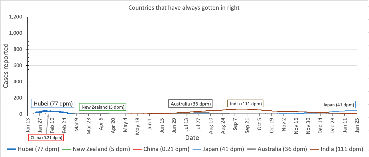
Last summer, we were worried about a wave of new cases in Australia, but looking back on it, per capita cases in Australia are barely even visible on this graph. Joining them on this graph are India (happy Republic Day BTW, enjoy your republic while it lasts!), New Zealand, Japan – and China, even Hubei province where the whole pandemic began.

What do these countries have in common?

You already know the answer to that, even if you like to pretend that you don’t.

Countries where COVID-19 is currently under control(-ish)

Countries where COVID-19 was bad but are now sort of under-control-ish

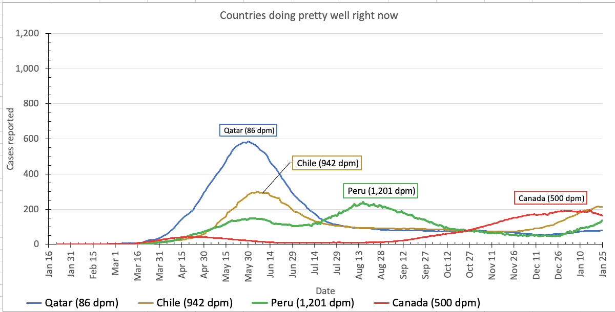
Last spring and summer we were watching things get bad in Qatar, Chile, and Peru, but they all appear to be doing OK right now – although cases are ticking back up in Chile and Peru. Cases were increasing in Canada but they are now decreasing again.

Countries moving in the right direction(-ish)

Regions where cases are still high but

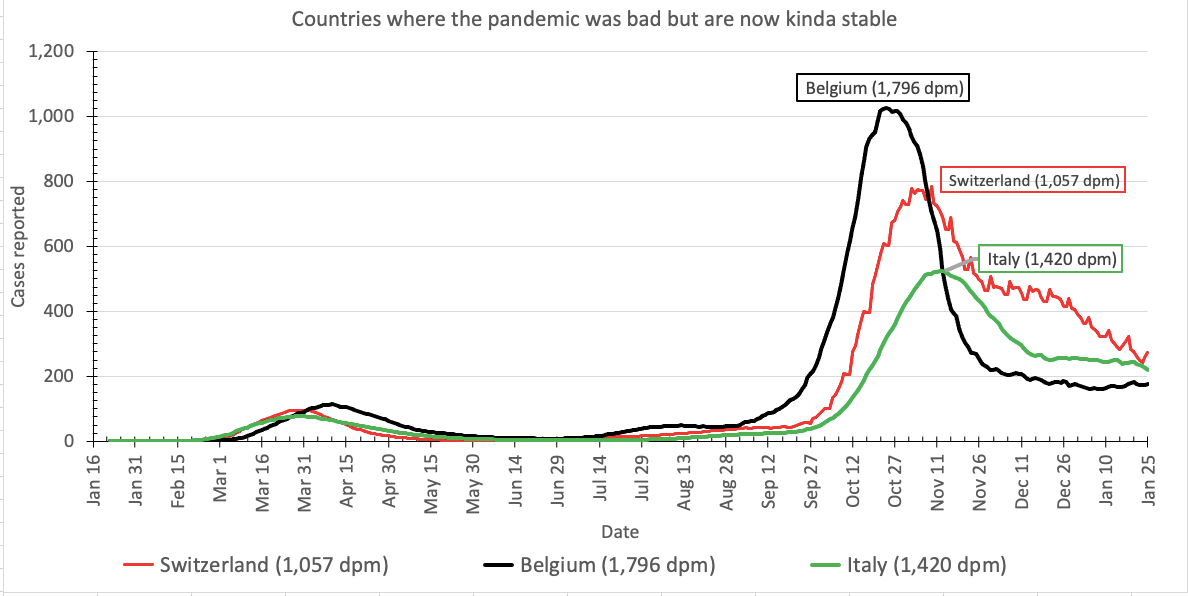
While we were away, the pandemic got very, very bad in Europe, particularly Belgium. Fortunately, cases are headed down, but they are still far higher than they should be.

Countries where the pandemic is still awful

Lastly, the countries where the pandemic is still infecting and killing lots and lots of people: the United States, Spain, the United Kingdom, Sweden, France, and Brazil.

Regions experiencing a second wave of cases

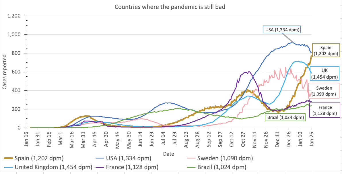
Fortunately, cases are decreasing everywhere except Spain.

I’ll be here again tomorrow. I’ve promised to keep doing this until the pandemic ends. I hope the pandemic ends.

Methods

Sadly, Corona Data Scraper has stopped reporting data in the way I was using it, so I have gone back to using the data from the JHU Coronavirus Resource Center. You can download the data from their GitHub repository. You are welcome to use my Excel spreadsheet (version 9.2).

Guest Post: Giving Thanks for Data Science

Photo of former Dallas Cowboys head coach Tom Landry in his trademark gray felt hat
Not actually Aaron

Guest Post!
One of the joys of being alive is having smart, curious friends to talk with – or to write guest posts for your blog. I’d love to see more of these, especially from friends with perspectives and opinions different from my own – email me your ideas!

Today it’s awesome friend Aaron Price, who is also the Director of Research and Evaluation at the Museum of Science and Industry in Chicago.

Aaron talks about an important question in today’s age of COVID-19: are people actually following the CDC’s advice to avoid large holiday gatherings?

Because I’m a nerd who works in data for a living, I wanted to see what evidence we have for people staying home this Thanksgiving.

In a widely reported prediction, AAA forecasted a 50% drop in air travel but only a 10% drop in overall travel. But, of course, we have to remember it’s the AMERICAN AUTOMOBILE Association that is saying that AMERICANS are robustly driving AUTOMOBILES this holiday. They don’t cite the source for their forecast, other than to say it was based on mid-October “models.” Even if those unexplained “models” are reliable, they still don’t include the impact of the last six weeks of the fall COVID-19 surge – or the whole prediction could be just a bunch of marketers throwing darts at a board.

Anyway, I looked at Google Trends for the word “traffic” a few days before the 2019 Thanksgiving vs. the last few days. Days on which more people search for the word “traffic” presumably are days on which more people are driving their cars. I graphed the results on the same relative y-axis scale, to place them on the same zeropoint – the vertical axis goes from zero percent (the number of Google searches for “traffic” on the day in which the fewest people searched for “traffic”) to 100 percent (the number the day the most people searched for “traffic.”). The graph is below.

Google searches for the word “traffic,” relative to the number of searches on December 1, 2019

The graph does indeed show an almost 50% drop year-over-year.

In the same article, AAA predicts the peak travel time to be the afternoon of the day before Thanksgiving. This is supported by last year’s Google Trends search data, which shows that searches for the word “traffic” did indeed peak on the day before Thanksgiving, which in 2019 came on Wednesday, November 27th.

Relative searches for the word “traffic” in the days before Thanksgiving 2019

Indeed, looking at the traffic over the days leading up to Thanksgiving 2019 does indeed show a jump of about 50% from Tuesday to Wednesday. We could look at the same trends in 2020 – except that at the moment, Google’s data only goes to up to 1 AM ET on Wednesday November 25th. So we’ll have to wait until at least tonight to see how many people searched for “traffic” yesterday (Wednesday). I’ll post an update here later for those of you on the edge of your seats.

I also checked Google Trends for recent searches for “turkey recipe,” with the assumption that in 2020, fewer large group gatherings will mean less turkey being cooked, because people don’t want to cook a turkey for a smaller group – although this could be debated, since four families staying home instead of going to grandma’s could mean four dead turkeys instead of one). The graph below shows the number of Google searches within the U.S. for “turkey recipe” from just before Thanksgiving 2019 to just before Thanksgiving 2020.

Google searches for “turkey recipe” by day, using a relative scale from zero to 100

Indeed, Google Trends shows that turkey recipe searches are down 25% over this time last year. Interestingly, the graph below shows U.S.-based Google searches for “honeybaked ham,” again between just before Thanksgiving 2019 and just before Thanksgiving 2020, again on a relative scale.

Searches for “honeybaked ham” from Thanksgiving 2019 to Thanksgiving 2020 on a relative scale

Searches for “honeybaked ham” are up almost exactly 25% over last year! Does this mean people prefer ham with smaller gatherings? Or that, when no one is looking, we all actually prefer ham over turkey? Count me in that group.

I also looked at searches for “flight status,” and those searches are down about 75% over this time last year.

My prediction

How will these trends hold up over the next few days? And – more importantly – what impact will this week end up having on COVID-19 cases in the U.S. over the coming weeks?

My prediction: overall, automobile travel will be down about 25% over last year and flights down about 50-75% over last year. So, about a third of our country is planning to do less for Thanksgiving than they would typically do. Which would make sense given our political makeup. About 1/3 are very liberal and take COVID-19 super seriously. About 1/3 are very conservative and believe it’s all fake. And 1/3 believe it is real and are concerned enough to make small to medium changes in lifestyle, but not enough to make major changes in lifestyle such as skipping a traditional Thanksgiving gathering.

Thus, we should see a surge in cases starting around December 6th. If I’m right, it may start out at about a 30% jump over this week’s pre-Thanksgiving rates… before the increase goes exponential.