Day twelve of me graphing data, day eighteen of the pandemic (as declared by the World Health Organization), day eighty-nine since the first cases were reported in Wuhan. Worldwide as of 5:30 AM ET this morning, more than 650,000 people have been diagnosed with COVID-19, and more than 30,000 have died. For comparison, that is nearly 10 times the number that died in the 9/11 terrorist attacks.
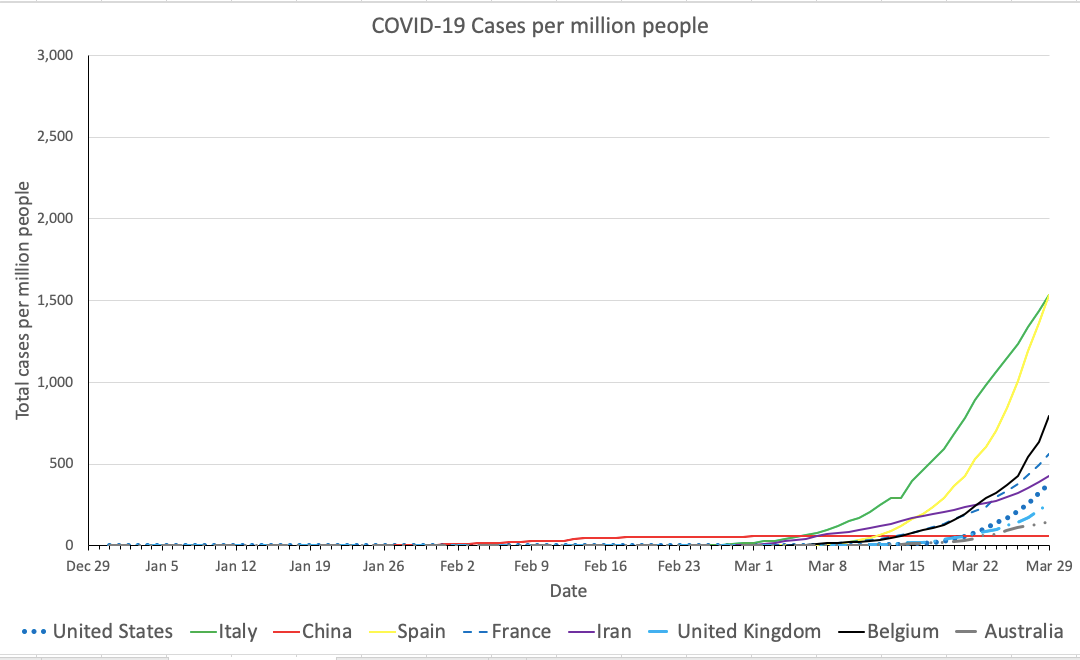
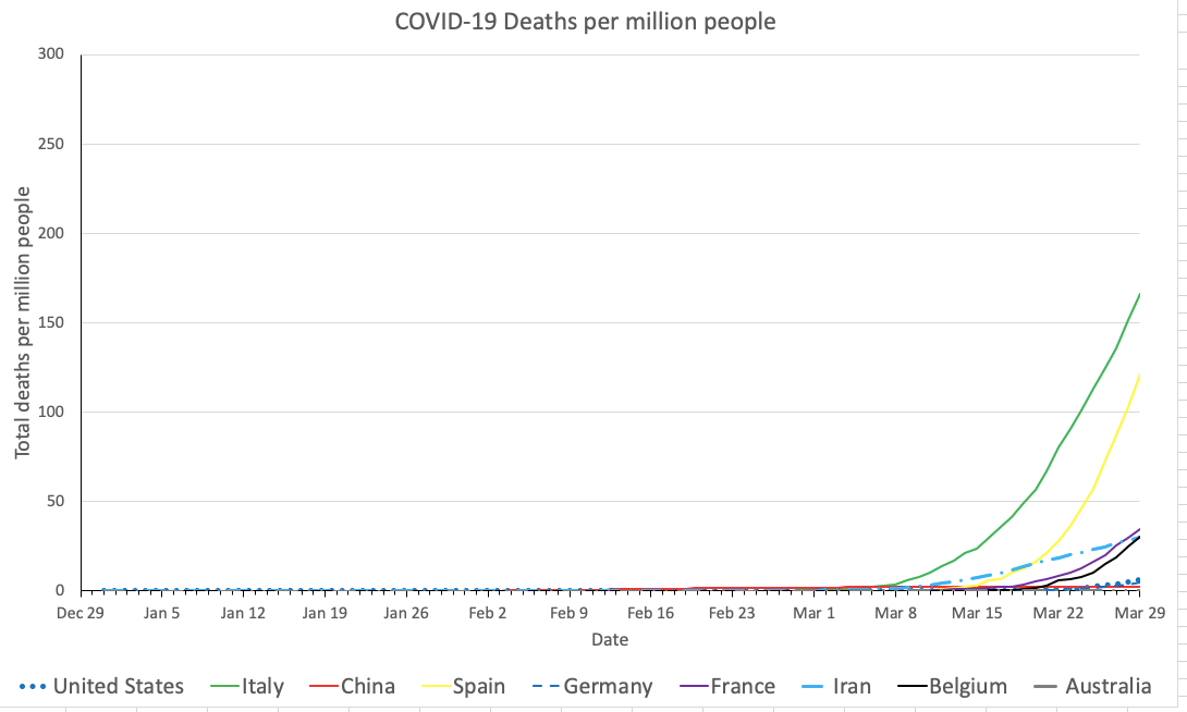
I am continuing to track the number of cases and deaths in China, the United States, Iran, Italy, Spain, France, Belgium, the United Kingdom, and Australia. As always, the graphs below show cases and deaths per million people in each country.
I have redone the graphs, so they are not directly comparable with the ones I’ve made before, but they show the same countries with the same lines. I also set the horizontal axis (date) to always show the current date on the far right, so that you can tell by just looking at the graph what day it comes from.
Hopefully the graphs are more readable today as well. Click on them to open a larger version in a new tab. Suggestions welcome!
Cases per million people
Countries are shown on the same color scale as before, but I have rescaled the graph. The highest case rate in the world is Italy’s at 1,535 per million (80,539 cases in about 60,000,000 Italians).
The vertical axis scale (cases per million people) in my graph now extends to 3,000, so there is now some room for the graph to grow into. But since the doubling time of cases is about 3 days, this room is likely to only last about 3 days, and then I’ll have to rescale again.

That’s what doubling time means – in three days, as many people will have caught COVID-19 as have ever caught it since it began at the seafood market in Wuhan.
Looking at patterns in individual countries, the number of reported cases in Spain continues to grow at a frightening rate. The cases per million people in Spain has not quite passed the cases per million in Italy (which was my prediction yesterday), but it’s damn close, and Spain will certainly take over the top spot tomorrow. The rate seems to have slowed down in Australia, but the same caveats apply.
It looks like the rate has started to increase again in Iran, but that could be due to better testing and reporting, and it could be random chance. Let’s keep a close eye in Iran over the next few days.
Deaths per million people
Sigh, I rescaled the graph yet again, and I hope the new rescaling will last three days before I have to do it yet again (remember, three day doubling time, and it might be even faster). The death rate is now 166 per million in Italy and 121 per million in Spain.

Per capita death rate has some lag behind per capita case rate – the time it takes patients to get sick and die.
My goal in doing this it to help you realize that you can make these kinds of graphs yourself. Links that will help you do that are in the postscript.
I’ll leave you with a question:
What important graph have I not yet shown you?
I’ll answer this, and show you the graph, later today.
Postscript: Data Resources
You can find the data from the European Centers for Disease Control’s Coronavirus Source Data site (download the CSV file from the “Full dataset” link).
I have revised my Excel template make the graphs above, plus the secret one I’m working on. It should also be easier to add new data each day, although it still takes several manual steps. Here is the new template.
Update tomorrow, and every day until this pandemic is over.