Graphs day 147, pandemic day 154, day 224 since the first cases were diagnosed. Remember that Very Exciting New Idea that I was talking about last week? Here it is!
I’m going to skip the overall global numbers for today, because I want to make sure I understand what I’m presenting to you. I’m going the other way today – looking at numbers at an unprecedentedly local scale.
To enable this more focused look, I’ve changed data sources. I’m now using data provided by the Corona Data Scraper global citizen science collaboration. It’s not their data, of course, it’s our data – data reported by hundreds of national, state, and local health departments. The Corona Data Scraper simply crawls the Internet and downloads the latest data from each of these hundreds of local sources.
If you don’t believe the U.S. Centers for Disease Control (CDC) or the World Health Organization (WHO) – first of all, why? That’s like wanting to see a basketball game but refusing to watch anything from the NBA, the NCAA, the Olympics, high schools, Eurobasket, or the Chinese Basketball Association. But if you’re determined to not believe the experts, you no longer have to! All the numbers come from local sources all over the world.
This kind of distributed data collection is simple, but it’s not easy. Volunteers all over the world have spent countless hours writing software and communicating with health departments and other volunteers. And it hasn’t been easy on my end either. I’ve spent probably 35 hours the past two weeks – including almost all day on both Saturday and Sunday – turning Corona Data Scraper reports into an Excel spreadsheet. A four-sheet, 900,000+ line, 64 MB Excel spreadsheet.
And it’s all worth it to show you this graph.
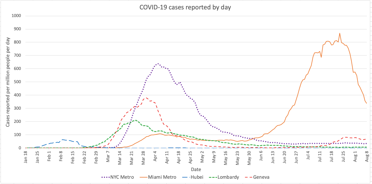
It’s a much simpler version of the graphs that I’ve been showing you – the lines are about equal thickness and there are no data labels; instead I use different styles of dashed lines along with color to show you which regions are which.
The difference? Instead of showing the case rate for the entire countries of the U.S., China, Italy, and Switzerland, I show you the case rates only for specific, hard-hit areas of those countries. In the U.S.: the metropolitan areas of New York City (purple dotted line) and Miami (orange solid line). In China: the province of Hubei (blue long dash), whose capital is the infamous Wuhan. In Italy: the region of Lombardy, home of the Milan metropolitan area, the largest in Italy. In Switzerland, the canton of Geneva.
I’m damn proud of this.
And this shows just one basic answer to one of the incredible variety and depth of questions that the Corona Data Scraper dataset can help us understand together.
Much, much, much more to come.
Want to give it a try yourself? You can get all the data from the Timeseries CSV link of the Corona Data Scraper website. Let me clean up my spreadsheet and share it as version 8 tomorrow.
Pandemic updates tomorrow, and roughly every day after that until the pandemic ends or I do.