Graphs day 148, pandemic day 155, day 225 since the first cases were diagnosed. And we’ve hit another milestone.
Total cases of COVID-19 diagnosed worldwide: 20,097,141
Total deaths: 748,616

Today, let’s take a look in detail at another country: Australia.
The epidemic in Australia has come in two waves. The first wave began in late February and peaked in late March. The second wave began in June and seems to be slowing a bit, but not even close to enough that we can declare it passed. But looking in more detail reveals a difference between the two waves; see the graph below. The first wave had cases all over Australia, while the second wave has been almost completely confined to one state: Victoria.
Australia consists of six states and three territories – yes, they’re called states rather than provinces. And like any county of states, there is plenty of good-natured trash talking among the states, and lately the other five states have had enormous fun at Victoria’s expense.
And while Victoria is the hot zone of Australia, let’s keep it in perspective. Victoria has about the same population as the U.S. state of Maryland. So as a comparison, I added Maryland to the graph, along with the usual comparison of Hubei Province in China.
The graph is below. We’re back to the usual format with labels, format explained below.
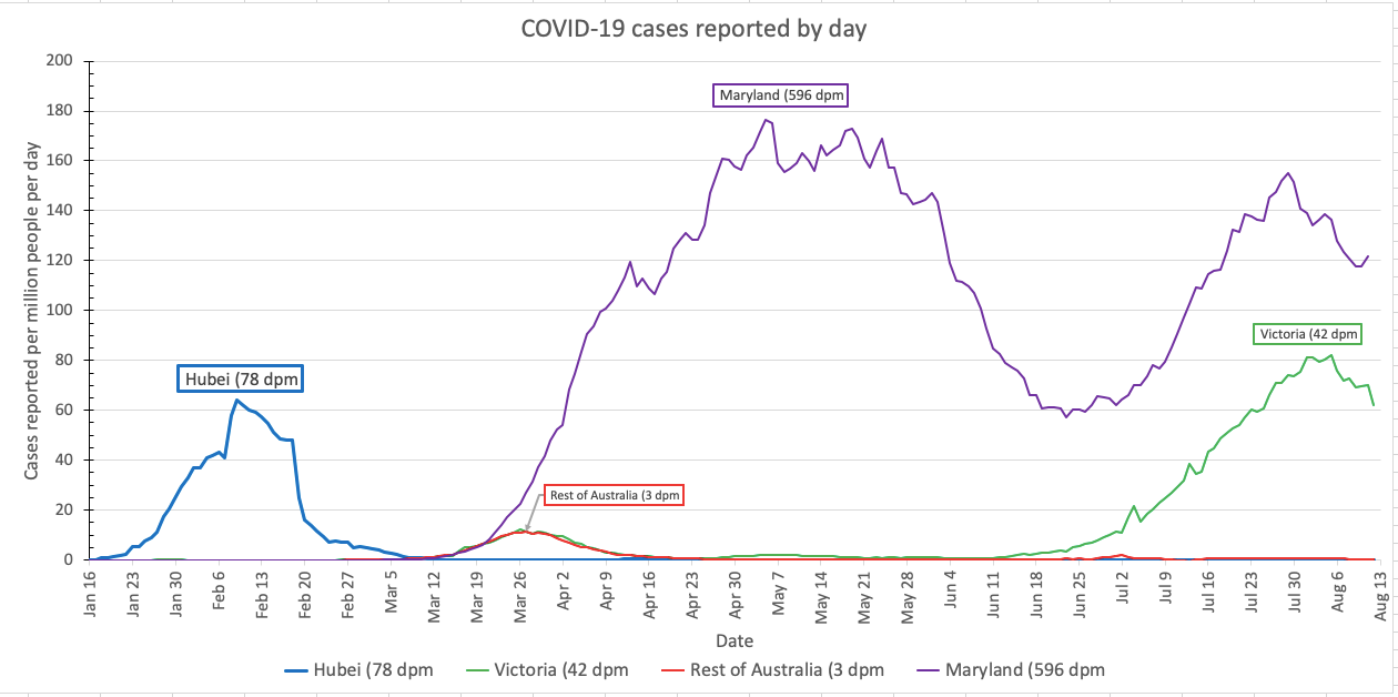
The main graph is on the traditional regular scale, from zero to 200 new cases diagnosed per day per million people. Each region gets a unique color in each graph: Hubei is blue, Victoria is green, the rest of Australia is red, and Maryland is purple. Line labels show the name of the region, and also the mortality rate (cumulative deaths per million people) in the region – cumulative because the dead stay dead. The thickness of the lines and the size of the labels depend on the cumulative case fatality rate – the number of people who died divided by the number diagnosed.
Victoria has had it far worse than the rest of Australia, but similarly-sized Maryland has had it even worse than that.
Want to give it a try? Please do! Here is my new spreadsheet (version 8), although God help you until I document it better. The good news is that you should only need to change the worksheet called Graphs, and only refer to the sheet called Daily to get the codes for each country. Also be warned, it’s so big that it calculates sloooooooooooooooowly. You will probably want to go to Settings -> Calculation and change Calculation Options to Manual. Then the spreadsheet will only calculate its updated numbers when you tell it to, by pressing F5 on Windows or Shift-Enter on Mac.
Pandemic updates tomorrow, and every day until the pandemic ends or I do.