
Graphs day 181, pandemic day 188, day 258 since the first cases were diagnosed.
I took some time off to work on some other projects, including a very cool study of federal banking data with my JHU colleague and friend Mac McComas (you’ve heard from him here before). What’s the biggest factor in who gets loans in Baltimore City and who does not? Spoiler alert: it’s race.
But the virus never takes a day off, and since I made my last graph, another nearly 7 million people have been diagnosed with COVID-19, and more than 120,000 have died. We are rapidly closing on one million deaths. Not bad for a virus that we are pretty sure had not infected even a single human one year ago.
Total cases of COVID-19 diagnosed worldwide: 28,524,156
Total deaths: 902,224
I’m once again using data from the amazing online volunteer effort that is the Corona Data Scraper project. I explained how the project works in more detail in a previous post, but in short a worldwide team of volunteers has written a complex set of Javascript programs to automatically retrieve and process data from thousands of individual sources, primarily national, state, and local health departments. In other words, please don’t tell me it’s a conspiracy. It literally can’t be. At no point was all the data in the hands of any person or entity until it shows up on their website and I paste it into my template. And don’t tell me I’m the conspiracy – I have always been entirely transparent about what I do here, and I always will be, even though it costs me significant time and effort and even a little bit of money. As always, you can download the template at the bottom of this post and see for yourself.
It took me literally most of the day to get the data cleaned and into my template, so I don’t have any new graphs to show you today. But here is an updated version of one I posted recently, showing COVID-19 case rates in various metro areas in Florida. Usual graph styles apply.
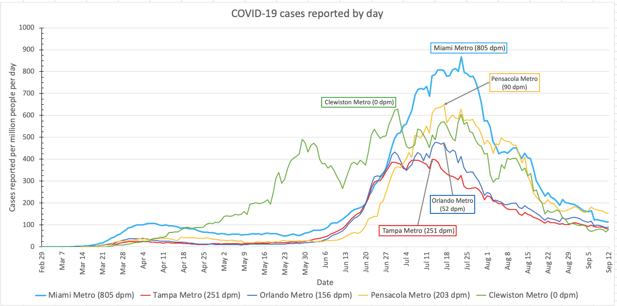
There is definitely cause for cautious optimism from this graph, but with two caveats. First, the case rate is still ahead of where it was during the first peak of the Florida epidemic in late March. Second, schools are a savage vector for virus transmission, and schools in many parts of Florida have been open for a little more than two weeks. So if there is going to be a third wave of infection that results, we should start seeing it riiiiiiiiiight about now. Let’s hope we don’t.
I obviously haven’t been living up to my initial plan to post an update every day of the pandemic, but why not start now? Another update tomorrow.
Want to give these graphs a try? Please do! Here, for the first time, is version 8 of my template. Beware, it’s big, it will take several minutes per calculation. Be sure you have Excel set to manual calculations.
Pandemic updates tomorrow. And probably not literally every day until the pandemic ends? But the virus is tenacious, and so am I.