
Today’s post has the same general idea as yesterday’s post – how can we begin to understand the scale of the tragedy that is the Taliban taking over Afghanistan?
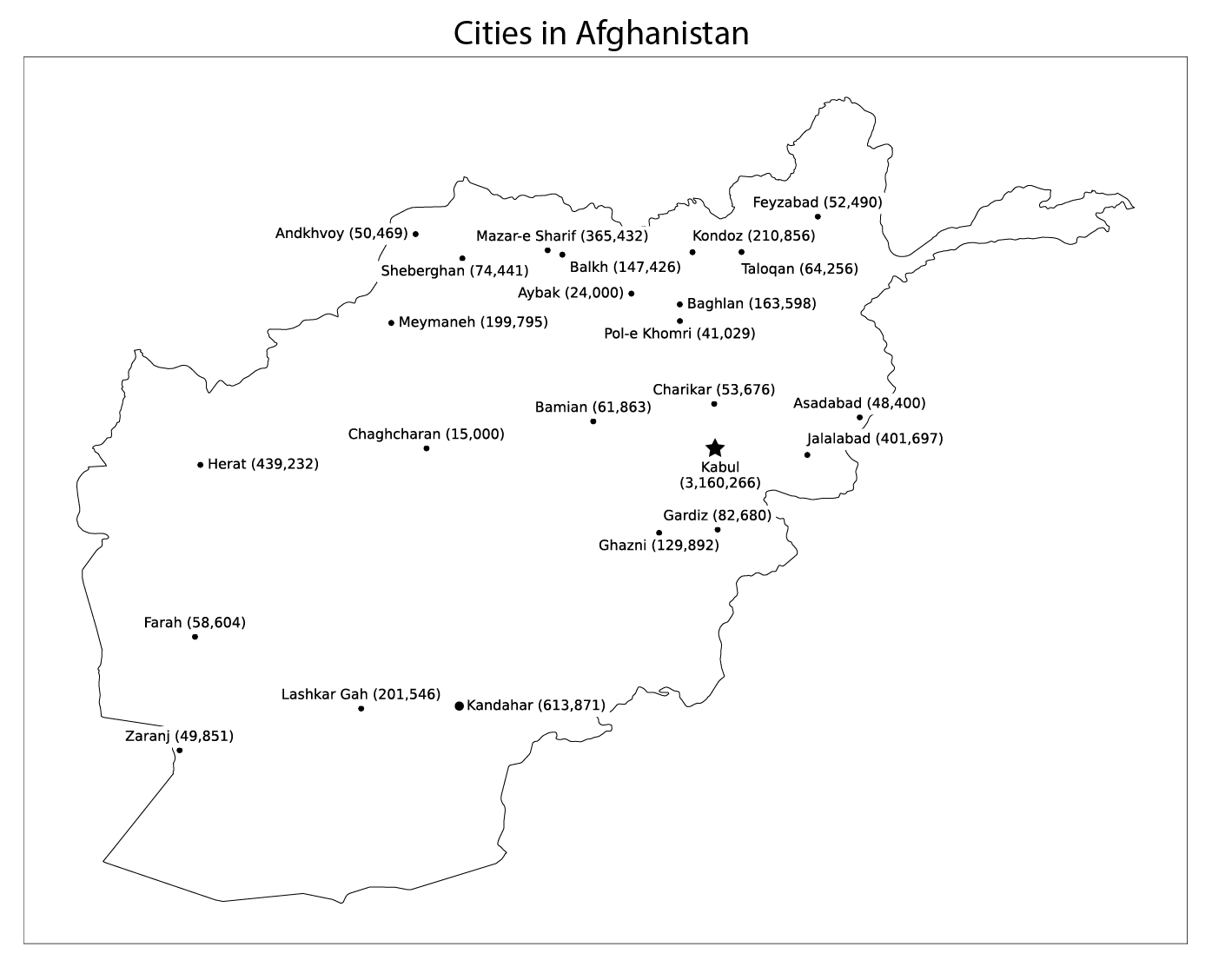
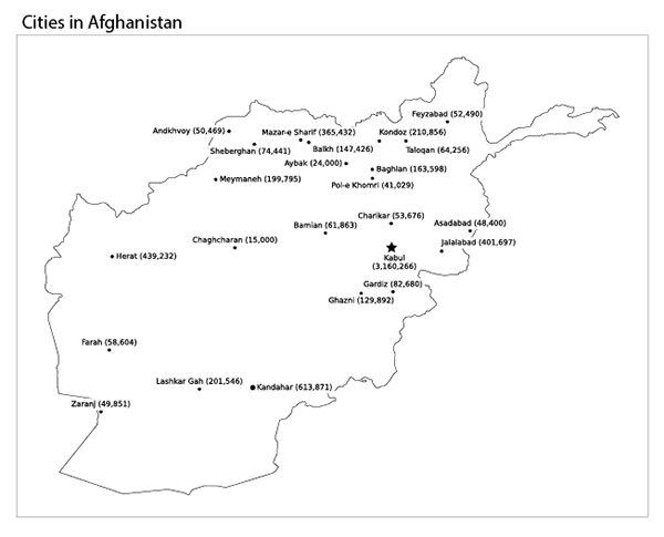
It can be difficult, because Afghanistan feels so far away and so mysterious. So I make a simple map of the cities in Afghanistan and their populations, supplemented by another map labeling each city with the name of a city with roughly the same population.
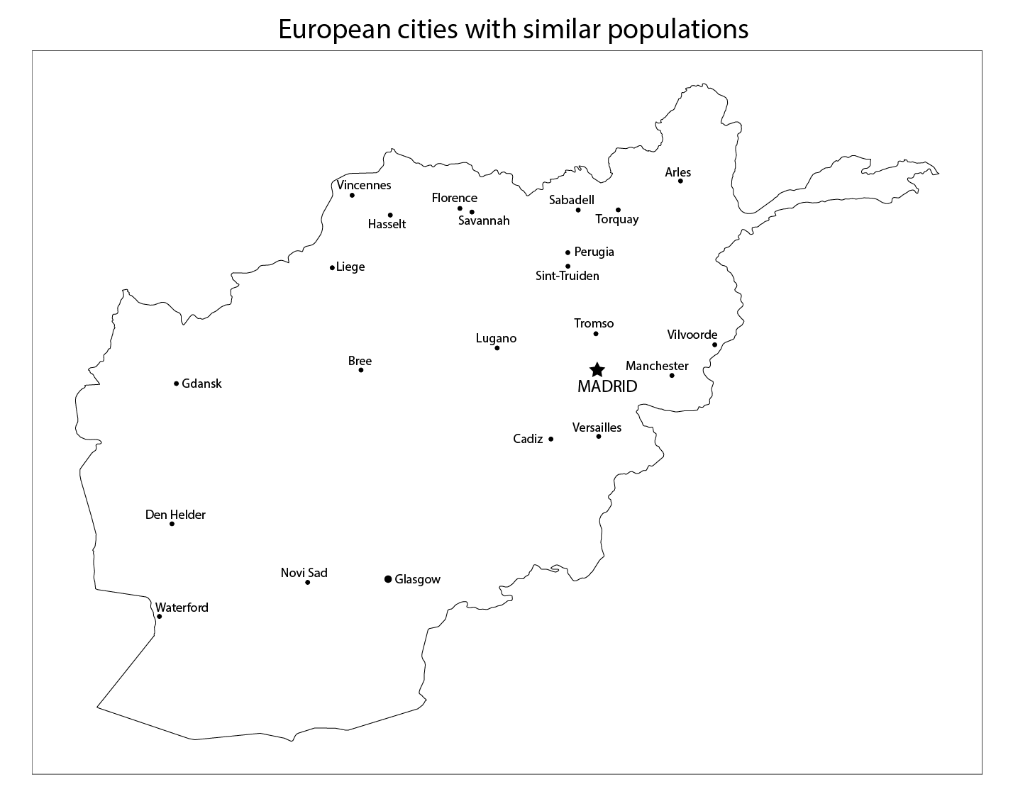
Yesterday, I chose those equivalent-population city labels from cities in the United States; today, I am labeling Afghan cities with the names of cities in Europe with similar populations. See the footnote at the end of this post to learn how I did it, and how you can make a similar map of your own.
Here it is, my map of Afghanistan, with major cities and their populations (click on the image for a larger version):
And here is the same map, but with Afghan cities relabled with cities in Europe with similar populations. As you can see, there are some very big cities in Afghanistan.
To see it even more clearly, look at the two maps side-by-side. Move the slider in the middle back and forth to switch between the cities in Afghanistan (and their populations), and their European equivalents.
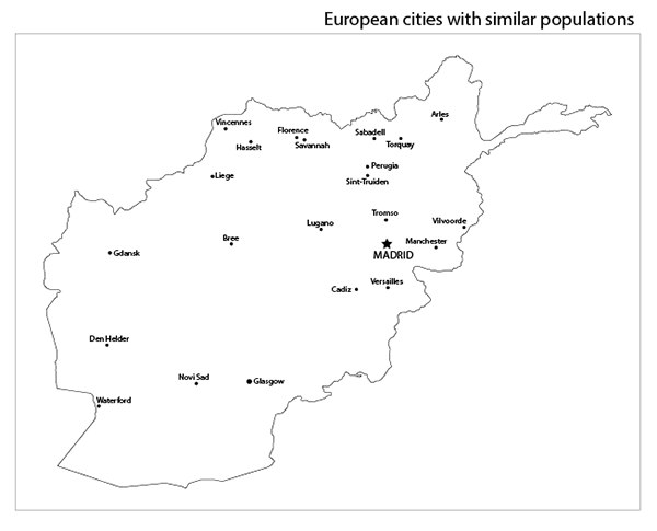
Imagine that you live in one of these European cities – a big one like Madrid or Manchester, or a smaller one like Waterford, Ireland or Sint-Truiden, Belgium.
Now imagine that your city has been taken over by the Taliban.
Footnote: how to show cities on a map of Afghanistan
To help us (including me) learn about what Afghanistan is really like, I used the Natural Earth 1:10m geography dataset to make a Python notebook in SciServer to make a simple map of cities in Afghanistan, and their populations. If you’d like to play with the data yourself, comment with your SciServer username and I’ll add you to the research group. I’m also hoping to make a kaggle.com notebook for this work, but something is buggy with Kaggle and it’s not saving the output image files.