Welcome to part three of our continuing series on gerrymandering: or, the subtle art of screwing over your political opponents through the power of MAPS!
Gerrymandering happens when the boundaries of legislative districts are planned with the goal of benefiting some group, often a political party. It’s one of the most infamous dirty tricks in politicians’ dirty tricks playbook. It can make the difference between a legislature that reflects the true intentions of its voters and a legislature that will pass policies that a majority of voters find abhorrent.
And remember, it’s always the same voters – the only thing that has changed is how you draw lines on the map.
In Part 1, we looked at what gerrymandering is, learned how it got its name, and looked at some of its most ridiculous results.
In Part 2, I introduced a measure of how gerrymandered a legislative district is: the Polsby-Popper (PP) score, essentially a measure of how much the district resembles a circle. The lower the PP score, the more gerrymandered the district. (The post also features a math mistake that I haven’t corrected yet – see if you can spot it!)
Today, let’s combine both approaches for a nationwide look at how legislative districts look in the United States. Gerrymandering is by no means an exclusively American phenomenon, but it was invented here, and its effects have been better studied in the U.S. than in other countries.
First, what does it look like? What happens when you look not just at a single district (like we did with Texas’s 33rd district in Part 1), and look at all U.S. House districts at once?
Here’s the map:
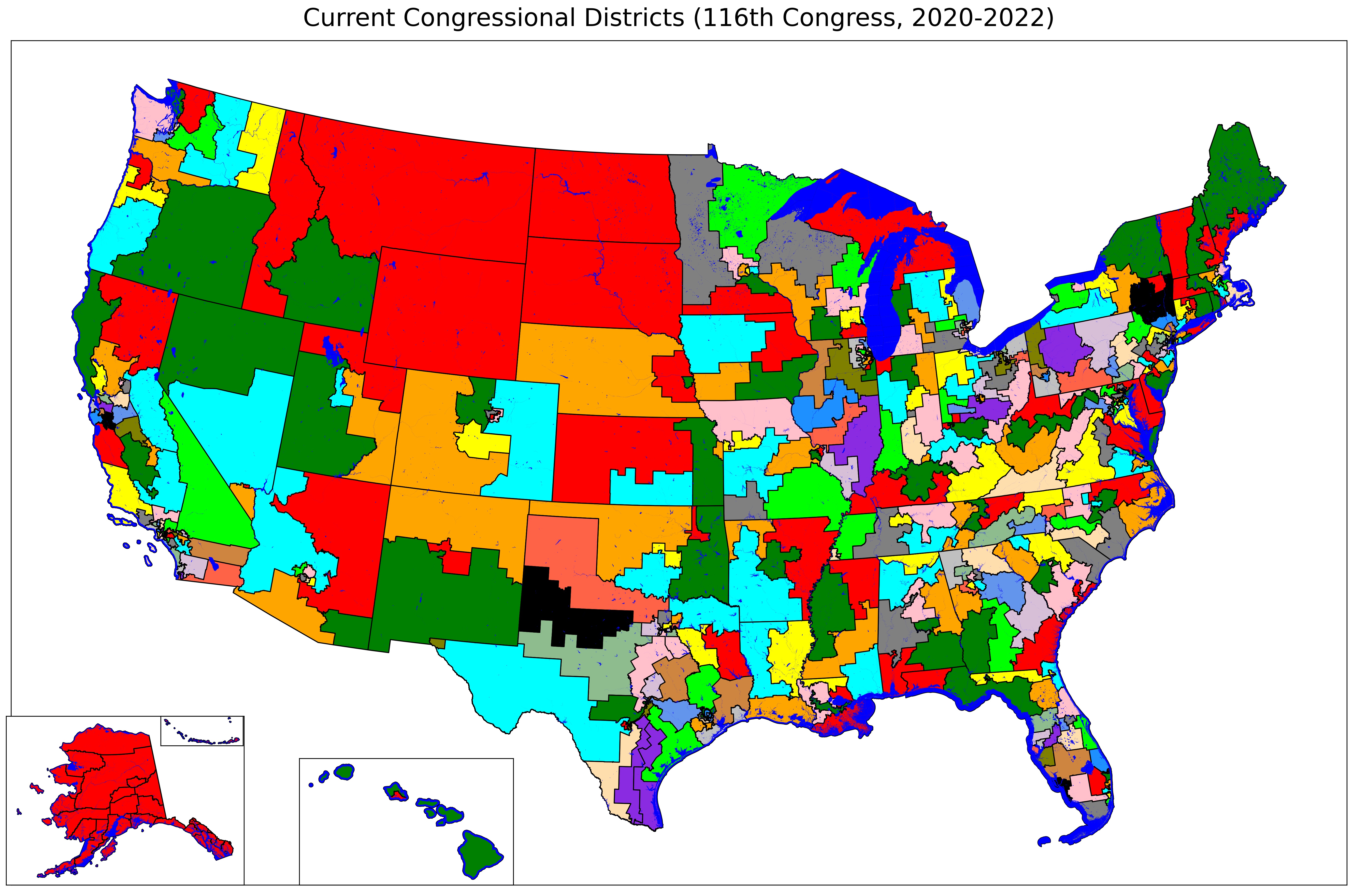
This map will make more sense when we look at it state-by-state, which we will do over the next few months. But for now, take a look at the map (click on it to see a larger view). You should be able to get a sense of which districts are more or less gerrymandered.
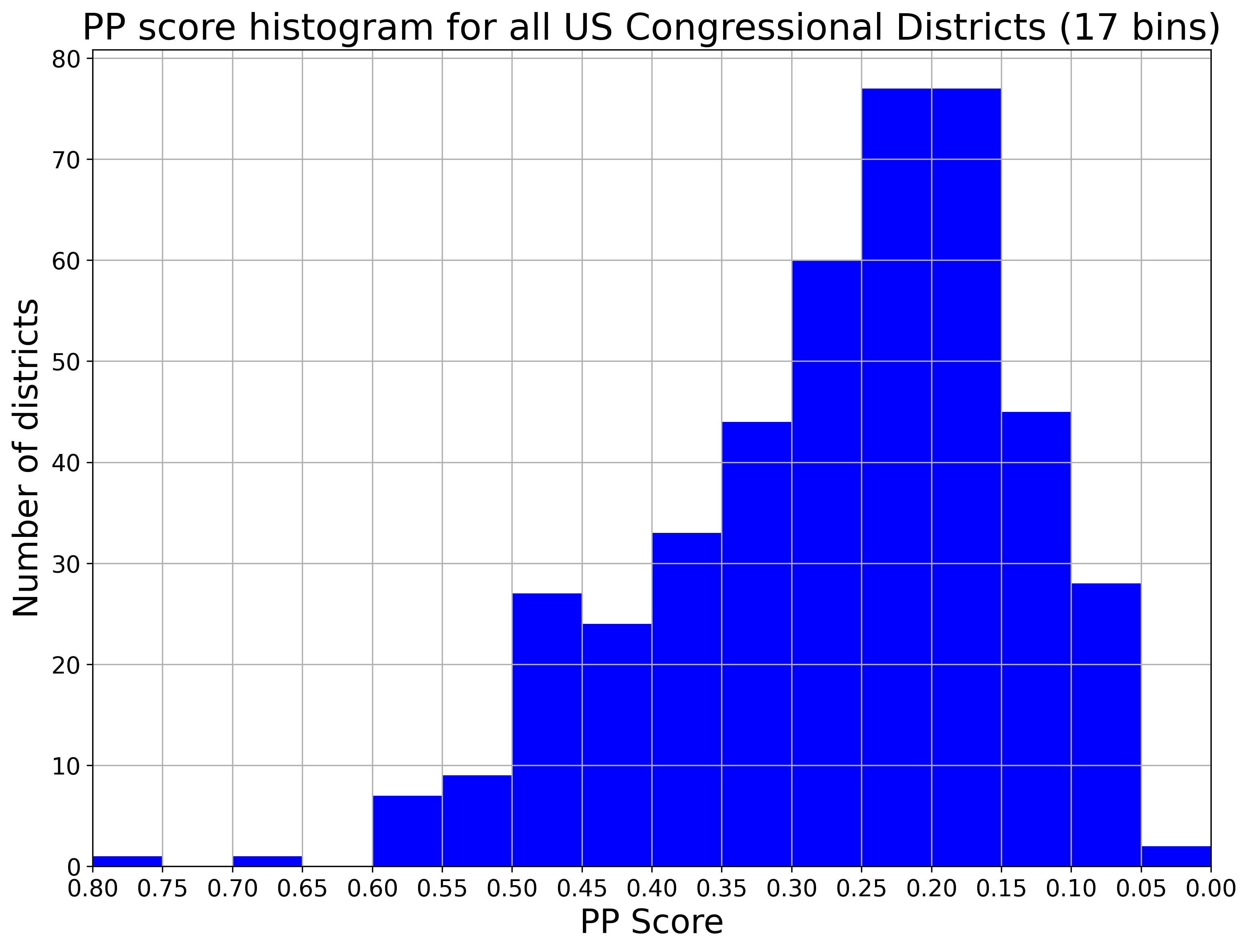
What happens when we Do the Math and look at the PP score for each district?
It would be easy enough to show a table of districts and their PP values, maybe sorted from lowest (most gerrymandered) to highest (least gerrymandered). But there are 435 districts to consider – a table with 435 rows won’t be useful for getting the story of what’s going on. It’s simply too many numbers for your brain to construct a story. We need a picture.
The traditional way to show this kind of data – data showing the same numerical measurement for many different units of analysis – is with a histogram. A histogram shows the range of values in the horizontal direction (x-axis), and the number of times that value appears in the vertical direction (y-axis). When the measurements can only take on discrete values (like 1, 2, 3…), this kind of graph is easy to make. When the measurements are continuous and can take on any value within the range, histograms require some judgment calls by the person presenting the data.
The judgment comes in how to bin the data – how many data points to show together in a single bar. With 435 districts, there are many possible options.
Here is what the histogram of PP scores in all US House districts looks like when dividing the data into 17 bins. The PP score decreases to the right, indicating increased gerrymandering.
and here is a histogram of the same PP scores for all the same districts, dividing into 85 bins:
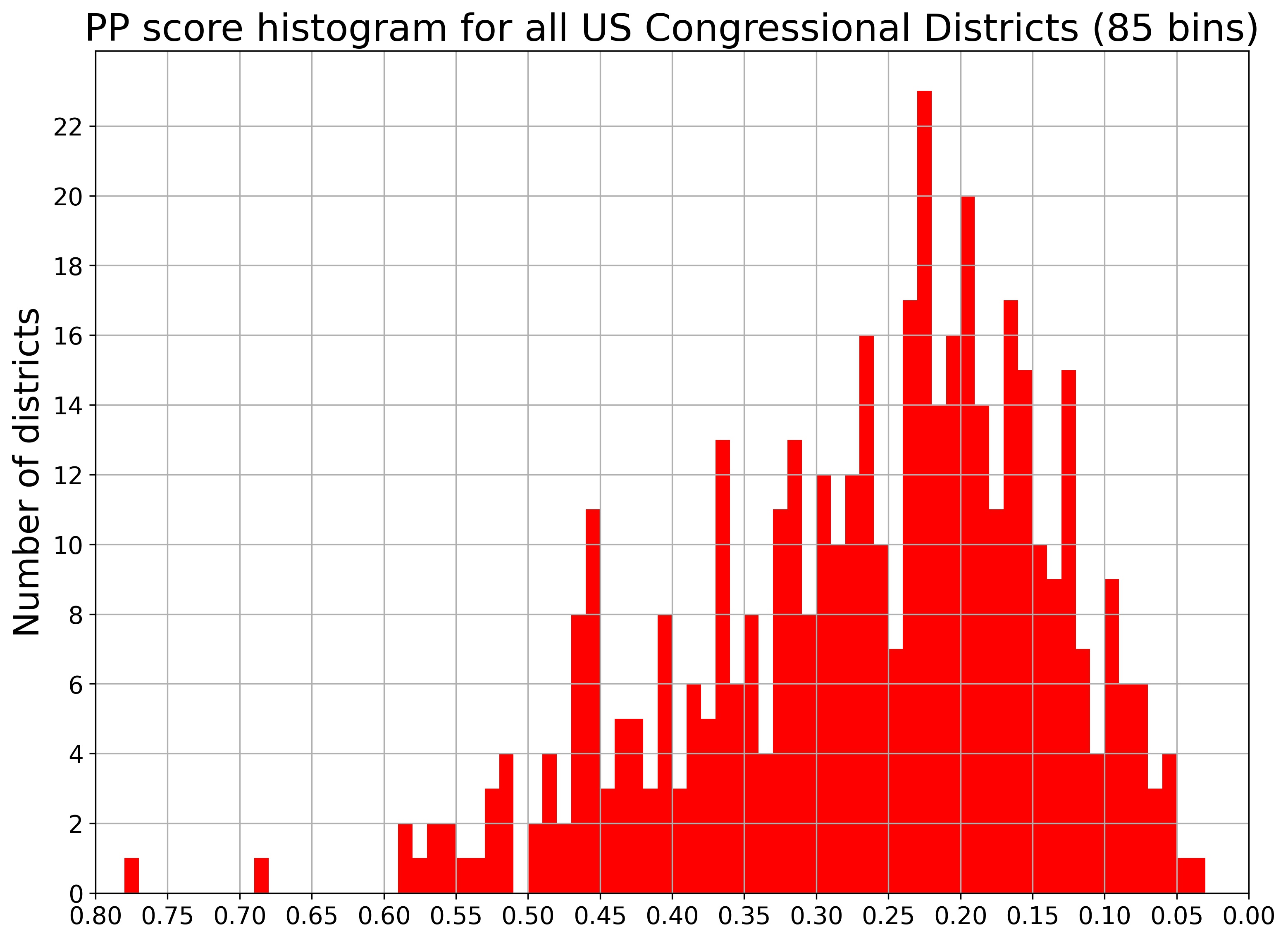
Notice how the story looks similar across the two histograms, but the two graphs emphasize different parts of the story. The first histogram (blue) shows the overall picture clearly, while the second histogram (red) shows some of the variation in district shapes from state to state.
These maps and graphs give you a good overview of what gerrymandering looks like across the entire United States at once. But it leaves a lot of important questions unanswered. How did the districts get that way? Who made them, and what strategies did they use? And maybe most importantly, how can we do better?