Take a deck of cards. Give it a good shuffle, and then lay the cards out one by one, like the picture below. Here’s the question:
How many possibilities are there for which cards will go where? And how many times will you likely have to deal to get the same arrangement of cards again?
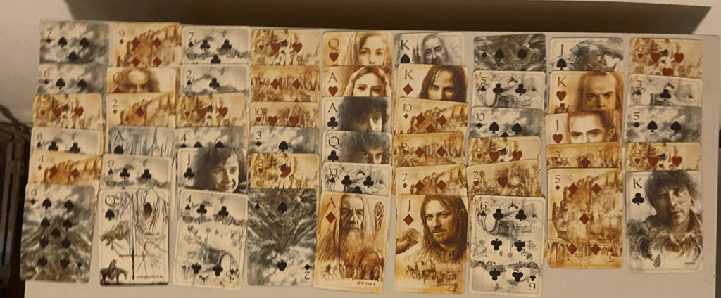
To deal a pack of cards, start with the first card. There are 52 possibilities; I got the 7 of spades. Once the first card is dealt, you have 51 cards left, so there are 51 possibilities for what the next card will be. The next card could be one of 50 possibilities, the one after that could be one of 49, and so on – until the last card, which can only have one possibility. To find the total number of possible orderings, multiply out all the possibilities to get:
52 x 51 x 50 x 49 x ………… x 3 x 2 x 1
Math has a special name for this operation: factorial, symbolized with an exclamation point (!). The factorial of a number is equal to that number times the previous number, times the number before that, and so on all the way down to 1. The exclamation mark is an appropriate symbol, because the factorial can get shockingly big shockingly quickly.
The first few:
1! = 1
2! = 2 x 1 = 2
3! = 3 x 2 x 1 = 6
4! = 4 x 3 x 2 x 1 = 24
5! = 5 x 4 x 3 x 2 x 1 = 120
6! = 6 x 5 x 4 x 3 x 2 x 1 = 720
7! = 7 x 6 x 5 x 4 x 3 x 2 x 1 = 5,040
8! = 8 x 7 x 6 x 5 x 4 x 3 x 2 x 1 = 40,320
That means that if you deal seven cards, you have 5,040 possibilities for their order. If you deal eight cards, you have 40,320 possibilities for their order.
What about for the full 52 cards – what does 52! equal?
52! = 80,658,175,170,943,878,571,660,636,856,403,766,975,289,505,440,883,277,824,000,000,000,000
That means that when you shuffle and deal a deck of cards, there are 80 unvigintillion 658 vigintillion 175 novemdecillion 170 octodecillion 943 septendecillion 878 sexdecillion 571 quindecillion 660 quattuordecillion 636 tredecillion 856 duodecillion 403 undecillion 766 decillion 975 nonillion 289 octillion 505 septillion 440 sextillion 883 quintillion 277 quadrillion 824 trillion different possibilities for how the cards could fall.
How big a number is that? It is unimaginably, unfathomably, amazingly huge. To call this number “astronomical” would be an insult to astronomy.
To get a sense for exactly how huge this number is, let’s consider the second half of the question I asked above: how many times would you have to deal before you could expect to see the same arrangement of cards again?
Because the cards are shuffled anew each time, every deal is independent of those that came before and after, and thus there is no definitive way or predicting the answer. It could happen again pretty soon, or it could never happen again for the rest of the history of the Universe.
But we can get some insight into the question by considering another random chance event that is much, much more likely: rolling a die. On average, how many times do you have to roll a six-sided die before you might expect to roll a 6?
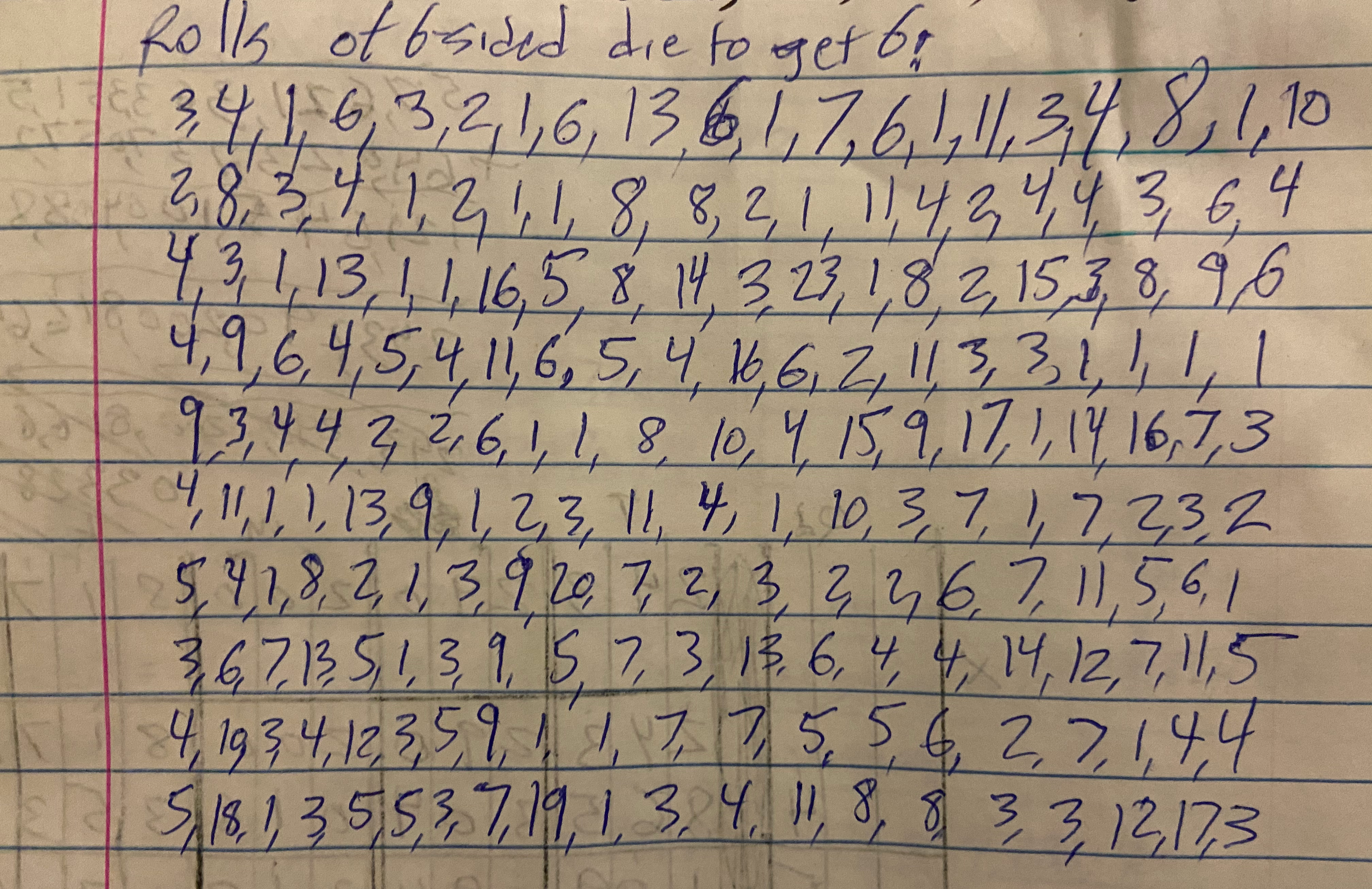
Yes, I really did roll a die this many times. I am committed to my art.
If you know enough statistics to know that recurrences occur in a geometric distribution (and if you know why it depends somewhat on what you mean by “you might expect,” you can skip to the answer – but it’s always more fun to figure it out. So I did an experiment. I rolled a die, and kept rolling until I got a 6. I wrote down the number of rolls that it took. And then did it again, and again, a total of 200 times.
Over those 200 trials, the average (mean) number of rolls required to get a six was 6 rolls. I tried again with rolling an 8-sided die, and over 50 trials it took on average 8 rolls to get an 8. And it sort of makes sense that the number of trials you need to get a specific outcome should be roughly equal to the number of possible outcomes.
Which means that for dealing cards, where there are 80,658,175,170,943,878,571,660,636,856,403,766,975,289,505,440,883,277,824,000,000,000,000 possible outcomes, you should expect to have to deal out the deck 80,658,175,170,943,878,571,660,636,856,403,766,975,289,505,440,883,277,824,000,000,000,000 times before getting the cars in the same order again.
How many times is that? Here’s a way of thinking about how big that number is, adapted from an essay by fellow data scientist Scott Czep.
Stand in the middle of Times Square in New York City. Deal out deck of cards and note the arrangement. Put the deck back together, shuffle, and take a step. Repeat: deal, shuffle, step. Deal, shuffle, step. Continue until you are standing on the beach in Los Angeles, California. But you’re not done yet. Far from it. Turn around and deal, shuffle, step, all the way back to New York. Then turn around and do the same thing: deal, shuffle step back to LA.
Now take an eyedropper and remove one drop of water from the Pacific Ocean. You’re there anyway. Turn around and deal, shuffle step back to New York, then back to LA. Then remove another drop from the Pacific Ocean.
Continue doing this until the Pacific Ocean is empty.
You’re still not done, though. Magically refill the entire Pacific Ocean, and then remove a pebble from the top of Mount Everest. Turn around and deal, shuffle, step back to New York. Deal, shuffle, step, New York, deal, shuffle, step, LA, drop, New York, LA, drop, New York, LA, drop, ocean empty, pebble off Mount Everest.
Continue until you have removed all of Mount Everest.
Congratulations! You have removed Mount Everest once, after having emptied the Pacific one drop at a time one billion billion times, while walking back and forth between New York and LA between drops, dealing and shuffling cards each time. To celebrate your accomplishment, lay a piece of paper on the ground. Magically refill the Pacific, magically rebuild Mount Everest all the way to the top, and repeat.
Deal, shuffle, step, New York, LA, drop, deal, shuffle, step, New York, LA, drop, ocean empty, pebble, deal, shuffle, step, New York LA, drop, ocean empty, Mount Everest gone, add a sheet of paper to the stack, repeat, keep stacking.
Continue until the stack of papers reaches the Sun.
After all this – countless pieces of paper on the stack, countless countless removals of Everest, countless countless countless emptyings of the Pacific, and countless countless countless countless hands of cards, are you done? No.
Repeat this entire process 66 more times. Sometime during your 67th trip, you reach the number of deals at which you might expect to see the same layout you saw on your first deal, back in New York so long ago.
Think about this next time you see a pack of cards: enormous complexity can hide in the simplest things.
Postscript: The Numbers
Doing these calculations was way easier because Scott Czep did most of the work in his essay about 52 factorial, I just changed a few things. If you see any errors, they are mine rather than his, and please let me know in the comments! And definitely check out Scott’s essay and the rest of his blog.
- 52! in scientific notation is about 8 x 1067, so that is the number we are aiming for.
- An average person has a stride length of a bit less than one meter, but let’s round up to 1 meter to make the calculations easier. It’s one hand of cards per step.
- The distance from New York to Los Angeles is 4500 km, so back and forth is 9000 km = 9 x 10⁷ meters. At one step per meter and one hand of cards per step, that’s 9 x 10⁶ hands. (Note: we’ll ignore the initial New York to LA walk since it will make so little difference with the number of times we’ll have to do the round trip.)
- Current total: 9 x 10⁷ hands dealt
- There are about 20 drops of water per cubic millimeter
- The Pacific Ocean contains 700 million cubic kilometers of water (7 x 10⁸ km3 = 7 x 10²³ mL = 1.4 x 1025 drops
- Current total: 1.2 x 1033 hands dealt
- Assume a pebble weighs about 1 ounce.
- Mount Everest weighs 357 trillion pounds = 5.7 x 10¹⁵ ounces = 5.7 x 10¹⁵ pebbles.
- Current total: 6.8 x 1048 hands dealt
- A sheet of paper is about 0.1 mm thick
- The distance from the Earth to the Sun is 150 billion km = 1.5 x 1017 mm = 1.5 x 10¹⁸ sheets of paper
- Current total: 1.2 x 1066 hands dealt
- Repeat the entire cycle 66.7 times to get to the target of 8 x 1067 hands


