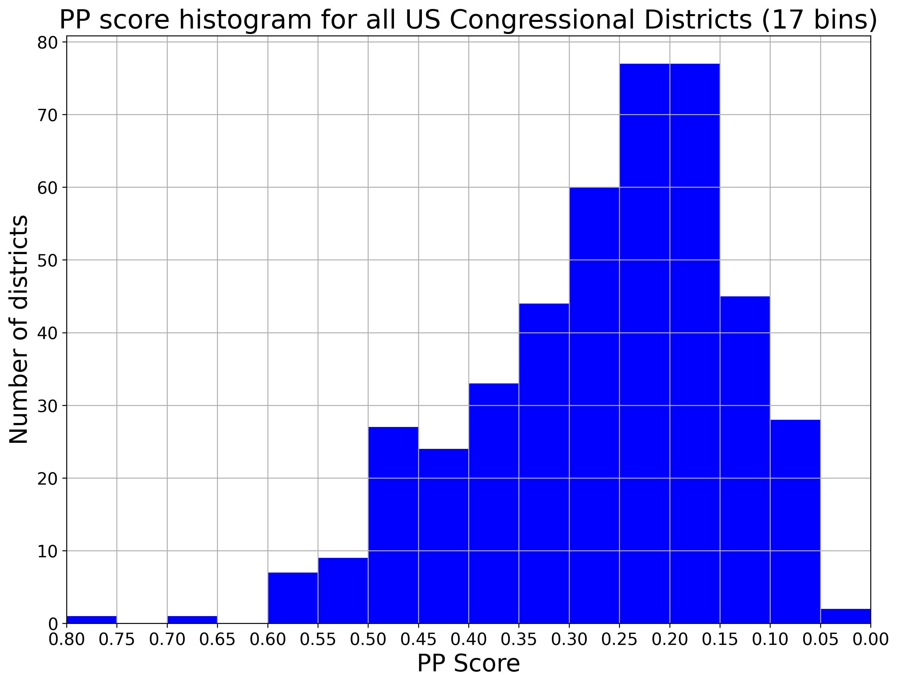
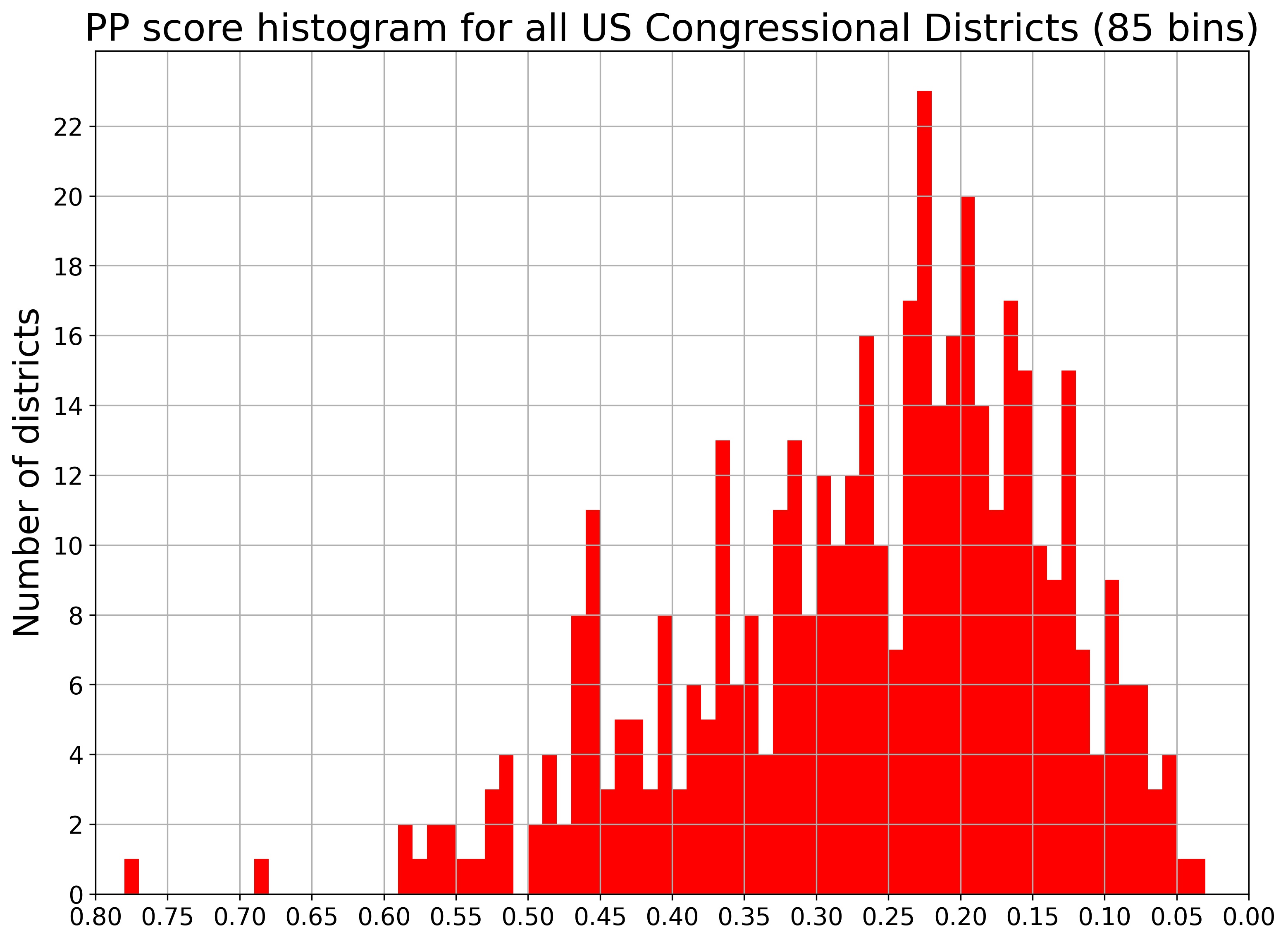
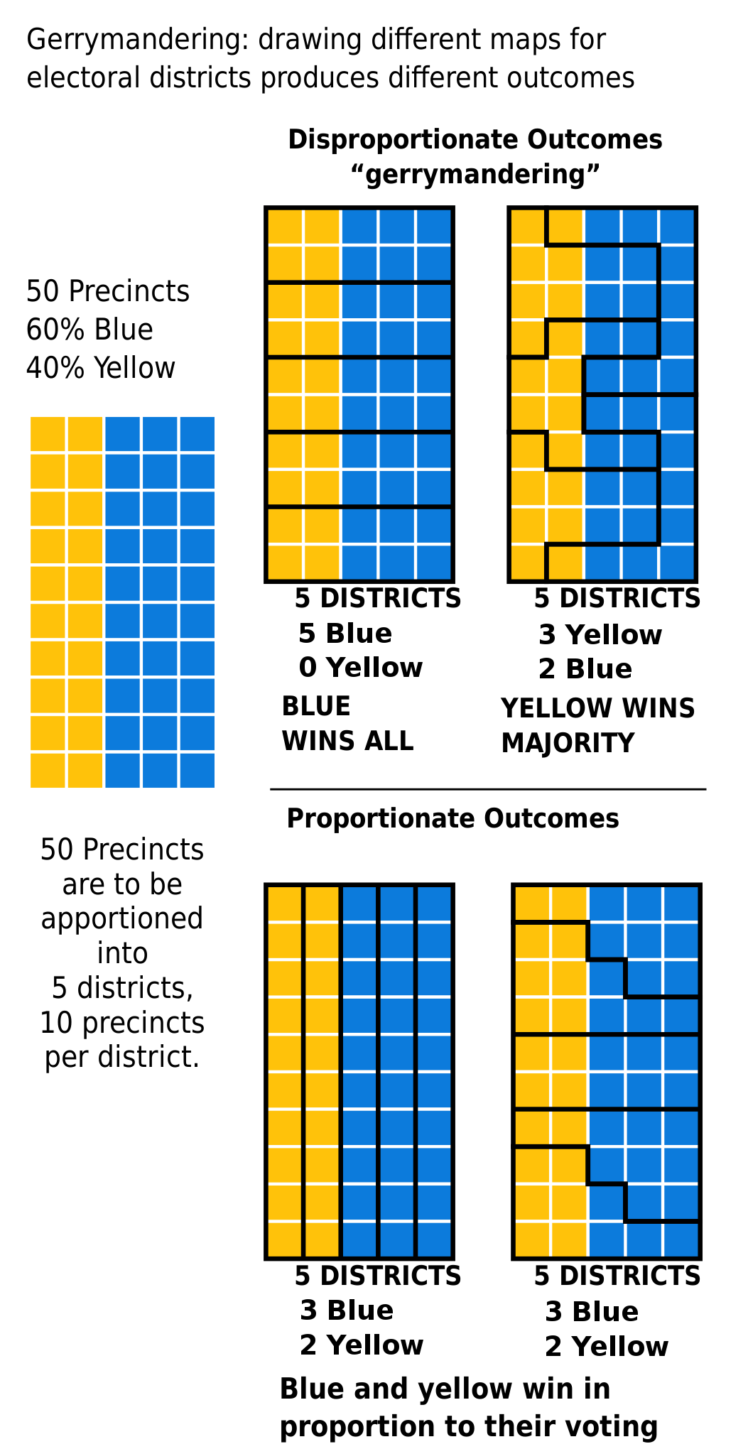
Recently we’ve been looking at gerrymandering, the practice of drawing the borders of legislative districts for the benefit of a political party or some other group. So far, we have looked at the history of gerrymandering, introduced a simple measure of how gerrymandered a district is, and mapped and measured all the House of Representatives electoral districts across the United States.
You might wonder why I am discussing gerrymandering now, and you might already know the answer to that question: states are right now in the process of redrawing their Congressional districts to reflect the composition of the U.S. as measured by the 2020 Census.

In some states, independent commissions draw the boundaries; in others, state legislatures do. Because state legislatures are controlled by one or the other of the USA’s two political parties, this provides an excellent opportunity for the parties that control state legislatures to draw districts to their advantage. Redistricting won’t happen again until the results of the 2030 Census are released in summer 2031 – meaning that the districts being planned right now are the districts that will be used in the next five house elections, thus shaping American democracy for an entire decade.
Now is the time to talk about gerrymandering because now is the time for gerrymandering.
We’ll return to the main post series soon, to look at some of the strategies these legislatures are using, and which party will benefit most from the upcoming changes. But today, we’ll start a new series that answers the question that state independent commissions ask, and state legislatures should ask: how to we draw districts fairly?
I’m here to find out.
I am at a major disadvantage compared to the state legislatures and independent redistricting commissions that are actually doing the redistricting. They have proprietary mapping software and highly-paid consultants to deliver the desired result; I’m just Some Guy on the Internet. But I have two major advantages. First, I have access to a virtual supercomputer through my institute’s flagship product, the SciServer Science Platform (and so do you – it’s free to everyone online!). Second, I am very, very stubborn.
I retrieved the 2020 reapportionment data from the U.S. Census Bureau’s website. This is exactly the same data that the redistricting commissions and state legislatures are now using to plan their new districts for 2022-2032. It’s important to note that I don’t have to download the entire 23 Gigabytes of data to my laptop – I can transfer all the data by FTP or Globus and store it all in the Terabytes of temporary space available in SciServer Compute. If I don’t use the data in 30 days, it will be automatically deleted; but that’s no problem, I can just transfer the data again, free.
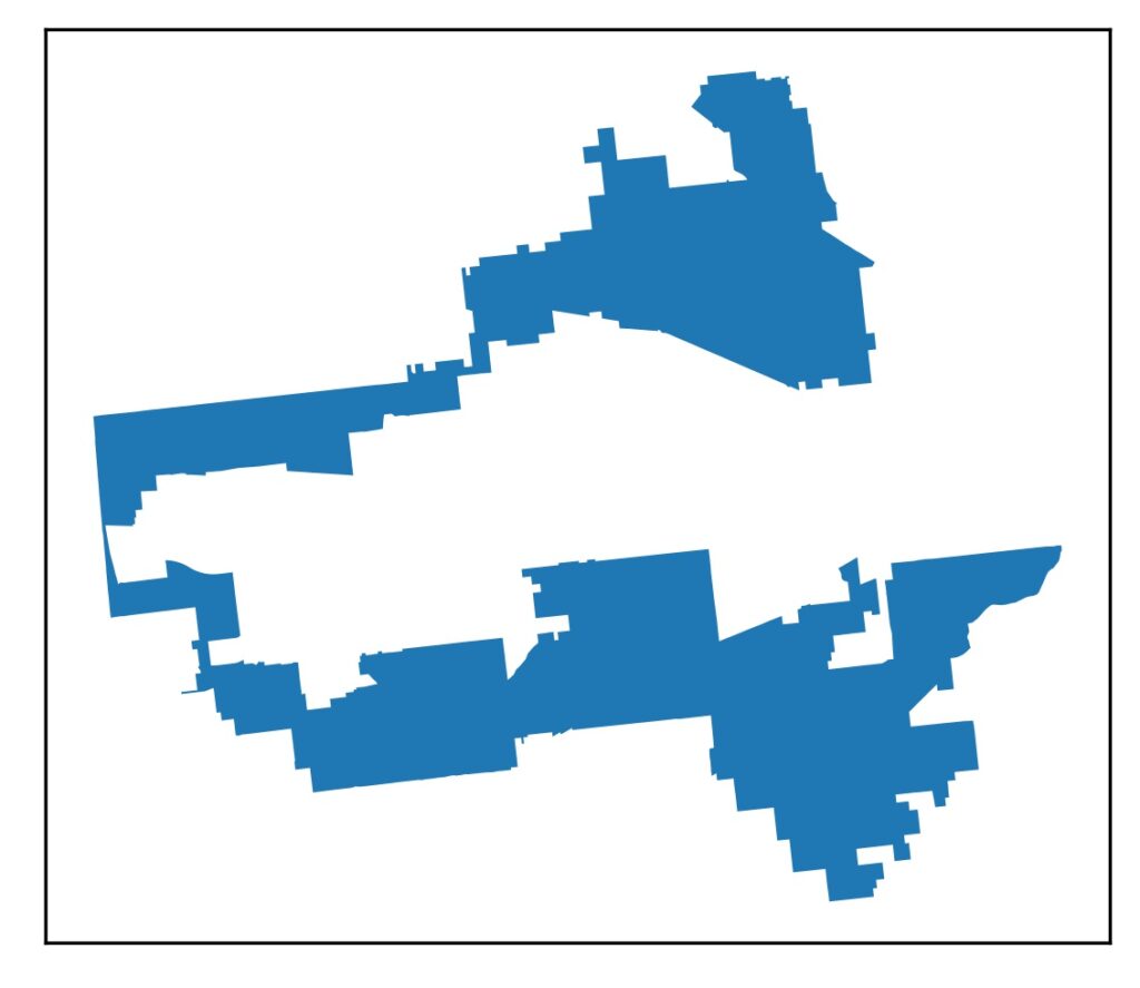
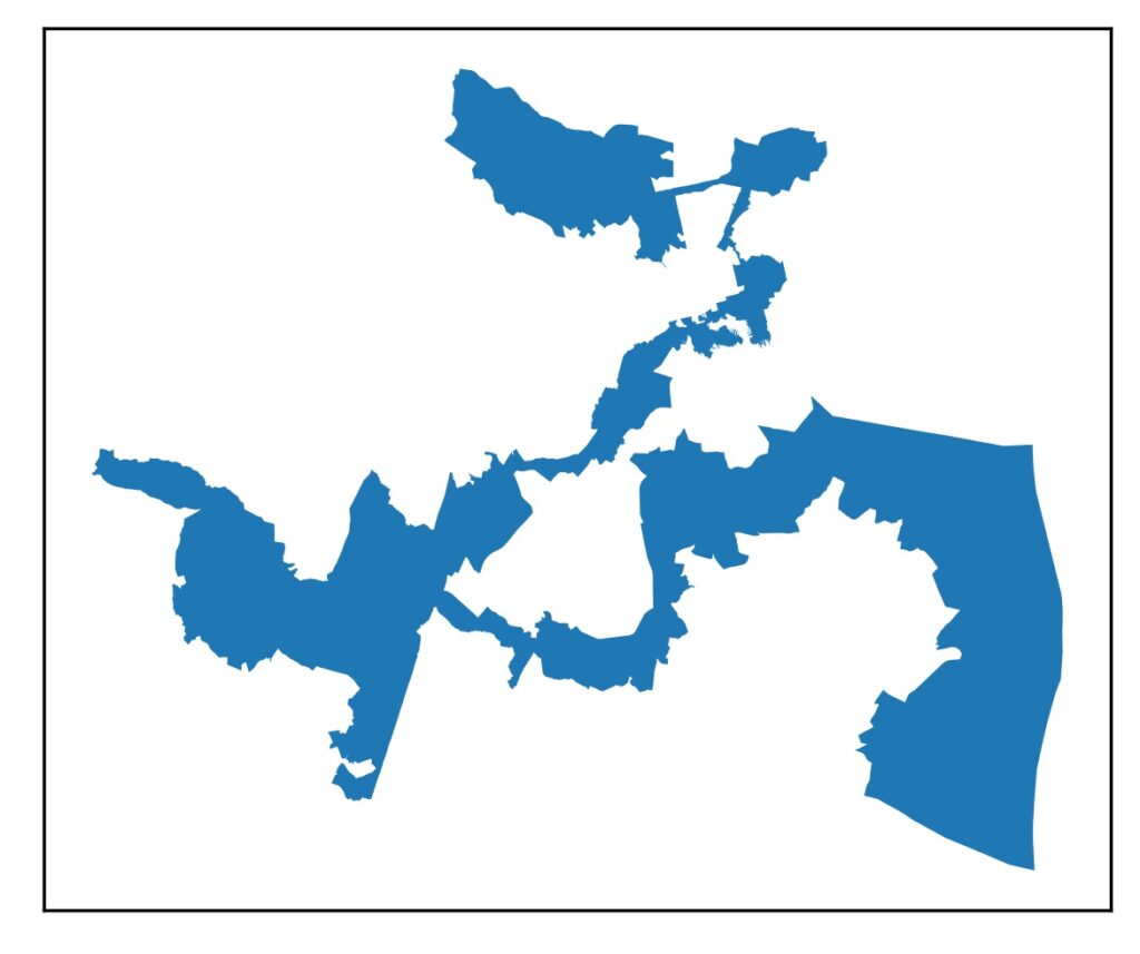
Once I get the data, what do I do with it? I’ll go into much more detail later, but basically, I start with whatever is the largest and/or most centrally-located city of the largest metropolitan area in the state. That’s the center of a district. I assign that district a number, usually the district number of that city had in the 2010 district map (for example, downtown Miami is currently District 27, so I assign downtown Miami as District 27 and go from there). I choose census tracts for that district until I reach the target population for each district (which is published as part of the Census data). I continue until I have covered the entire metropolitan area with districts. Then I move on to the next-largest metropolitan area in the state, then the next, and so on. At some point, I run up against either a nearby metro area or the edge of the state and I start filling in a new district there.
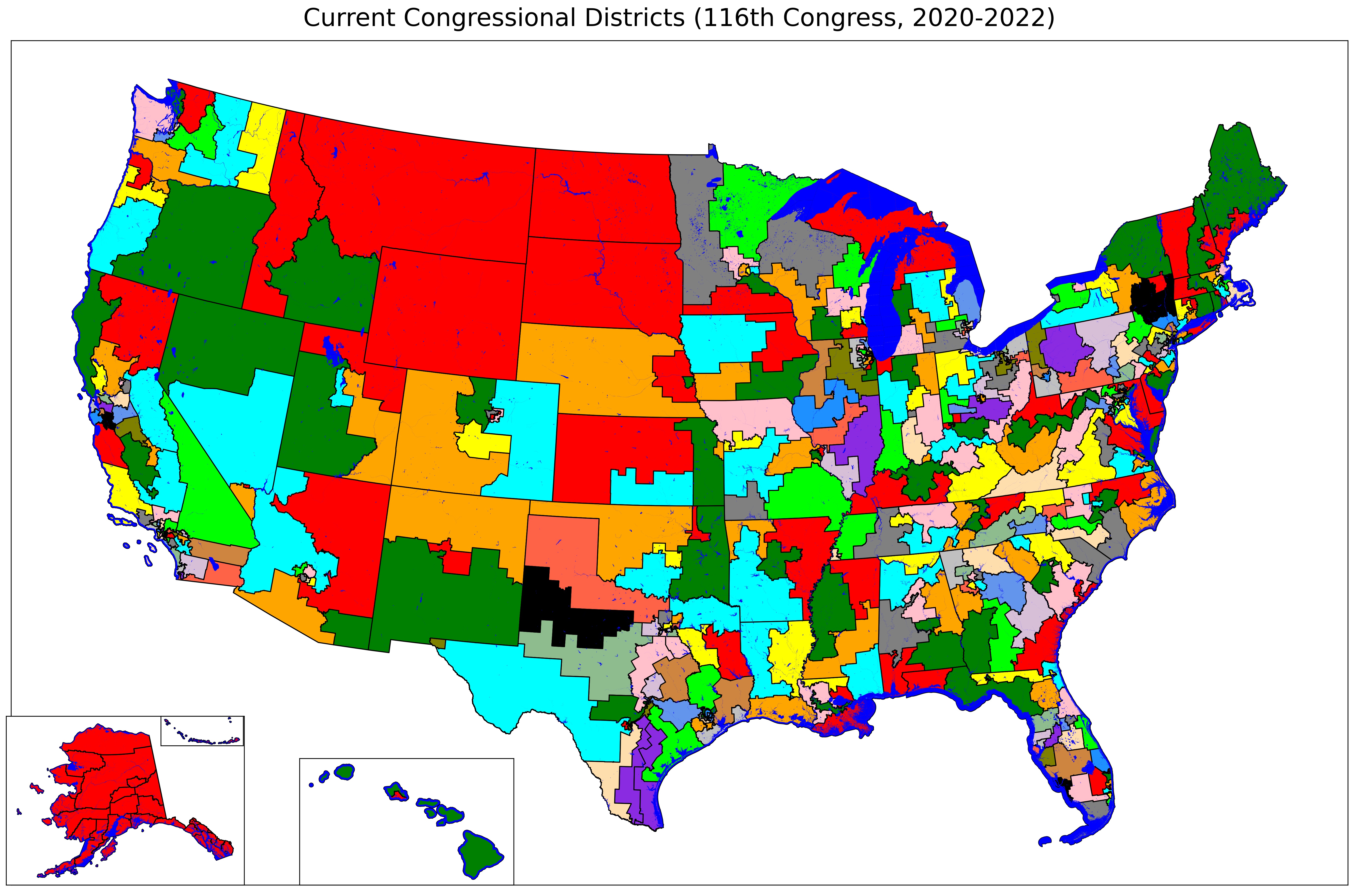
This is mostly a manual process, and it’s a bit time-consuming, but I’ve got scripts to automate the parts that can be automated, and it’s kind of fun. I’ll go through each state, one state at a time, to show you the following three maps:
- What the state’s Congressional districts look like now (based on results of the 2010 Census)
- What the state’s new Congressional districts look like, if the state has finalized them; if not, what the proposals are
- What the state’s Congressional districts should look like from my method
We’ll start with the easy ones: Alaska, Delaware, North Dakota, South Dakota, Vermont, and Wyoming have one seat each. Thus they have one Congressional district, and the boundaries of the district are the same as the boundaries of the state.
Six down, forty-four to go.
Next up: Idaho