Continuing today my forecast for the 2020 U.S. elections, now just 15 days away!
Previously, I gave my Presidential election forecast (the most recent), a Senate forecast, and an overall House forecast. The House forecast was originally going to be a single post, then a 3-part series. So hey, welcome to my 4-part series of 2020 House election predictions!
Today: the first half of previews of close races.
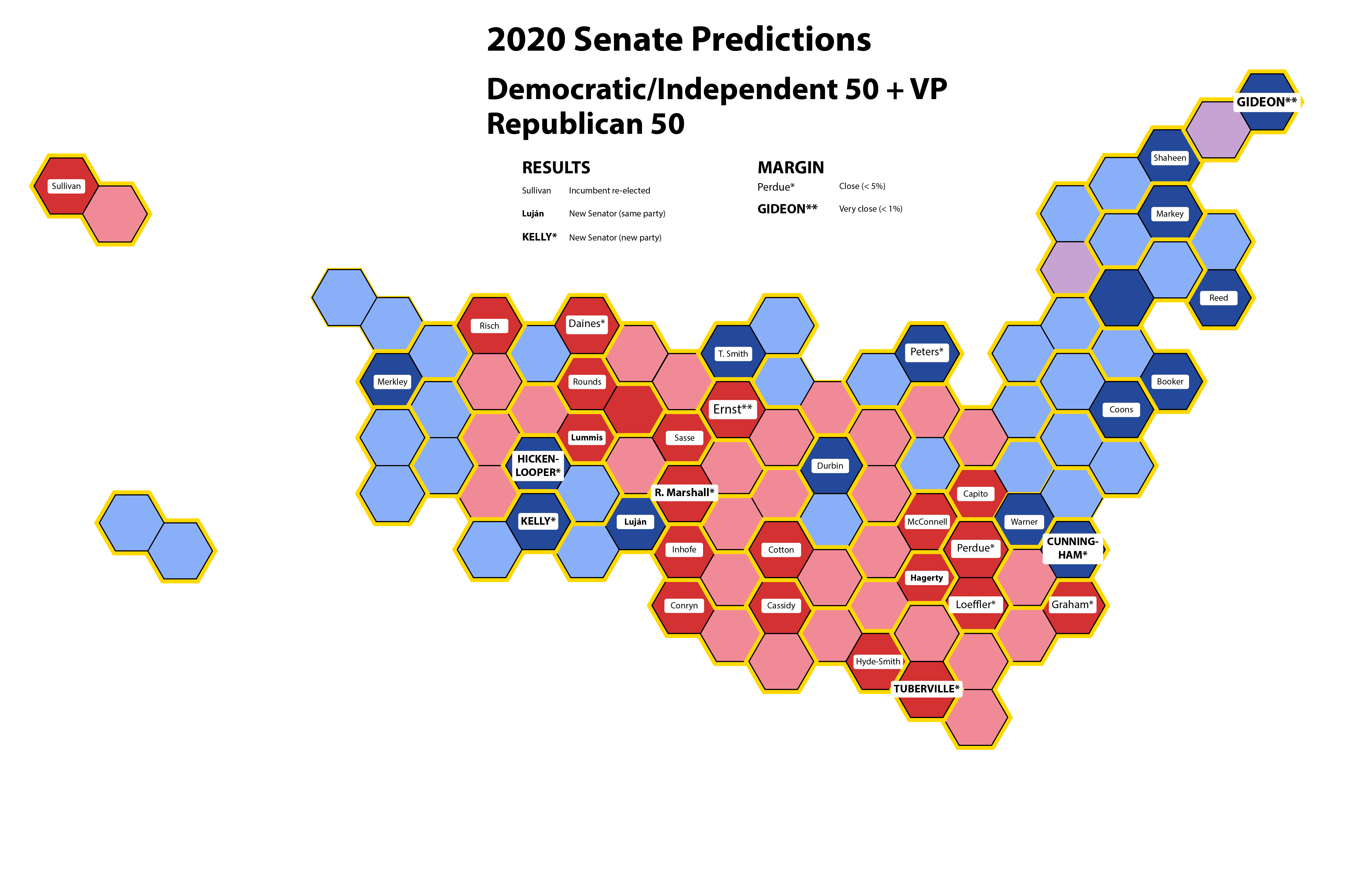
The National Map
Below is my forecast map for what the entire House will look like w2hen the 117th U.S. Congress opens on January 3, 2021 (for comparison, here’s what the map looks like now). See the guide below for what each part of the figure means, and definitely click on it for a version you can actually read.

How to read the map (skip if you know it already)
As is traditional yet completely arbitrary, Republican representatives are shown by red hexagons and Democratic representatives are shown by blue hexagons. The text labels show the names of the incoming representative; plain text means that I predict the incumbent will be re-elected, bold means that I predict a new representative will be elected from the same party, and bold all-caps means that I predict a party switch. A larger font size and a single asterisk(*) mean the election is likely to be close, within about 5%. An even larger font size and double asterisk(**) mean the election is likely to be very close, maybe within 2%.
Preview of close races (Alaska to North Carolina)
In my Senate prediction, I offered at least a passing comment on each of the 35 races. With 435 House races, I’m obviously not going to do that here, but I have looked at them all to get a sense of which will be most exciting.
Here they are, starting with the close races (forecast to be within 5 percentage points, meaning a 52.5%-47.5% vote). These races are marked with a single asterisk (*) in the map above.
I’m running through previews alphabetically by state name, and today I preview states from Alaska through Minnesota. I am then skipping over all the “New” states directly to North Carolina, because apparently I cannot into alphabet.
Alaska at-large

Click to see what he actually looks like.
This district covers the entire state of Alaska, and it’s the second-largest electoral district by land area in the world (only the Nunavut district for the Canadian House of Commons is bigger).
Republican Don Young has represented the district since 1973, and considering his long service it’s shocking that he’s in any race at all with challenger Alyse Galvin, an Anchorage-based education consultant and activist.
The race was within 5% when I made the map, but Young has pulled more than 6 points ahead in polling, so he is virtually certain to return for his 25th term in Congress.
Prediction: Young re-elected.
Arkansas-2
This district covers central Arkansas, including the state capital of Little Rock (aerial photo below). Like most districts containing urban centers, it is far more friendly to Democratic candidates than the rest of the state. Except it’s Arkansas, so it’s still not at all friendly to Democratic candidates.

Republican third-term incumbent French Hill currently leads Joyce Elliot (who represents Little Rock in the State Senate) by 5 percentage points. The race is getting closer, but time is getting short.
Prediction: Hill re-elected.
Arizona-6
This district covers the northeastern suburbs of Phoenix, including the cities of Scottsdale and Paradise Valley.
Four-term Republican David Schweikert faces emergency room doctor and health care advocate Hiral Tiperneni. Schweikert leads by 3 points in a tightening race.
Prediction: Schweikert re-elected.
California-39

This district covers the foothills east of Los Angeles -parts of Los Angeles, Orange, and San Bernardino counties – including Yorba Linda, the hometown of Richard Nixon.
In 2018, a longtime Republican Congressman retired and Gil Cisneros sniped the seat for the Democratic party, narrowly winning the seat in a recount against state assemblywoman Young Kim. The same two are running again, and Cisneros currently leads by 5 points.
Prediction: Cisneros re-elected.
California-48

This district covers the coast of wealthy, traditionally Republican Orange County, from Huntington Beach to Laguna Beach. In 2018, Harley Rouda became the first Democratic representative in the district’s history. Rouda is running for re-election against Orange County Councilwoman and self-proclaimed “Tax Fighter,” the impressively-named Michelle Steel. Rouda is ahead by a bit under 3 points. I’m less sure about this one – but when the incumbent is ahead with less than a month left, go with the incumbent.
Prediction: Rouda re-elected.
Florida-26
This district covers the Tip of the Wang, from Homestead in southern Miami-Dade County to all of the Florida Keys. I’m amazed that in the ridiculously close President/Senate state of “It All Comes Down To” Florida, this is the only remotely close House race.
First-term Democratic incumbent Debbie Murcasel-Powell goes up against Miami-Dade County mayor Carlos Giménez (note that “mayor” here is equivalent to County Commissioner in other counties. Not to be confused with the mayor of the city of Miami, who is just as Cuban-American, young, and good-looking as you would expect).
Like Alaska, this is a race that has separated even since I made my map, and Murcasel-Powell is virtually certain to win re-election.
Prediction: Murcasel-Powell re-elected.
Georgia-6

This district includes the northern suburbs of Atlanta – and as always, as go the suburbs, so go the nation. In a 2017 special election, the district famously gave Democratic pundits hope when Jon Ossoff lost to Karen Handel by about 9,000 votes – thus demonstrating just how desperate for hope Democratic pundits were in 2017.
But in 2018, Democratic prospects were better, and Lucy McBath captured Handel’s seat by only 3,264 votes. It’s McBath vs. Handel again this year, and McBath is just over 3 percent ahead in current polling.
Prediction: McBath re-elected.
Illinois-13
This is a gerrymaderific district that mostly includes rural west-central Illinois, but has weird squid tentacles that include small parts of the state capital of Springfield and the college towns of Champaign and Bloomington because reasons.
The district hasn’t voted Democratic since ’92…….. 1892, that is. In 2018, Republican Rodney Davis won re-election against challenger Betsy Dirksen Londrigan by a ridiculously thin margin of 2,058 votes.
Davis and Dirksen Londrigan play it again this time, with Davis ahead by about 3 percent in the polls.
Prediction: Davis re-elected.
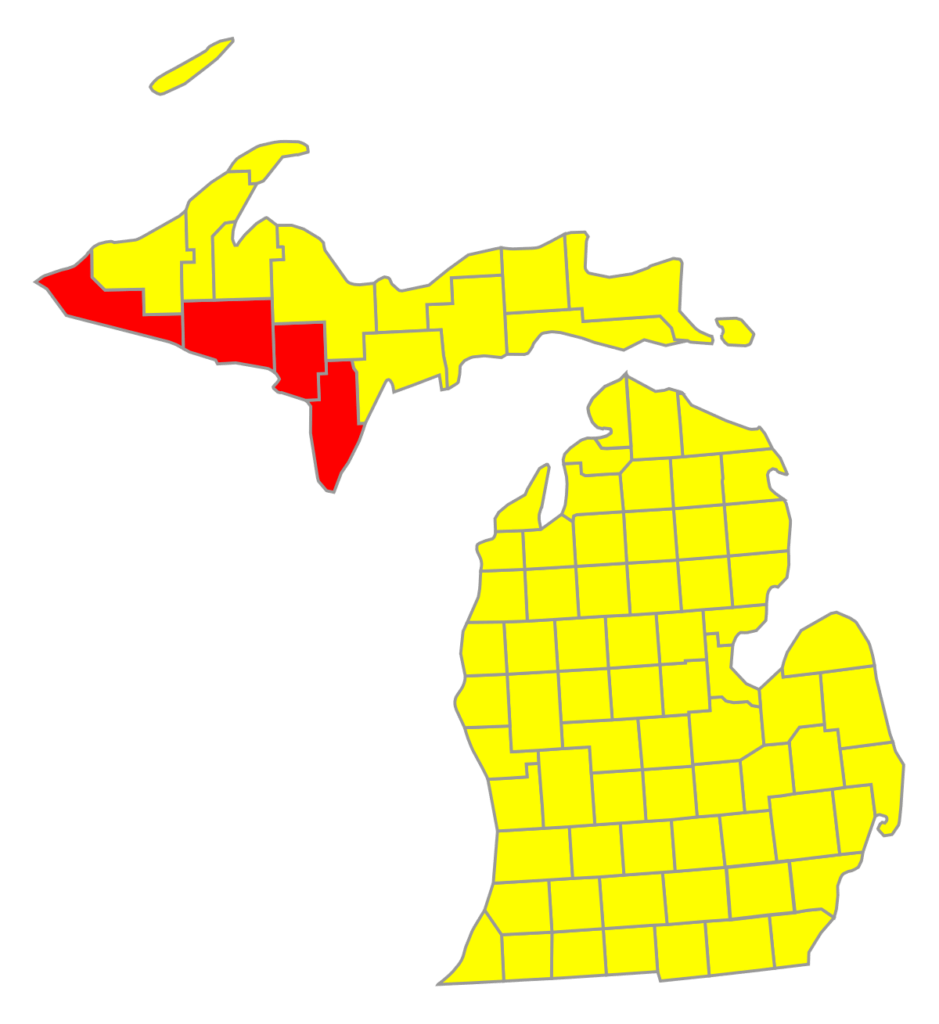
Michigan-3

This district includes the city of Grand Rapids and the surrounding area of central Michigan. Justin Amash was elected as a Republican in 2010, but ran afoul of President Trump and switched parties – first to Independent and then to Libertarian, becoming the first third-party representative in Congress since 1950. th
Understandably, Amash has had enough and is not running for re-election. The seat will either go back to the Republicans via Peter Meijer, heir to Michigan’s Meijer supermarket chain – or else will flip Democratic with immigration lawyer and education activist Hillary Scholten. Polling is absolutely all over the place, but the average has Meijer ahead by about 3 points.
Prediction: Meijer wins, capturing the seat for the Republican Party.
Minnesota-1

This is a rural district that stretches across the whole southern border, and includes midsize cities like Mankato, Rochester, and Winona.
The district has traditionally leaned very, very slightly Democratic, but it currently represented by massively conservative, massively controversial Republican Jim Hagedorn. In 2018, Hagedorn defeated Democratic candidate Dan Feehan by just 1,311 votes. Feehan, an Iraq War veteran and former middle school math teacher, is running again. Some polls have Feehan ahead, but on average, Hagedorn leads by 4 points.
Prediction: Hagedorn re-elected.
Minnesota-7

Unlike Peterson, THIS JOKE WILL NEVER GET OLD!
This is another rural district, eh? It is the largest district by area Minnesota, covering the whole western side of the state except the far south, with the largest city being Moorhead. It’s the most conservative part of Minnesota, with a long history of Representatives with wonderfully Scandinavian names like Haldor Boen, Ole Juulson Kvale, and Odin Langen.
The district has been represented since 1990 by Collin Peterson, one of the founders of the Blue Dog Democratic Coalition. But thanks to the USA’s increasing partisanship and a strong candidate – Lieutenant Governor Michelle Fishbach – the Republicans seem poised to capture the seat from the 15-term incumbent. When I made the map, Fishbach was 4.5 points ahead when I made the map, but her lead has increased to six points.
Prediction: Fishbach captures the seat for the Republicans.
Montana at-large

Yes, I know Montana has moose, but YOU WERE EXPECTING IT THIS TIME, WEREN’T YOU?
This district represents the entire state of Montana, and it’s actually the largest district by population in the country. Incumbent Greg Gianforte is stepping down to run for Governor of Montana.
The Republican candidate is state auditor Matt Rosendale; the Democratic candidate is former state representative Kathleen Williams. Rosendale has led the entire way, but Williams has pulled within 5 points – not very close with so little time remaining.
Prediction: Rosendale wins, retaining the seat for the Republican Party.
North Carolina-8

Click to see what Richard Hudson (R-NC-8) actually looks like.
This district covers rural south-central North Carolina, including the midsize cities of Concord, Albemarle, and Pinehurst.
The district is currently represented by Republican Richard Hudson. He is running or a fifth term against Patricia Timmons-Goodson, an Associate Justice of the state Supreme Court. Polls are tightening, with Hudson currently holding a 3-point lead.
Prediction: Hudson wins re-election.
Party switches
If you’re keeping score at home (can’t tell the players apart without a program!), that’s two seats that I predict will switch parties:
- Michigan-3: From Libertarian to Republican (although Justin Amash was originally elected as a Republican), captured by Peter Meijer
- Minnesota-1: From Democratic to Republican, captured by Michelle Fishbach
That’s two seats over the Republicans, but remember that my overall prediction was five seats turning Democratic. That means that there are some switches that way still to come in my House forecast previews.
Coming Wednesday: Close races from New Jersey to Texas.
Coming Friday: An additional ten races that I predict will be very close – within two percent at 51%-49% or closer. Which means that they will likely require a recount, bringing us more drama for weeks after the election. Getcha popcorn.


