Graphs day 140, pandemic day 147, day 217 since the first cases were diagnosed. I had to look up how to write 140 in Roman numerals. Worst franchise ever.
Just a quick update of some national- and state-level data while I work on SOMETHING REALLY EXCITING!
Total cases of COVID-19 diagnosed worldwide: 18,282,208
Total deaths: 693,694
Earth is quickly headed for the new milestone of 700,000 deaths, probably later this week.
Today’s update is for some of the countries and states we have been following where cases continue at high rates. The main graph is on a slightly modified regular scale, running from zero to 250 cases per million people per day. The inset is on the infamous Qatar scale (0-700 cases per million people per day). Each region gets a unique color and is labeled close to the line with the same color. The label also gives the mortality rate (cumulative deaths per million people) in the region – cumulative because the dead stay dead. The thickness of the lines and the size of the labels depend on the cumulative case fatality rate – the number of people who died divided by the number diagnosed.
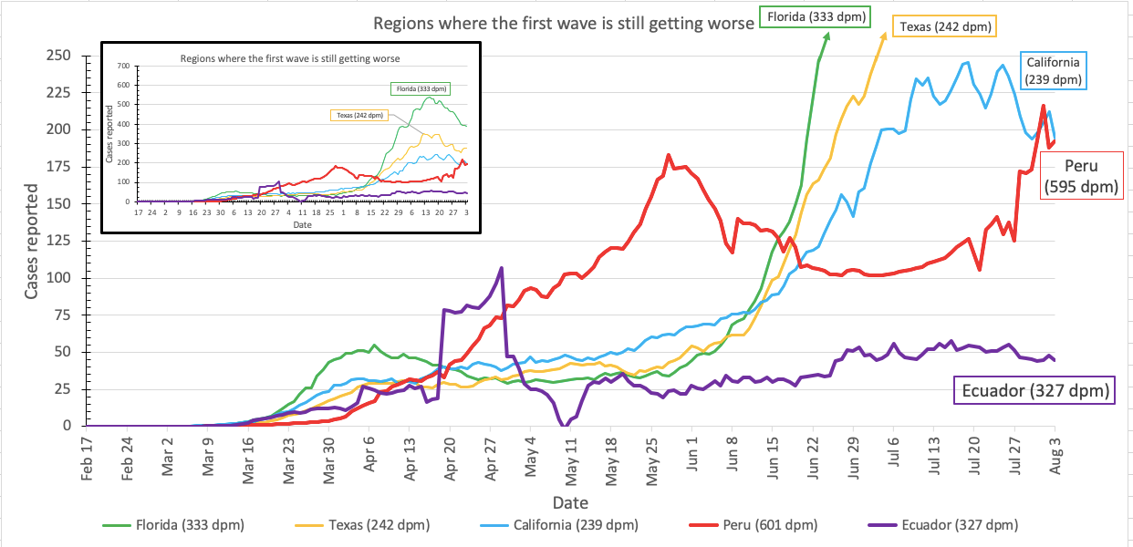
Florida is definitely doing better. California and Texas are a bit less clear, but hopefully they are moving in the right direction.
Stay tuned for SOMETHING REALLY EXCITING! Probably not tomorrow, but soon.
Want to try these graphs yourself? Go for it!!! I’ve updated my spreadsheet (still version 7) to restore the formulas. The upside is that you can now more easily make changes to make the graphs your own; the downside is that unless you are on a high-end computer, the calculations will be slooooooooooooooooow. To speed up calculations, replace formulas with values once you decide you have the right formulas. If you’re not sure how to do that, just ask – leave a comment, messenge me on social media, or send me an email at jordan.raddick@gmail.com.