Graphs day 152, pandemic day 159, day 229 since the first cases were diagnosed.
Total cases of COVID-19 diagnosed worldwide: 21,239,780
Total deaths: 767,692
I am continuing to use data retrieved by the Corona Data Scraper, which collects online reports from county, state, and national health departments all over the world. I am getting worried that I might be approaching the limit of what I can do with Excel running on my laptop. I could easily make these graphs in Python with SciServer or Kaggle, but that would be a wasted opportunity. There’s a reason I’ve been making these graphs in Excel all along – I want to show you how you can study the COVID-19 pandemic using a tool you probably already have and probably already know how to use.
If you know anything about how to speed up computation in Excel, or if you know of any other resources I can bring to this, please let me know! Comment here or reach out to me in one of the ways you know how to reach me.
Today’s graph compares some of the major global hotspots, and adding a new one today: the Atlanta metropolitan area.
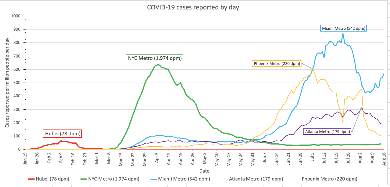
Just when it looked like the epidemic in Florida was getting better, cases are back up again in Miami. We’ll keep watching closely.
Want to give it a try? Please do! Here is my new spreadsheet (version 8), although God help you until I document it better. The good news is that you should only need to change the worksheet called Graphs, and only refer to the sheet called Daily to get the codes for each country. Also be warned, it’s so big that it calculates sloooooooooooooooowly. You will probably want to go to Settings -> Calculation and change Calculation Options to Manual. Then the spreadsheet will only calculate its updated numbers when you tell it to, by pressing F5 on Windows or Shift-Enter on Mac.
Pandemic updates tomorrow, and every day until the pandemic ends or I do.