Graphs day 153, pandemic day 160, day 230 since the first cases were diagnosed.
Total cases of COVID-19 diagnosed worldwide: 21,389,903
Total deaths: 772,373
Today’s Excel graph update comes from my weird home state of Florida. We’ve been following cases there for quite a while, but with the county health department data collected by Corona Data Scraper, we can look at patterns around the state in much greater detail. We’ll look at five urban areas: Miami, Tampa, Orlando, Pensacola – and Clewiston, a town of 7,000 people on the south shore of Lake Okeechobee. (Technically the data we’re looking at for the first four is for their metropolitan statistical areas, and Clewiston’s is for its micropolitan statistical area.)
Graphs are in the usual format, on the “Miami scale,” which runs from zero to 1,000 cases reported per million people per day. Urban areas are color-coded and labeled. Line thicknesses and label sizes are proportional to case fatality rates.
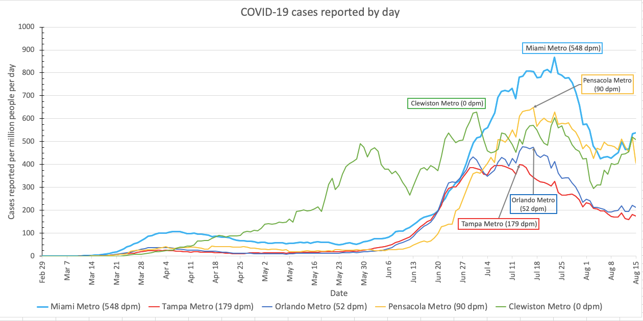
I also looked at the Jacksonville metropolitan area, and it follows almost exactly the same trend as Orlando.
And speaking of Florida, the Wang Mansion has sold! It’s now listed as Pending on Zillow. Which one of you lucky readers purchased it? (If you don’t know what I’m talking about, see my post from July 2020, Wangception.)
Want to give it a try? Please do! Here is my new spreadsheet (version 8), although God help you until I document it better. The good news is that you should only need to change the worksheet called Graphs, and only refer to the sheet called Daily to get the codes for each country. Also be warned, it’s so big that it calculates sloooooooooooooooowly. You will probably want to go to Settings -> Calculation and change Calculation Options to Manual. Then the spreadsheet will only calculate its updated numbers when you tell it to, by pressing F5 on Windows or Shift-Enter on Mac.
Pandemic updates tomorrow, and every day until the pandemic ends or I do.
Your article helped me a lot, is there any more related content? Thanks!