Democracy in the United States is not what it first appears.
Last week, we looked at how maps of the U.S. Senate can mislead, and I showed a new map that visually reflects the reality of state-by-state Senate representation, and also leaves room for additional information.
Today, we’ll the same thing for the more complicated example of the U.S. House of Representatives.

Unlike the Senate, where each state is represented equally by two Senators, representation in the House is based on population as recorded in the once-a-decade national census. The United States is divided into 435 Congressional Districts, and with a 2010 U.S. population of about 310 million, each House member represents about 700,000 people.
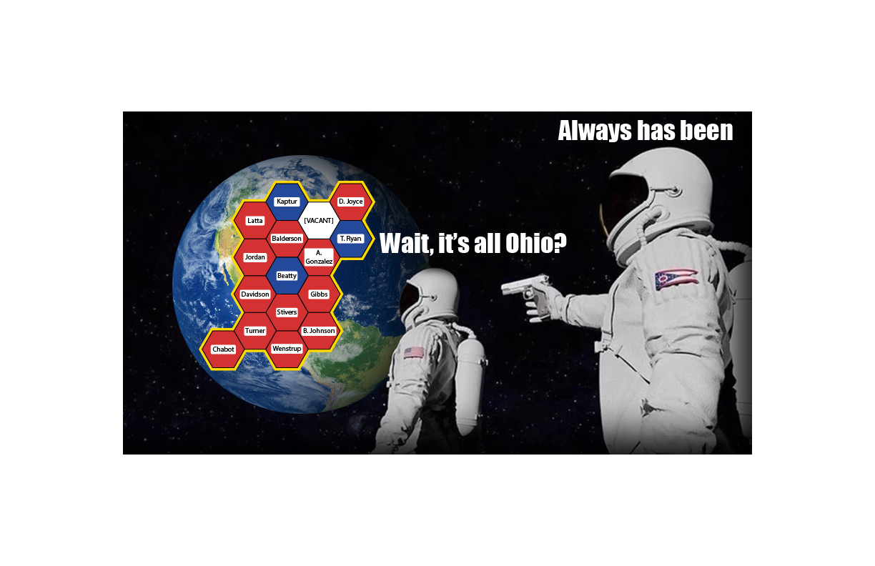
Districts are set and voted on at the state level, which means no matter how few people live in a state, that state is guaranteed to have at least one House member. The number of House members per state varies from one each in the lowest-population states (from Alaska to Montana) to 53 in California. The boundaries of each district are set by the state legislature or an entity they assign. Districts must be contiguous (no enclaves or exclaves), but other than that anything goes. This opens House representation to all sorts of partisan strategic fuc kery – but much more on that later.
The question here is: how can we visualize U.S. House membership in a way that fairly shows the distribution of power, and also leaves room for other information? I’ll follow the same approach I used to visualize the U.S. Senate.
Most depictions of the House of Representatives that I have seen fall into one of two categories.
This:
Click to open a larger version in a new window.
or this:

Click to open a larger version in a new window.
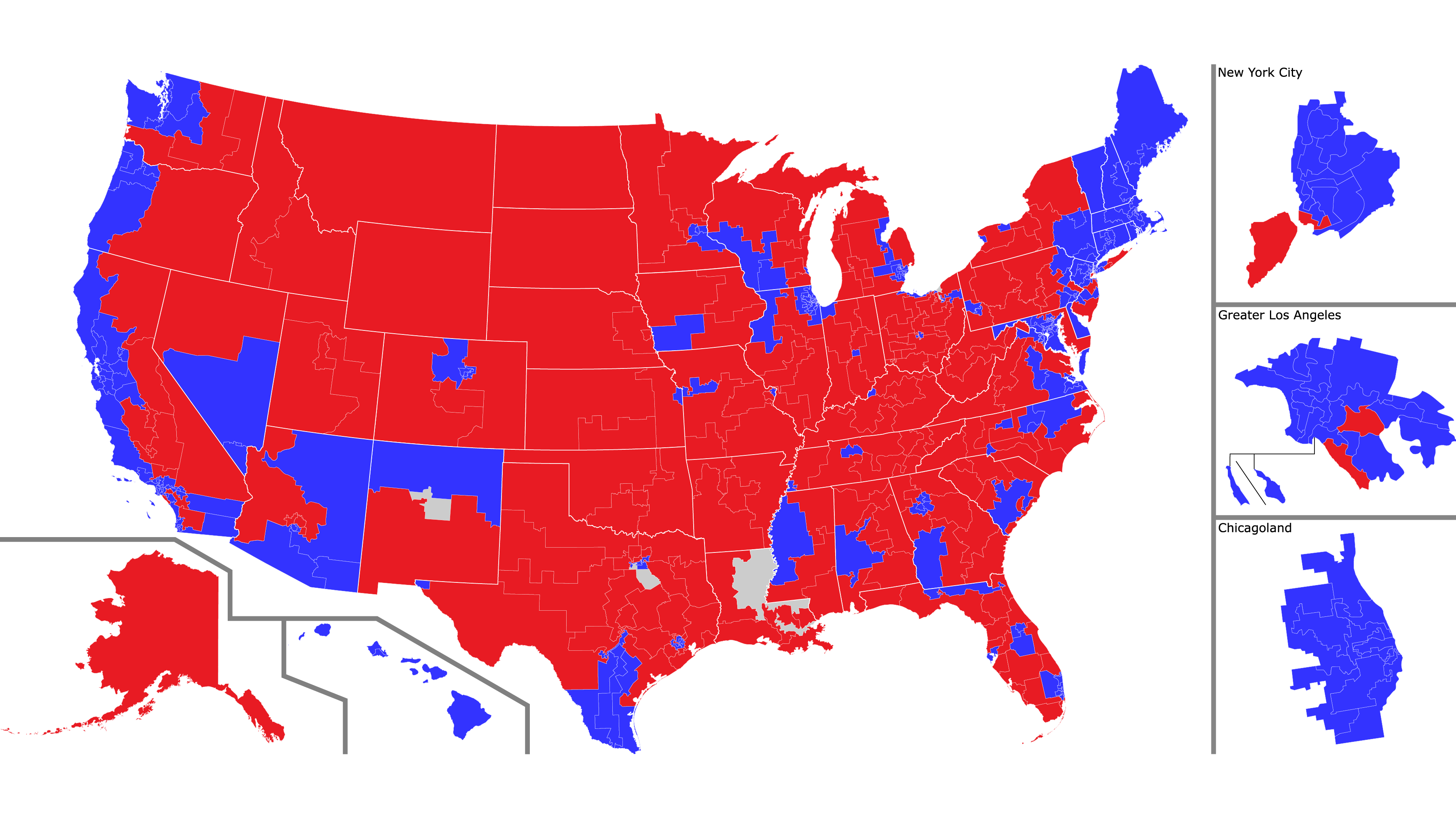
As we saw with the Senate, each of these views has advantages and disadvantages. The map view makes a clear connection with U.S. geography and shows district borders accurately, but the vastly different sizes of the districts make it look like a vast sea of red, when in reality the House has a Democratic majority. The dot view makes it clear that all districts enjoy equal representation, but at the price of making an abstract visualization that looks nothing like the United States.
And as with the Senate, why not combine the advantages of both, and add some more information to the visualization?
Like this (click to open a larger version in a new window):
Click on the map for a larger view – especially recommended this time so you can read the names of all the representatives
Each hexagon represents a single representative. The hexagons are color-coded, blue for Democratic, red for Republican, and white for vacant (Louisiana-2 is blue because the seat will be filled in a runoff special election on April 24th, but both candidates are Democratic).
States are outlined in yellow borders, each in its approximate position and orientation. In addition, whenever possible I put each district is in approximately its correct place in the state. For example, Florida’s 1st Congressional District sits at the western tip of the Florida Panhandle including Pensacola (and is represented by Republican pedophile Matt Gaetz, allegedly), so its hexagon at the far northwestern end. Florida’s 26th Congressional District includes Homestead and Key West (and is represented by Republican Carlos Giménez), so its hexagon is at the far southern tip.
As usual with images on this blog, you can click on the image to see a larger view, and in this case, I would definitely recommend it so you can read all the names. The linked image is quite large (3600 x 1996 pixels), so it may take time to load and you may need to scroll to see it all.
From now on, whenever I talk about the House, including in posts about future elections, I will use this map. I have some ideas about how to improve the map, and I’d love to hear yours.
So what’s next? As I alluded to above, real congressional districts are not hexagons. They are usually designed by state legislatures – and because state legislatures are partisan, districts can be drawn in a partisan way. And they are.
Welcome to Mapping Democracy!