Democracy in the United States is not what it first appears.
There are many reasons for this, of course, but I am convinced that one of the reasons is that the maps we use to understand are democracy are misleading. Consider the U.S. Senate: two senators per state. Most depictions of the Senate that I have seen fall into one of two categories.
This:
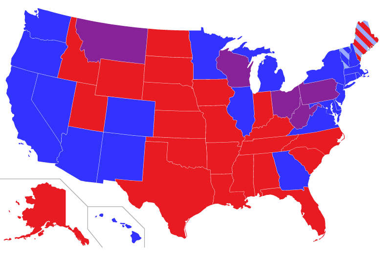
The light blue in Vermont and Maine stands for Independent Senators who work with the Democratic caucus
or this:

Each of these views has advantages and disadvantages. The map view makes a clear connection with U.S. geography and shows which parties represent which states, but it the different sizes of states obscure the fact that each Senator, regardless of how much land area the state takes up, gets exactly one vote. The dot view makes it clear that states are equal, but at the price of making an abstract visualization that looks nothing like the United States.
Why not combine the advantages of both, and add some more information to the visualization?
Like this (click to open a larger version in a new window):
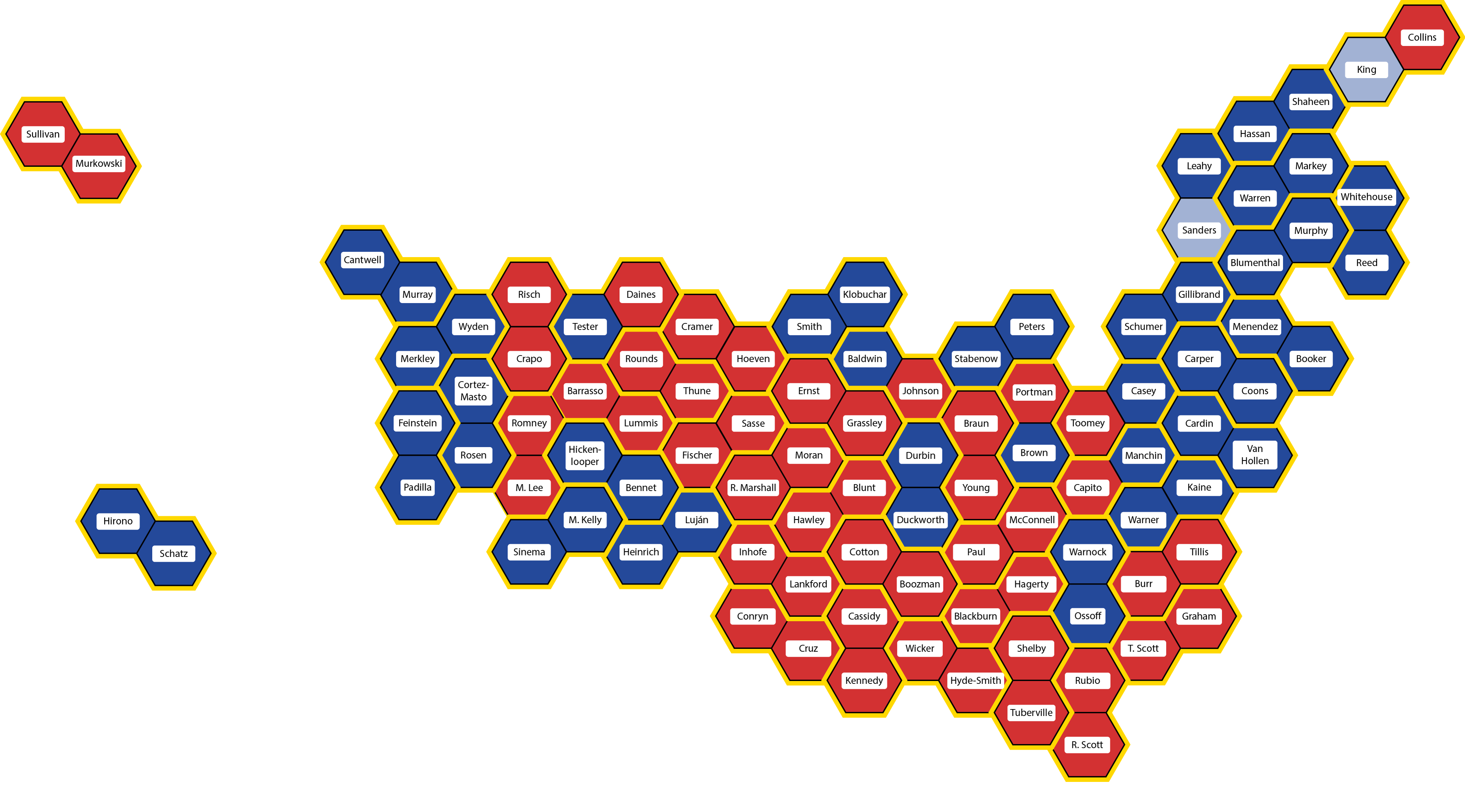
Click on the map for a larger view – especially recommended this time so you can read the names of the Senators
Each state, no matter how large or small, no matter how many or few people live there, is represented by two Senators. So in this visualization, each state has a yellow outline, and is placed approximately in its appropriate position and orientation. Maine is the tip of the mammoth’s trunk, Florida is its front hoof, Washington state is its tail, and so on.
Each state consists of two hexagons, one per Senator. Hexagons are color-coded by party: blue for Democratic, red for Republican, and light blue for the two Independent Senators who have joined the Democratic caucus.
And that’s another advantage of this map compared to the first: Ohio is not represented by a Senator from the Purple Party, it is represented by Democratic Senator Sherrod Brown and Republican Rob Porter. Lastly, each hexagon is labeled with each Senator’s name.

As usual with images on this blog, you can click on the image to see a larger view, and in this case, I would definitely recommend it so you can read all the names. The linked image is quite large (3600 x 1996 pixels), so it may take time to load and you may need to scroll to see it all.
From now on, whenever I talk about the Senate, including in posts about future elections, I will use this map. I have some ideas about how to improve the map, and I’d love to hear yours. And if you know anything about American democracy, you can probably guess what’s next.
Welcome to Mapping Democracy!
One thought on “Mapping Democracy: the 117th U.S. Senate”
Comments are closed.