The state of the House, what remains, and what it means

EDIT: I originally said Oregon’s 5th district was still undecided; it was actually Oregon’s 6th district, containing the far southwestern suburbs of Portland

We still don’t know all the members of the House of Representatives for the incoming 118th United States Congress. We don’t even know which party will be in the majority.

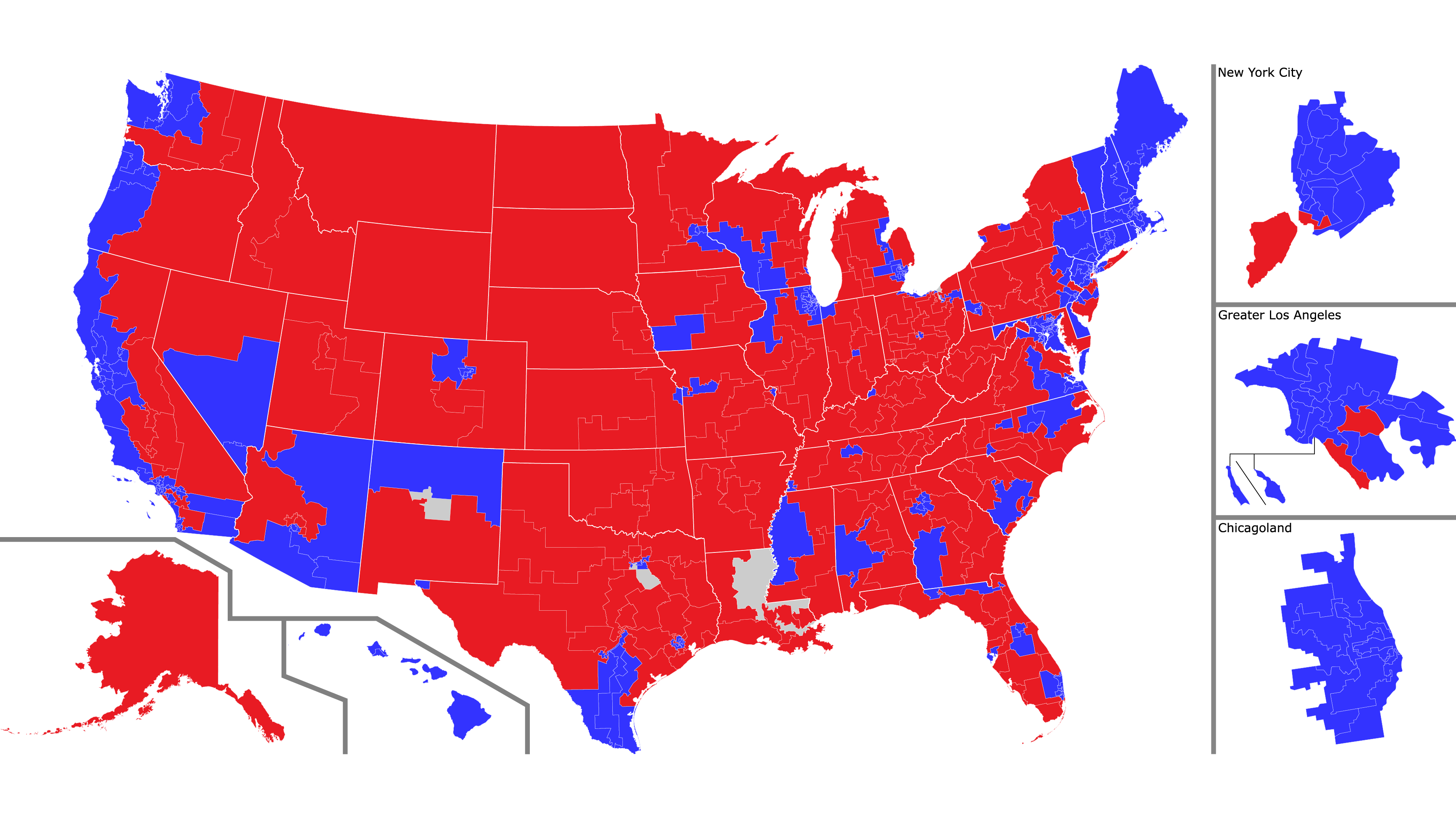
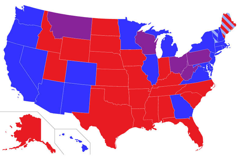
Here’s what we do know so far, presented in the usual Mapping Democracy map style. White ? hexagons are seats that are still undecided. Click for a larger view.
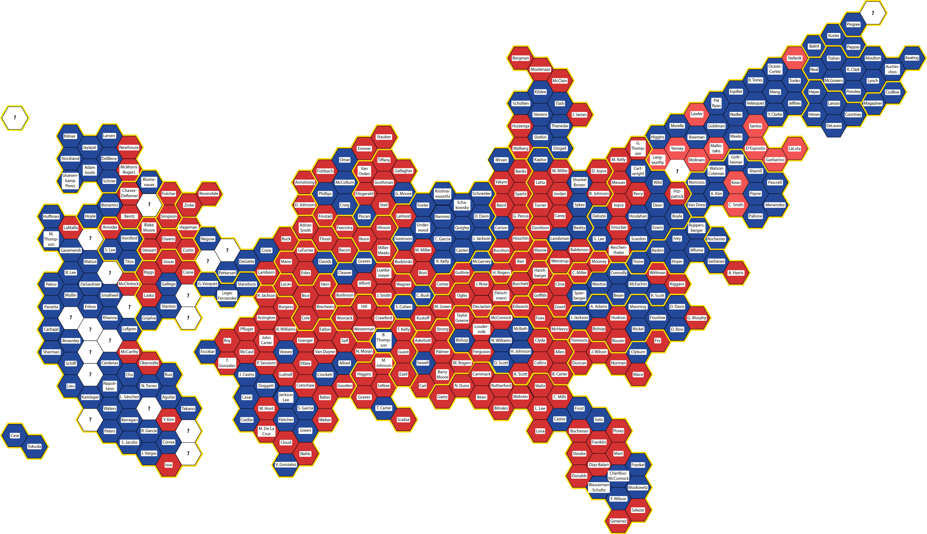
The current state of the House of Representatives, with 20 seats undecided.
Red = Republican
Blue = Democratic
White = party undecided
Click for a full-size version.

The current count by party is Republican 212, Democratic 203. Twenty seats are still up for grabs: one each in Alaska, Maine, New York, and Oregon; two each in Arizona and Colorado; and twelve in California. Halfway, at 218 seats, is enough for control – so Republicans must win six of the remaining seats to hold the advantage. That seems likely, but whothehellknows.

If Republicans do get the majority, what happens? Obviously, it would be harder to pass legislation with different parties controlling the House and Senate – but maybe not impossible. Remember that Republicans in the House will face the same Joe Manchin Effect a the Democratic Senate – the closer the margin, the more people will need to be convinced to vote for the party line. And representatives from competitive districts will have an incentive to show their voters that they are willing to stand up to the party line.

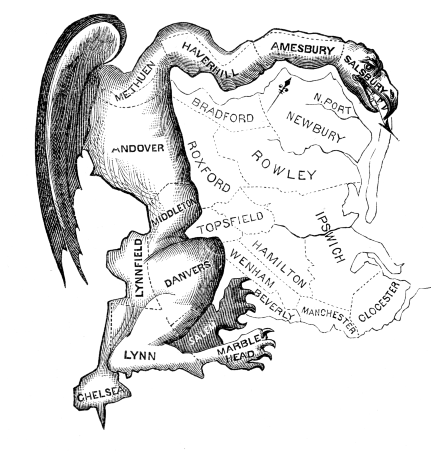
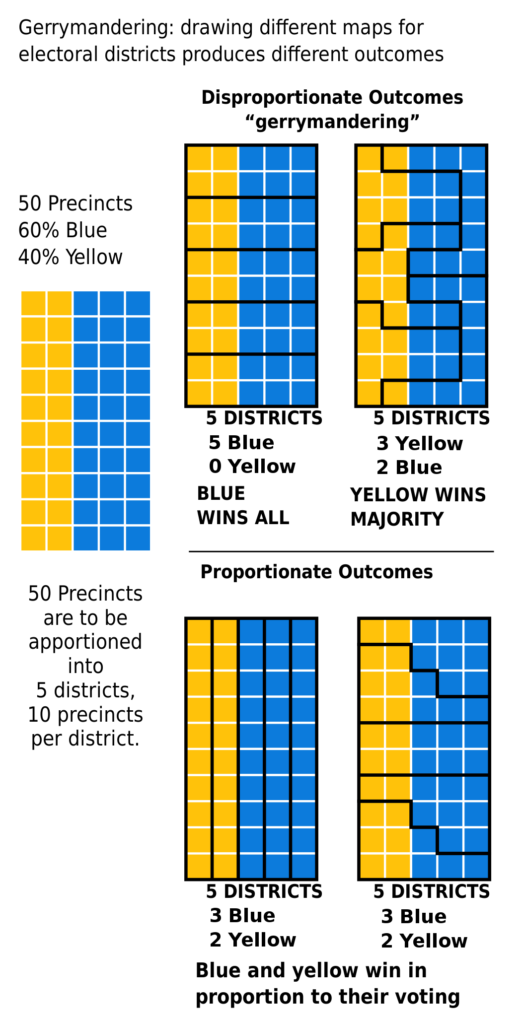
With gerrymandering, are there enough competitive seats to make a difference? Yes, obviously – after all, there are still 20 seats up for grabs now, nearly a week after votes were cast. Here are those districts, with information about where they are:

Alaska at large: the entire state

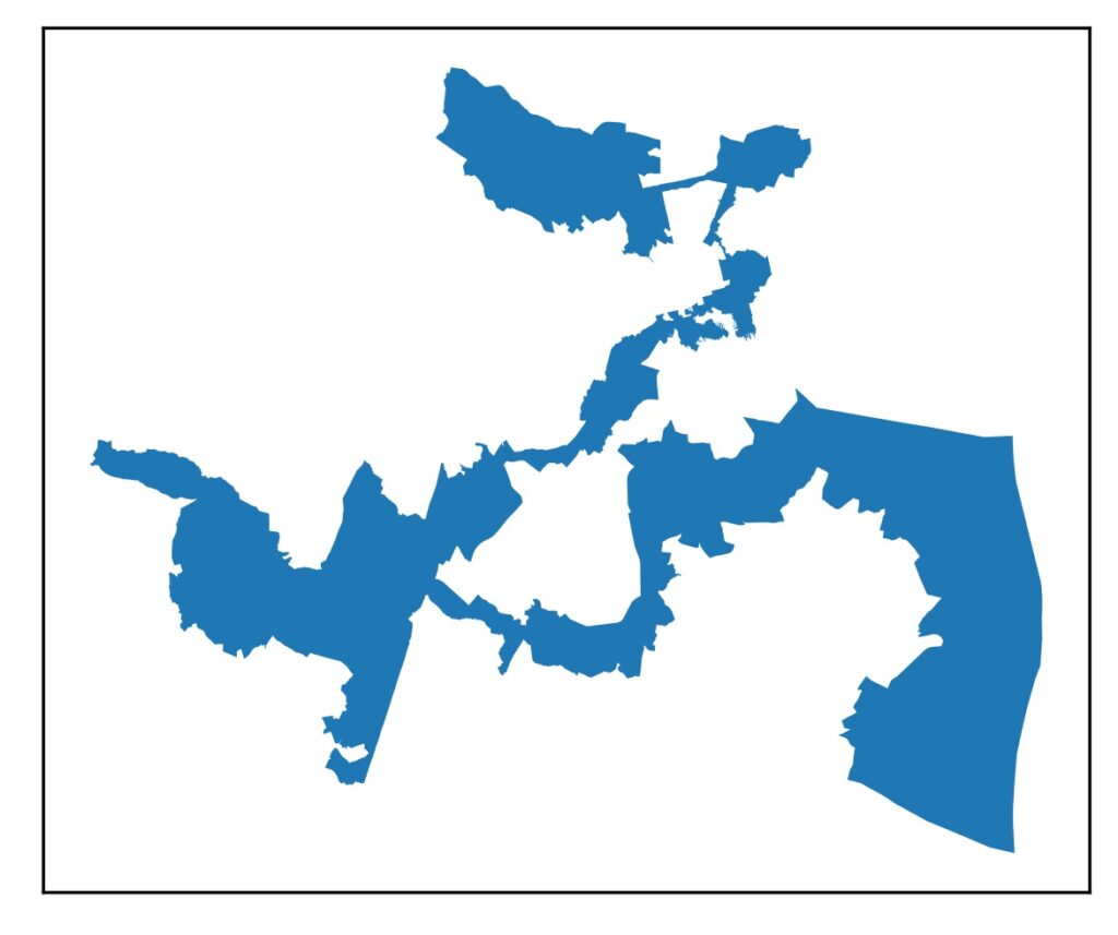
Arizona-1: the northeastern quarter of the state, plus a gerrymandered bit of the northwestern suburbs of Phoenix – parts of Scottsdale and Paradise Valley

Arizona-6: the northeastern suburbs of Phoenix, including parts of Scottsdale and Paradise Valley

California-3: the rural Sierra Nevada mountains and the northeastern suburbs of Sacramento, including Roseville

California-6: the northern half of the city of Sacramento, and parts of Arden-Arcade and Rancho Cordova

California-9: Stockton and surrounding areas of San Joaquin County

California-13: Merced and surrounding areas

California-21: Fresno and the southern San Joaquin Valley

California-22: The eastern half of Bakersfield and rural areas to the north

California-27: Northern Los Angeles County, including Lancaster, Palmdale, Glendora, and Pasadena

California-34: The eastern part of the city of Los Angeles

California-41: Moreno Valley, Palm Springs, and the southern part of the city of Riverside

California-45: Irvine and northern Orange County

California-47: Long Beach and coastal Orange County

California-49: Oceanside and San Juan Capistrano

Colorado-3: Pueblo, Grand Junction, and the rural western third of the state

Colorado-8: Northeast of Denver

Maine-2: Mostly-rural northern and eastern Maine

New York-22: Utica, Binghamton, and surrounding areas

Oregon-6: The southwestern suburbs of Portland

As results are announced in these 20 districts, I’ll update the non-misleading map accordingly.

Gerrymandering Part 1: WTF?

What the hell is this?

Impractical cardboard earmuffs? Rhode Island and Anti-Rhode Island about to disappear in a flash of cosmic rays?

…or how about this?

A top-heavy steam shovel falling off a cliff? The Big Dipper viewed from inside a black hole?

…or this?

Did someone build a bridge to from Norway to Panama, and did Spain grow antlers?

No. These are United States Congressional districts under the influence of gerrymandering (from top to bottom, Illinois-4, Texas-2, and Texas-33).

What is gerrymandering, and how does it work?

Gerrymandering is the art and science of drawing the borders of Congressional districts to give an advantage to a political party or some other segment of the population.

Article 1 Section 2 of the U.S. Constitution says that the House of Representatives is elected by voters every two years. The number of representatives that each state gets is proportional to the population of the state, recalculated every ten years from the results of the decennial U.S. census. And that’s it.

The Constitution gives no details on how the representatives are distributed within the state, and different states had different practices. It took an act of Congress, the Apportionment Act of 1842, to standardize the process. Ever since, each state has been divided into districts, with one representative per district. This makes good sense – the citizens of Watertown, New York have very different needs from the citizens of Lower Manhattan, and they deserve to elect a representative who they believe will best meet their needs.

So how do you go from this general principle of local representatives to specific districts to be represented? In general, it’s up to each state legislature to divide the state into congressional districts. Districts must be contiguous (covering a single area, with no holes or outlying areas), and must have approximately equal populations. Other than that, and a few other legal requirements and guidelines we’ll look at later, it’s entirely up to the state legislature.

Leaving something so fundamental to the political process in the hands of a potentially partisan state legislature is a recipe for parties using the process to their advantage – and indeed, history has shown that creative assignment of congressional districts is one of democracy’s most effective cheat codes.

The "Gerrymander" political cartoon from 1812, showing the salamander-shaped district created by Elbridge Gerry as an actual salamander
The Gerrymander illustration by Elkanah Tisdale, 1812

The name comes from the first famous proponent of the practice, former Massachusetts Governor Elbridge Gerry. In 1812, Gerry was in charge of designing Massachusetts’s 20 electoral districts (Massachusetts elected representatives by district even before the Apportionment Act of 1842 required it).

Gerry was a member of the Democratic-Republican Party in a state with a majority of voters from the opposing Federalist Party. He figured out the One Weird Trick to guarantee his party a House seat by connecting multiple Democratic-Republican strongholds west of Boston into a single long, narrow district. Federalists looked at a map of the district and noticed that it looked like a salamander, so they named it the “Gerrymander.” The carton shown here helped popularize the name, and solidified the opposition to Gerry’s proposal. The name stuck, and has been adopted worldwide – as a verb, adjective, and noun to describe the practice and its effects. (Interesting aside: Gerry’s name is pronounced with a hard G, as in gay, while the eponymous practice of gerrymandering is pronounced with a soft G, as in “Genesis Device.” I have no idea how that change happened).

An illustration of how gerrymandering can lead to different representation for the same voters
Image by Wikipedia user M.Boli

This diagram from Wikipedia is a great simple illustration of how gerrymandering works in practice. The rectangle shows an imaginary state where 60 percent of voters vote for the Blue Party and 40 percent for the Yellow Party. Where the state legislature draws the lines around districts will have a massive effect on how the state is represented.

It is easily possible to draw lines resulting in a majority of representatives for the Yellow Party, despite a clear voter preference for the Blue Party – or alternatively, to elect only Blue representatives, ignoring the opinions of 40 percent of voters. Or, hopefully, to design a legislature that really represents the will of the people.

Stay tuned, because over the next several weeks (or months?), we’ll be taking a deep, deep dive into gerrymandering, with lots of maps and datasets to guide us. Along the way, we’ll explore the reasons for gerrymandering, the strategies used to enact it, and how it is employed (or not) in countries around the world. And, maybe most importantly, we’ll go state by state to look for ways to draw electoral district maps more fairly.

Coming up on Wednesday: a simple measure of how gerrymandered a state is, based solely on how weird the shape of the district is. This will make more sense once I tell you about the metric, but an obvious question is: what is the most weirdly-shaped district in the entire United States?

Right here. It’s the district I lived in from 2003 to 2021: Maryland’s 3rd district. Behold:

Maryland’s 3rd Congressional District (?!!)

Mapping Democracy: the 117th U.S. House of Representatives

Democracy in the United States is not what it first appears.

Last week, we looked at how maps of the U.S. Senate can mislead, and I showed a new map that visually reflects the reality of state-by-state Senate representation, and also leaves room for additional information.

Today, we’ll the same thing for the more complicated example of the U.S. House of Representatives.

Don’t worry, I’ll explain this later in the post (click to open a larger version in a new tab)

Unlike the Senate, where each state is represented equally by two Senators, representation in the House is based on population as recorded in the once-a-decade national census. The United States is divided into 435 Congressional Districts, and with a 2010 U.S. population of about 310 million, each House member represents about 700,000 people.

Districts are set and voted on at the state level, which means no matter how few people live in a state, that state is guaranteed to have at least one House member. The number of House members per state varies from one each in the lowest-population states (from Alaska to Montana) to 53 in California. The boundaries of each district are set by the state legislature or an entity they assign. Districts must be contiguous (no enclaves or exclaves), but other than that anything goes. This opens House representation to all sorts of partisan strategic fuc kery – but much more on that later.

The question here is: how can we visualize U.S. House membership in a way that fairly shows the distribution of power, and also leaves room for other information? I’ll follow the same approach I used to visualize the U.S. Senate.

Most depictions of the House of Representatives that I have seen fall into one of two categories.

This:

A traditional map of the U.S. House of Representatives with accurately-drawn districts
A map of U.S. House of Representatives districts with accurate borders. The main map shows the entire U.S., with side maps for: Alaska, Hawaii, New York City, greater Los Angeles, and greater Chicago.

Click to open a larger version in a new window.

or this:

A graph of the House of Representatives showing one dot per representative
A more abstract map of the House: one dot equals one representative. Red = Republican, blue = Democratic, gray= currently vacant

Click to open a larger version in a new window.

As we saw with the Senate, each of these views has advantages and disadvantages. The map view makes a clear connection with U.S. geography and shows district borders accurately, but the vastly different sizes of the districts make it look like a vast sea of red, when in reality the House has a Democratic majority. The dot view makes it clear that all districts enjoy equal representation, but at the price of making an abstract visualization that looks nothing like the United States.

And as with the Senate, why not combine the advantages of both, and add some more information to the visualization?

Like this (click to open a larger version in a new window):

Map of the U.S. House of Representatives with colors representing parties: blue = Democratic (220), red = Republican (212), white = vacant (4)
Each hexagon represents one U.S. House member. States are in their approximately correct geographic positions, outlined in yellow, and each district is in approximately its correct place in the state. The colors are the same as before, and each hexagon is labeled with the name of that district’s representative.

Click on the map for a larger view – especially recommended this time so you can read the names of all the representatives

Each hexagon represents a single representative. The hexagons are color-coded, blue for Democratic, red for Republican, and white for vacant (Louisiana-2 is blue because the seat will be filled in a runoff special election on April 24th, but both candidates are Democratic).

States are outlined in yellow borders, each in its approximate position and orientation. In addition, whenever possible I put each district is in approximately its correct place in the state. For example, Florida’s 1st Congressional District sits at the western tip of the Florida Panhandle including Pensacola (and is represented by Republican pedophile Matt Gaetz, allegedly), so its hexagon at the far northwestern end. Florida’s 26th Congressional District includes Homestead and Key West (and is represented by Republican Carlos Giménez), so its hexagon is at the far southern tip.

An American astronaut realizes that Earth is all the Ohio House map before an Ohio astronaut shoots him
It’s all Ohio: Ohio’s 16 congressional districts (click for a larger meme)

As usual with images on this blog, you can click on the image to see a larger view, and in this case, I would definitely recommend it so you can read all the names. The linked image is quite large (3600 x 1996 pixels), so it may take time to load and you may need to scroll to see it all.

From now on, whenever I talk about the House, including in posts about future elections, I will use this map. I have some ideas about how to improve the map, and I’d love to hear yours.

So what’s next? As I alluded to above, real congressional districts are not hexagons. They are usually designed by state legislatures – and because state legislatures are partisan, districts can be drawn in a partisan way. And they are.

Welcome to Mapping Democracy!

Mapping Democracy: the 117th U.S. Senate

Democracy in the United States is not what it first appears.

There are many reasons for this, of course, but I am convinced that one of the reasons is that the maps we use to understand are democracy are misleading. Consider the U.S. Senate: two senators per state. Most depictions of the Senate that I have seen fall into one of two categories.

This:

Senators by state: blue = two Democratic Senators, red = two Republican Senators, purple = one of each
The light blue in Vermont and Maine stands for Independent Senators who work with the Democratic caucus

or this:

A more abstract map of the Senate: one dot equals one Senator. Red = Republican, blue = Democratic, light blue = Independent caucusing Democratic

Each of these views has advantages and disadvantages. The map view makes a clear connection with U.S. geography and shows which parties represent which states, but it the different sizes of states obscure the fact that each Senator, regardless of how much land area the state takes up, gets exactly one vote. The dot view makes it clear that states are equal, but at the price of making an abstract visualization that looks nothing like the United States.

Why not combine the advantages of both, and add some more information to the visualization?

Like this (click to open a larger version in a new window):

Each hexagon represents one senator. States are in their approximately correct geographic positions, outlined in yellow. The colors are the same as before, and each hexagon is labeled with the name of a Senator.

Click on the map for a larger view – especially recommended this time so you can read the names of the Senators

Each state, no matter how large or small, no matter how many or few people live there, is represented by two Senators. So in this visualization, each state has a yellow outline, and is placed approximately in its appropriate position and orientation. Maine is the tip of the mammoth’s trunk, Florida is its front hoof, Washington state is its tail, and so on.

Each state consists of two hexagons, one per Senator. Hexagons are color-coded by party: blue for Democratic, red for Republican, and light blue for the two Independent Senators who have joined the Democratic caucus.

And that’s another advantage of this map compared to the first: Ohio is not represented by a Senator from the Purple Party, it is represented by Democratic Senator Sherrod Brown and Republican Rob Porter. Lastly, each hexagon is labeled with each Senator’s name.

All Ohio: Senators Sherrod Brown (D-OH) and Rob Portman (R-OH)

As usual with images on this blog, you can click on the image to see a larger view, and in this case, I would definitely recommend it so you can read all the names. The linked image is quite large (3600 x 1996 pixels), so it may take time to load and you may need to scroll to see it all.

From now on, whenever I talk about the Senate, including in posts about future elections, I will use this map. I have some ideas about how to improve the map, and I’d love to hear yours. And if you know anything about American democracy, you can probably guess what’s next.

Welcome to Mapping Democracy!

Mapping Democracy: The U.S. House of Representatives

There’s a lot more to our democracy than just the President. On Wednesday, I showed you a map of current U.S. Senators, and explained how the clustering of similar states fools your eyes and brain into seeing our urban-rural divide as a divide between the coasts and the middle of the country.

Today, I map the U.S. House of Representatives. The map is below. As before, each hexagon shows one elected representative. I show all the representatives for a single state together, enclosed by a thicker yellow line; the number of representatives varies from one each (Alaska, Wyoming, Montana, North Dakota, South Dakota, Vermont) to fifty-three (California).

I also tried to keep the locations of districts within states roughly geographically accurate. For example, New York’s 26th District covers the city of Buffalo in Western New York, and so in the map it is second from the left in New York.

Red shows Republican representatives, blue shows Democratic representatives, and white shows a few vacant seats whose incumbents died or resigned in the second year of their terms. The single splotch of yellow is Michigan District 3, represented by Justin Amash, who switched to the Libertarian Party in April 2020 and became the first third-party representative in seventy years. Unfortunately for third parties everywhere, he is not running for re-election. Each district is labeled with the name of the person who represents it (and bite me for having the same last name and first initial, Adam Smith [D-WA9] and Adrian Smith [R-NE3]).

The map below is so compressed that the names are extremely hard to read, so if you’d like to see who represents where, click for a larger version.

Map of U.S. House representatives. Red hexagons show Republican senators, blue hexagons show Democratic senators, yellow shows Libertarian, and white shows vacant seats.

Click for a larger version.

What can we learn from this map?

House districts are designed to give equal representation to all Americans, so by definition and by design the House shows a more accurate picture of the state of American democracy. Each district is home to about 700,000 people (the 308.7 million people in the 2010 U.S. Census divided by the 435 available seats). The specific boundaries of the districts are set by state legislatures, sometimes with hilarious consequences, but that’s a post for another day.

The map makes it much clearer that the blue/red divide (the colors are still arbitrary) is driven not by state boundaries, nor by each state’s positions within the nation. Rather, the partisan divide is actually an urban/rural divide. It’s easy to see that in this map, where I have graffiti-circled and labeled the metro areas of Denver, Chicago, Houston, and Atlanta. Those areas tend to elect Democratic representatives, while the rural areas of their states tend to elect Republican representatives.

The same map as above, but with four metro areas circled.

Now that I’ve got these maps of the composition of the U.S. Senate and House today, I can use them to predict what the composition might be after next month’s elections. That’s coming next, along with an updated prediction for the 2020 Presidential Election.