There’s a lot more to our democracy than just the President. On Wednesday, I showed you a map of current U.S. Senators, and explained how the clustering of similar states fools your eyes and brain into seeing our urban-rural divide as a divide between the coasts and the middle of the country.
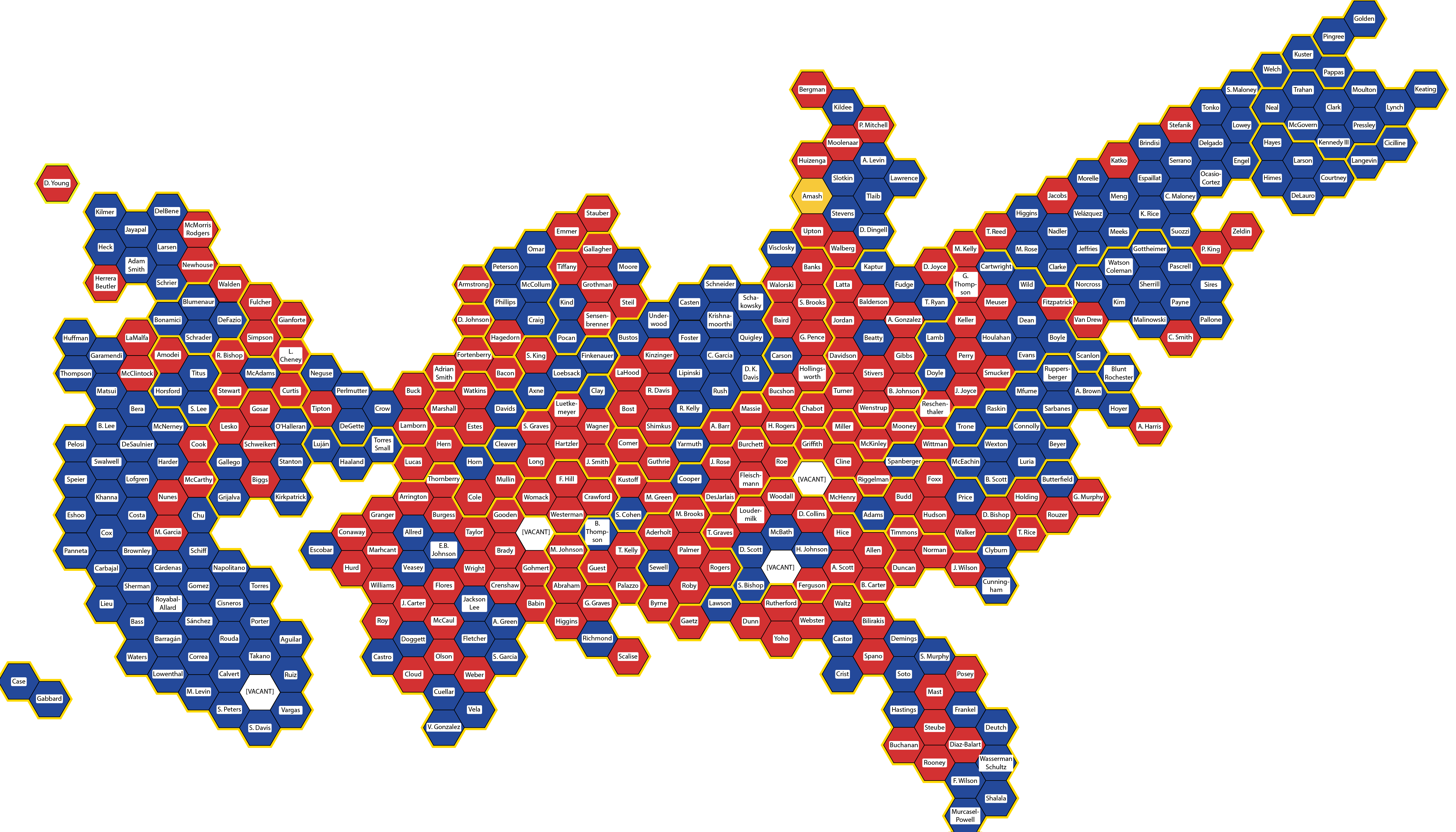
Today, I map the U.S. House of Representatives. The map is below. As before, each hexagon shows one elected representative. I show all the representatives for a single state together, enclosed by a thicker yellow line; the number of representatives varies from one each (Alaska, Wyoming, Montana, North Dakota, South Dakota, Vermont) to fifty-three (California).
I also tried to keep the locations of districts within states roughly geographically accurate. For example, New York’s 26th District covers the city of Buffalo in Western New York, and so in the map it is second from the left in New York.
Red shows Republican representatives, blue shows Democratic representatives, and white shows a few vacant seats whose incumbents died or resigned in the second year of their terms. The single splotch of yellow is Michigan District 3, represented by Justin Amash, who switched to the Libertarian Party in April 2020 and became the first third-party representative in seventy years. Unfortunately for third parties everywhere, he is not running for re-election. Each district is labeled with the name of the person who represents it (and bite me for having the same last name and first initial, Adam Smith [D-WA9] and Adrian Smith [R-NE3]).
The map below is so compressed that the names are extremely hard to read, so if you’d like to see who represents where, click for a larger version.
Click for a larger version.
What can we learn from this map?
House districts are designed to give equal representation to all Americans, so by definition and by design the House shows a more accurate picture of the state of American democracy. Each district is home to about 700,000 people (the 308.7 million people in the 2010 U.S. Census divided by the 435 available seats). The specific boundaries of the districts are set by state legislatures, sometimes with hilarious consequences, but that’s a post for another day.
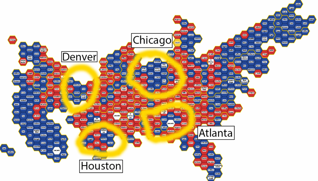
The map makes it much clearer that the blue/red divide (the colors are still arbitrary) is driven not by state boundaries, nor by each state’s positions within the nation. Rather, the partisan divide is actually an urban/rural divide. It’s easy to see that in this map, where I have graffiti-circled and labeled the metro areas of Denver, Chicago, Houston, and Atlanta. Those areas tend to elect Democratic representatives, while the rural areas of their states tend to elect Republican representatives.
Now that I’ve got these maps of the composition of the U.S. Senate and House today, I can use them to predict what the composition might be after next month’s elections. That’s coming next, along with an updated prediction for the 2020 Presidential Election.