Graphs day 145, pandemic day 152, day 222 since the first cases were diagnosed. Remember that Very Exciting New Idea that I was working on last week? I’ve spent almost the entire weekend working on it, and It’s almost done – you’ll definitely see it this week! For today, here’s a quick update on COVID-19 numbers around the world.
Total cases of COVID-19 diagnosed worldwide: 19,637,506
Total deaths: 726,781
Happy Independence Day to Singapore, we’ll include their numbers in today’s graphs. And some countries have changed categories today.
Usual graphs and labels for all five categories today. All five graphs are in the usual styles. The main graph is on the regular scale, from zero to 200 new cases diagnosed per day per million people. Where there are smaller inset graphs, they are on the “Qatar scale,†which runs from zero to 700 cases per million people. Each country gets a unique color in each graph (although the colors can repeat across graphs). Line labels show the name of the region, and also the mortality rate (cumulative deaths per million people) in the region – cumulative because the dead stay dead. The thickness of the lines and the size of the labels depend on the cumulative case fatality rate – the number of people who died divided by the number diagnosed.
Regions where COVID-19 was quickly contained
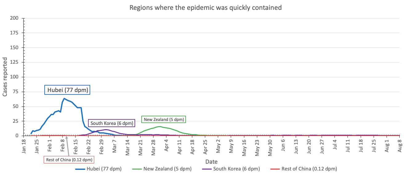
No changes to this category. In fact, New Zealand has now gone 100 days without community transmission (virus transmission from one person to another within New Zealand). That is an incredible achievement.
Regions where COVID-19 is currently under control(-ish)
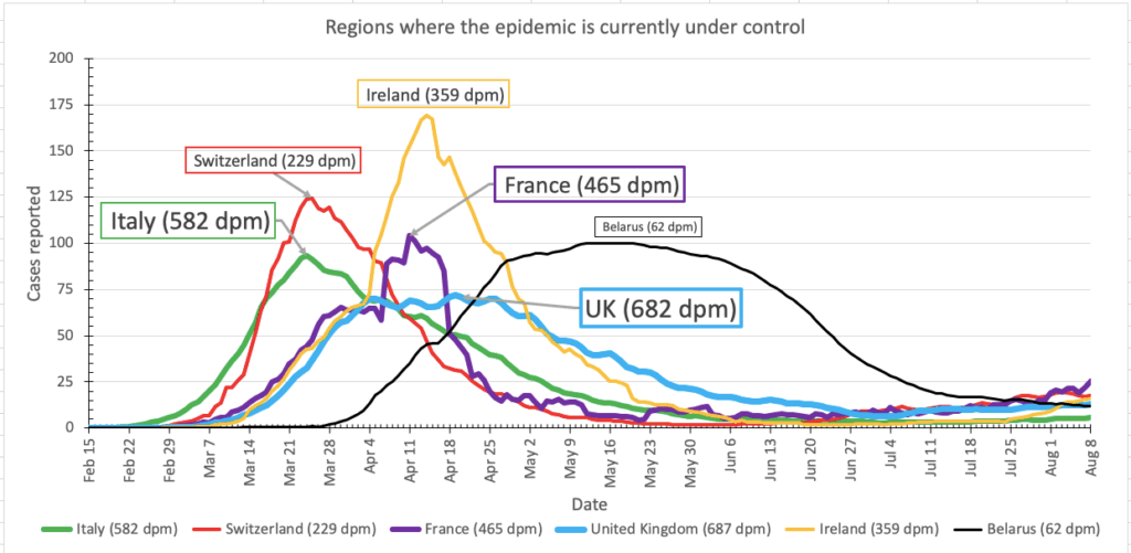
The last two weeks have seen a worrying increase in cases in France, but not enough to move France out of the under control category.
Regions moving in the right direction(-ish)
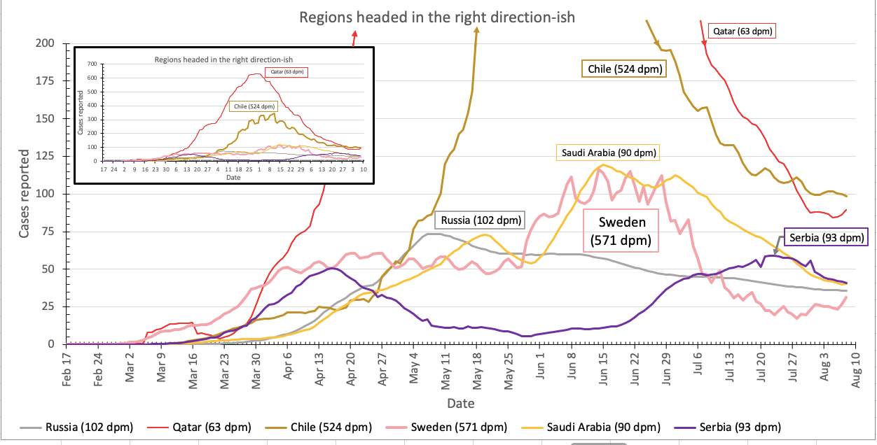
Welcome to getting better, Serbia!
And the rate of new cases reported in Sweden continues at a level lower than Russia and Saudi Arabia. Sweden took a risk by having less restrictive social distancing laws than nearby countries. Is the risk paying off? Not so far – even though cases are low right now, the death rate in Sweden is far higher than other countries. Sweden is playing the long game, betting that in the long run their approach will be more sustainable and deaths in other countries will inevitably catch up. We’ll see. The long game is the only game worth playing.
Regions experiencing a second wave of COVID-19 cases
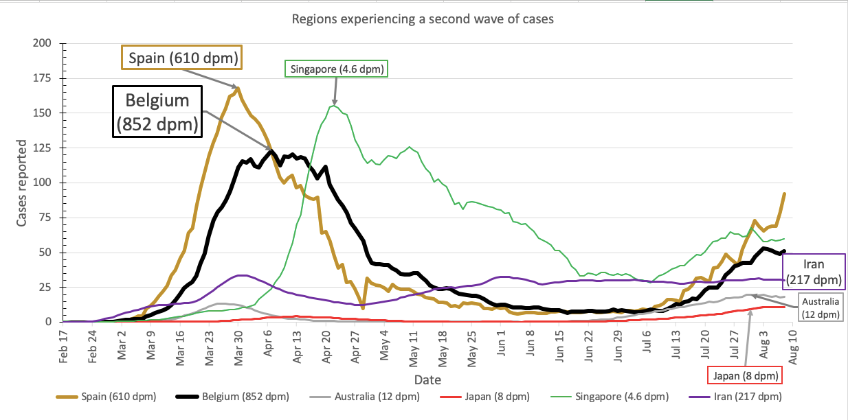
This is the graph where Singapore goes, where cases have been increasing since early July. Also, it’s been a while since we’ve checked in with Iran, where cases started to increase in late April but have stayed at a fairly low level since.
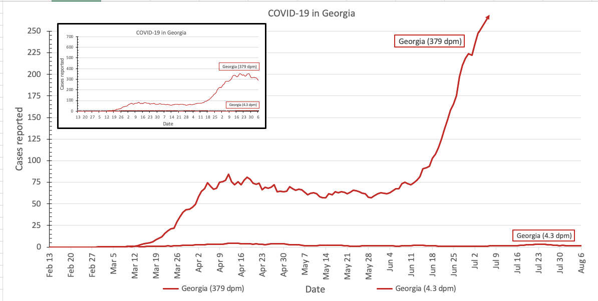
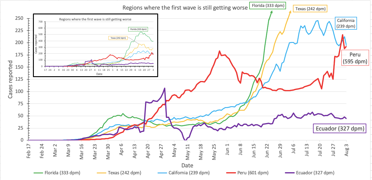
Regions where the first wave of COVID-19 continues to get worse
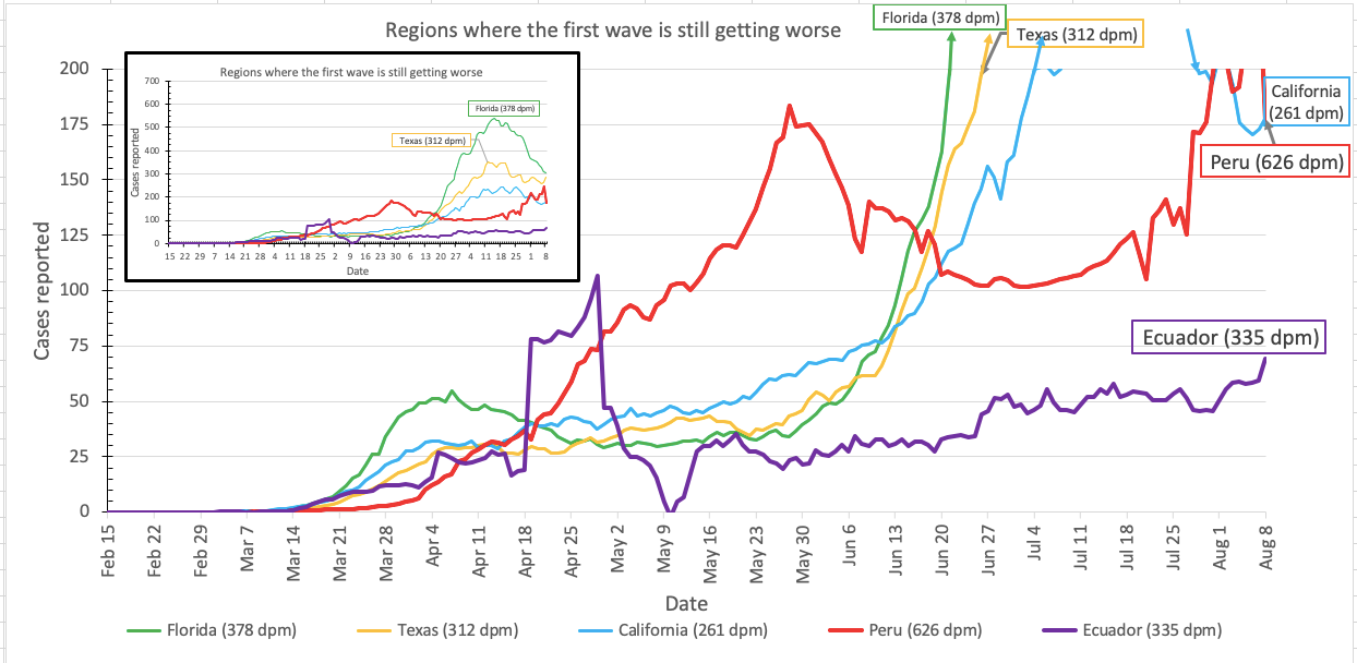
Reported cases continue to decrease in Florida.
Want to give it a try? Please do! Here is version 7.2 of my spreadsheet.
Pandemic updates tomorrow, and every day until the pandemic ends or I do.