Today’s post has the same general idea as yesterday’s post – how can we begin to understand the scale of the tragedy that is the Taliban taking over Afghanistan?
It can be difficult, because Afghanistan feels so far away and so mysterious. So I make a simple map of the cities in Afghanistan and their populations, supplemented by another map labeling each city with the name of a city with roughly the same population.
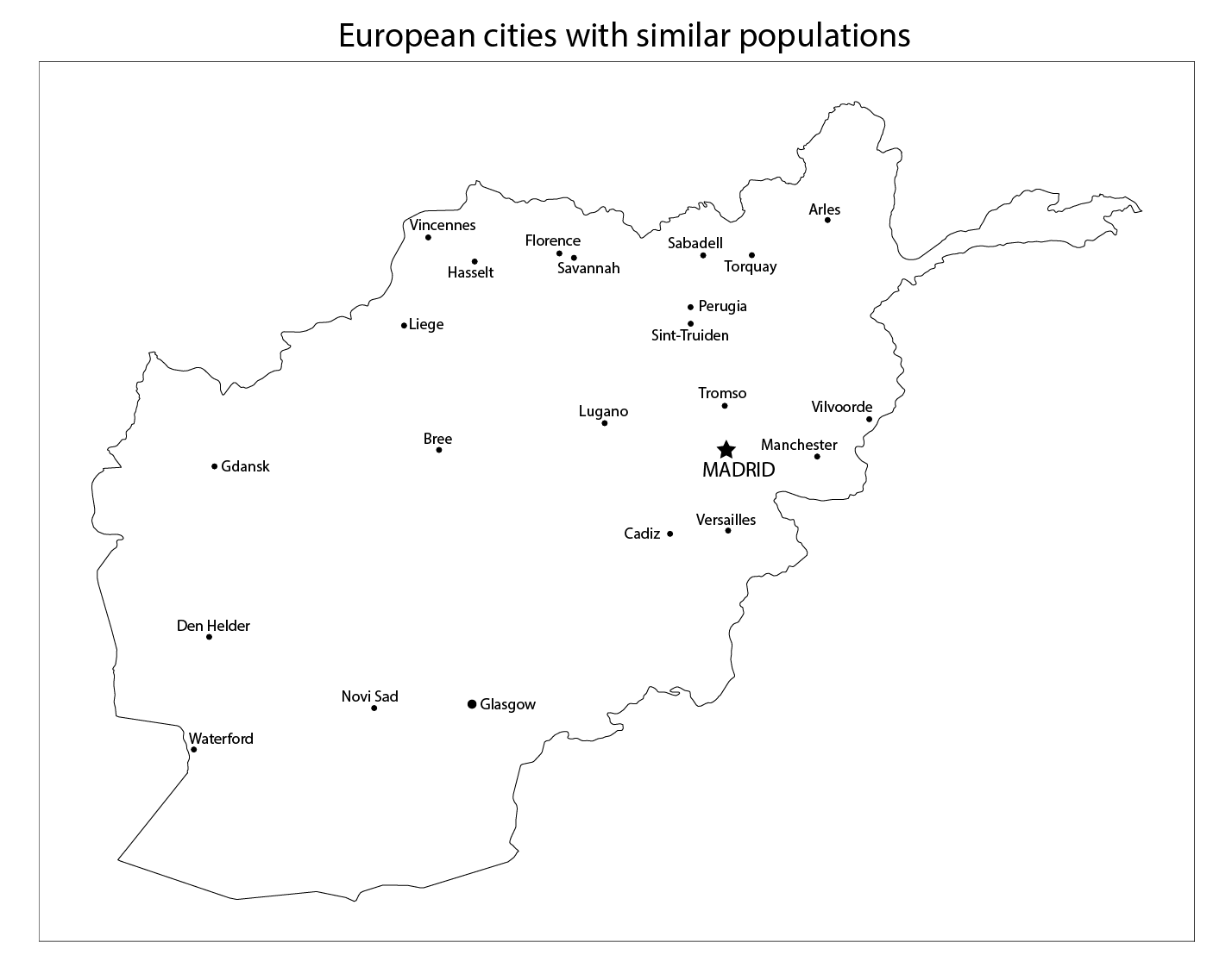
Yesterday, I chose those equivalent-population city labels from cities in the United States; today, I am labeling Afghan cities with the names of cities in Europe with similar populations. See the footnote at the end of this post to learn how I did it, and how you can make a similar map of your own.
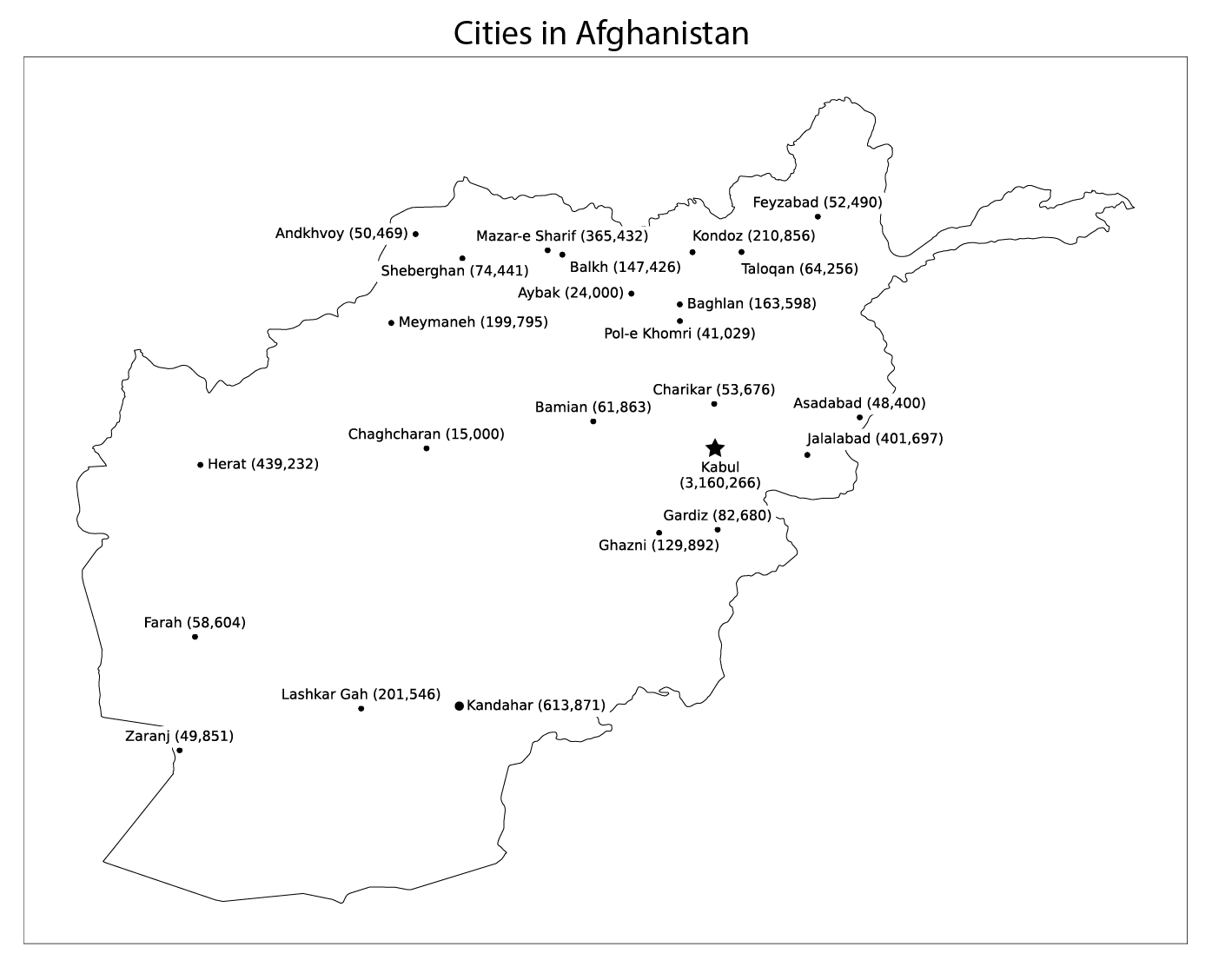
Here it is, my map of Afghanistan, with major cities and their populations (click on the image for a larger version):
Cities in Afghanistan (click for a larger version)
And here is the same map, but with Afghan cities relabled with cities in Europe with similar populations. As you can see, there are some very big cities in Afghanistan.
Cities in Afghanistan labeled with European cities of equivalent population (click for a larger version)
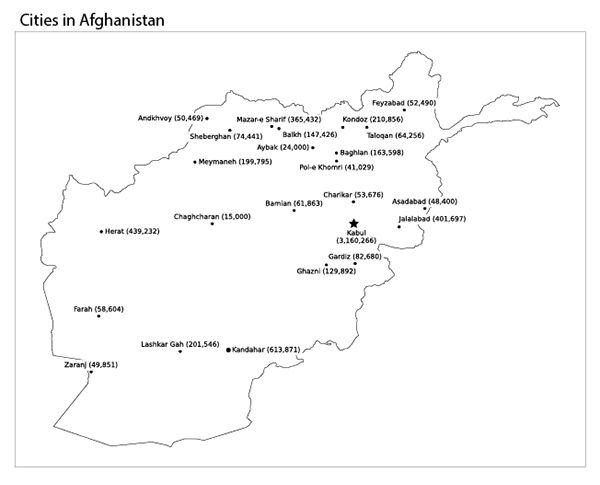
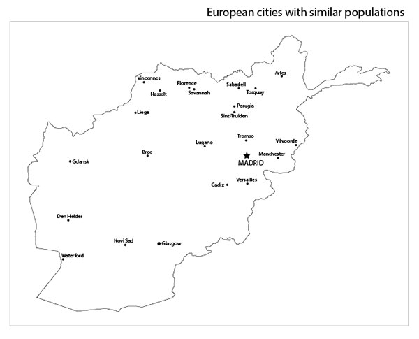
To see it even more clearly, look at the two maps side-by-side. Move the slider in the middle back and forth to switch between the cities in Afghanistan (and their populations), and their European equivalents.
Use the slider to wipe back-and-forth between Afghani cities (left) and their American equivalents (right)
Imagine that you live in one of these European cities – a big one like Madrid or Manchester, or a smaller one like Waterford, Ireland or Sint-Truiden, Belgium.
Now imagine that your city has been taken over by the Taliban.
Footnote: how to show cities on a map of Afghanistan
To help us (including me) learn about what Afghanistan is really like, I used the Natural Earth 1:10m geography dataset to make a Python notebook in SciServer to make a simple map of cities in Afghanistan, and their populations. If you’d like to play with the data yourself, comment with your SciServer username and I’ll add you to the research group. I’m also hoping to make a kaggle.com notebook for this work, but something is buggy with Kaggle and it’s not saving the output image files.
What I can say about the Taliban taking over Afghanistan
What can I even say about the Taliban taking over Afghanistan?
It’s terrible, and a lot of people will die this week, and a lot of people will suffer for decades to come.
Honestly, it’s probably good that Kabul surrendered so quickly. After the Taliban took over Kandahar, Mazar-e Sharif, and Jalalabad (in that order), they controlled all access roads into Kabul, and had the city fully surrounded and ready for an old-fashioned siege. Kabul could have held out for a few weeks or a few months before inevitably falling – at which point the Taliban would be even more angry and murdery than they would have been already. At least this way, more people get to live.
My only connection to Afghanistan is that I liked their cricket team and their national anthem (both of which no longer exist, since the Taliban have banned both sports and music), and even I am heartbroken by this news. I cannot even imagine how horrific this must be for the people who actually live there.
Part of what makes it hard for us to imagine the scale of this tragedy here in the U.S. is that Afghanistan is so far away and seems so mysterious. Even though we have been there for 20 years, we generally know very little about it, even those of us as geography-obsessed as I am. Where exactly is Jalalabad? How far is Bamian from Mazar-e Sharif? How many people live in Kabul?
To help us (including me) learn about what Afghanistan is really like, I used the Natural Earth 1:10m geography dataset to make a Python notebook in SciServer to make a simple map of cities in Afghanistan, and their populations. If you’d like to play with the data yourself, comment with your SciServer username and I’ll add you to the research group. I’m also hoping to make a kaggle.com notebook for this work, but something is buggy with Kaggle and it’s not saving the output image files.
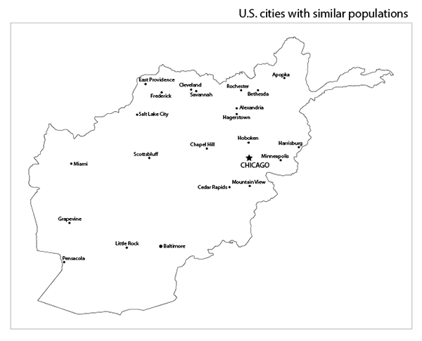
Here it is, my map of Afghanistan, with major cities and their populations (click on the image for a larger version):
Cities in Afghanistan (click for a larger version)
But that map is still a bit abstract. Great, so Kabul has 3.1 million people, but how many people is that exactly?
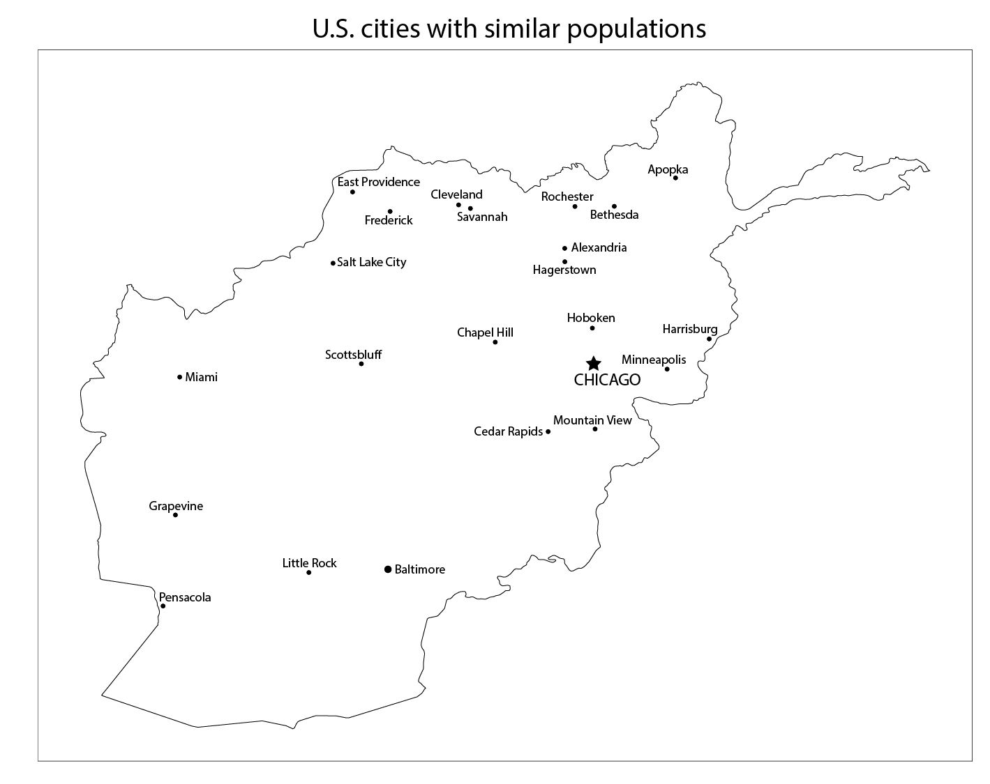
A good way to wrap your mind around what these places are like is to compare them to cities you might be more familiar with. That’s what I did in the map below. For each city in the map above, I chose a city in the U.S. with a similar population. Here it is (click on the image for a larger version) – and there some very big cities in Afghanistan.
Cities in Afghanistan labeled with U.S. cities of equivalent population (click for a larger version)
To see it even more clearly, look at the two maps side-by-side. Move the slider in the middle back and forth to switch between the cities in Afghanistan (and their populations), and their U.S. equivalents.
Use the slider to wipe back-and-forth between Afghani cities (left) and their American equivalents (right)
Imagine that you live in one of these American cities – a big one like Chicago or Baltimore, or a smaller one like Apopka, FL or Scottsbluff, NE.
Now imagine that your city has been taken over by the Taliban.
Democracy in the United States is not what it first appears.
Last week, we looked at how maps of the U.S. Senate can mislead, and I showed a new map that visually reflects the reality of state-by-state Senate representation, and also leaves room for additional information.
Today, we’ll the same thing for the more complicated example of the U.S. House of Representatives.
Don’t worry, I’ll explain this later in the post (click to open a larger version in a new tab)
Unlike the Senate, where each state is represented equally by two Senators, representation in the House is based on population as recorded in the once-a-decade national census. The United States is divided into 435 Congressional Districts, and with a 2010 U.S. population of about 310 million, each House member represents about 700,000 people.
Districts are set and voted on at the state level, which means no matter how few people live in a state, that state is guaranteed to have at least one House member. The number of House members per state varies from one each in the lowest-population states (from Alaska to Montana) to 53 in California. The boundaries of each district are set by the state legislature or an entity they assign. Districts must be contiguous (no enclaves or exclaves), but other than that anything goes. This opens House representation to all sorts of partisan strategic fuc kery – but much more on that later.
The question here is: how can we visualize U.S. House membership in a way that fairly shows the distribution of power, and also leaves room for other information? I’ll follow the same approach I used to visualize the U.S. Senate.
Most depictions of the House of Representatives that I have seen fall into one of two categories.
This:
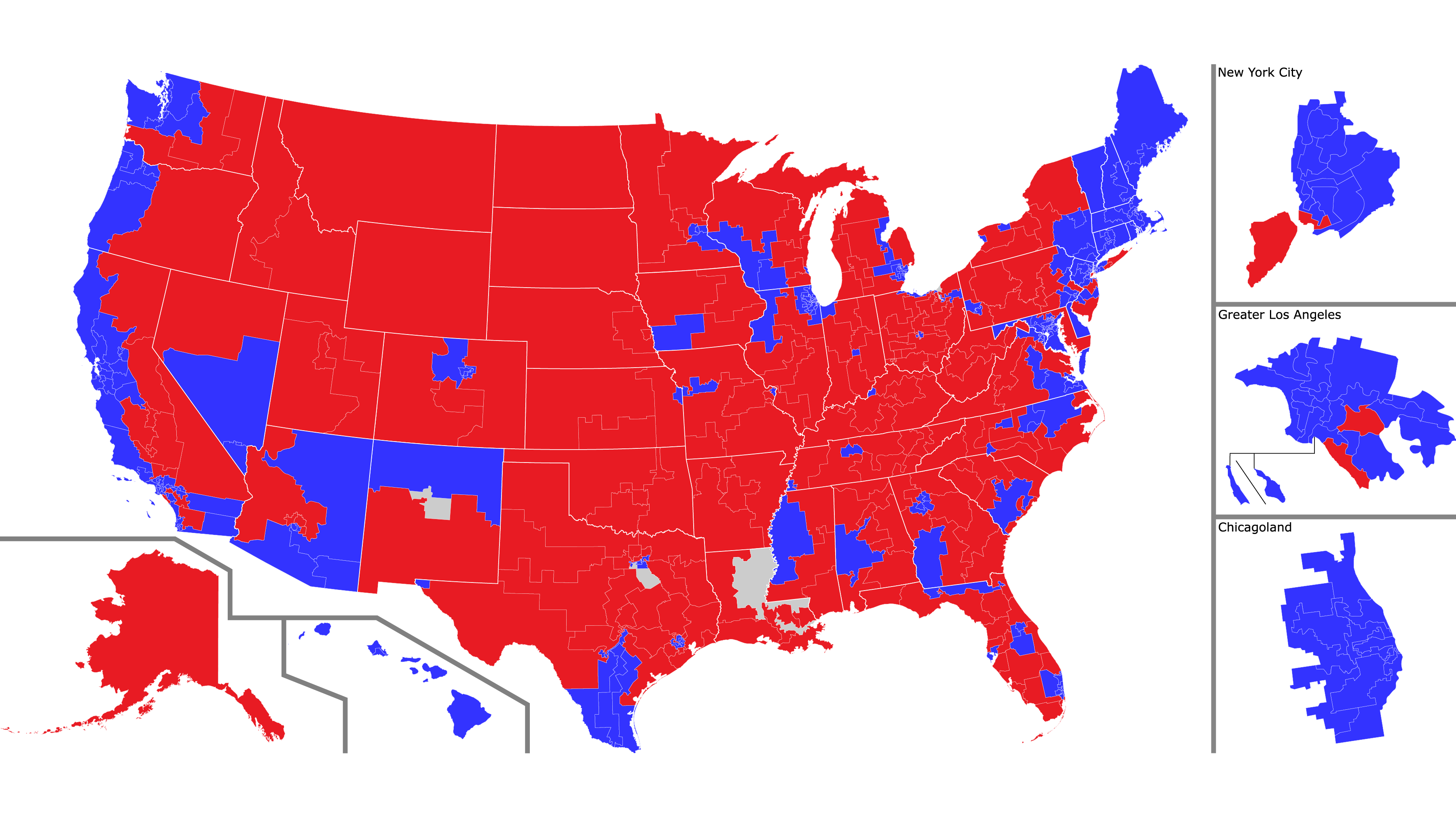
A map of U.S. House of Representatives districts with accurate borders. The main map shows the entire U.S., with side maps for: Alaska, Hawaii, New York City, greater Los Angeles, and greater Chicago.
Click to open a larger version in a new window.
or this:
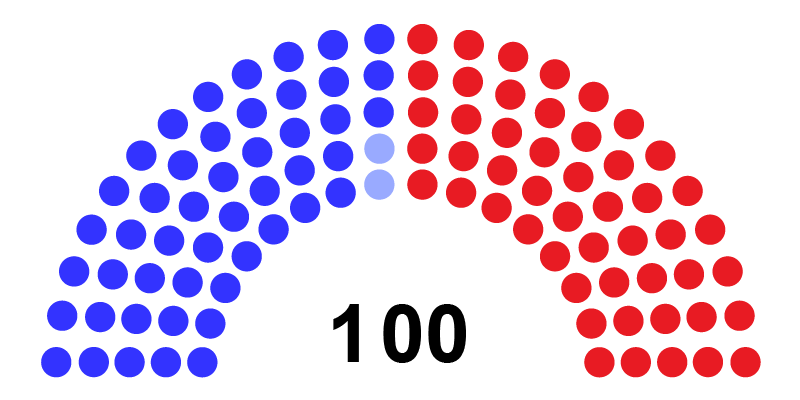
A more abstract map of the House: one dot equals one representative. Red = Republican, blue = Democratic, gray= currently vacant
Click to open a larger version in a new window.
As we saw with the Senate, each of these views has advantages and disadvantages. The map view makes a clear connection with U.S. geography and shows district borders accurately, but the vastly different sizes of the districts make it look like a vast sea of red, when in reality the House has a Democratic majority. The dot view makes it clear that all districts enjoy equal representation, but at the price of making an abstract visualization that looks nothing like the United States.
And as with the Senate, why not combine the advantages of both, and add some more information to the visualization?
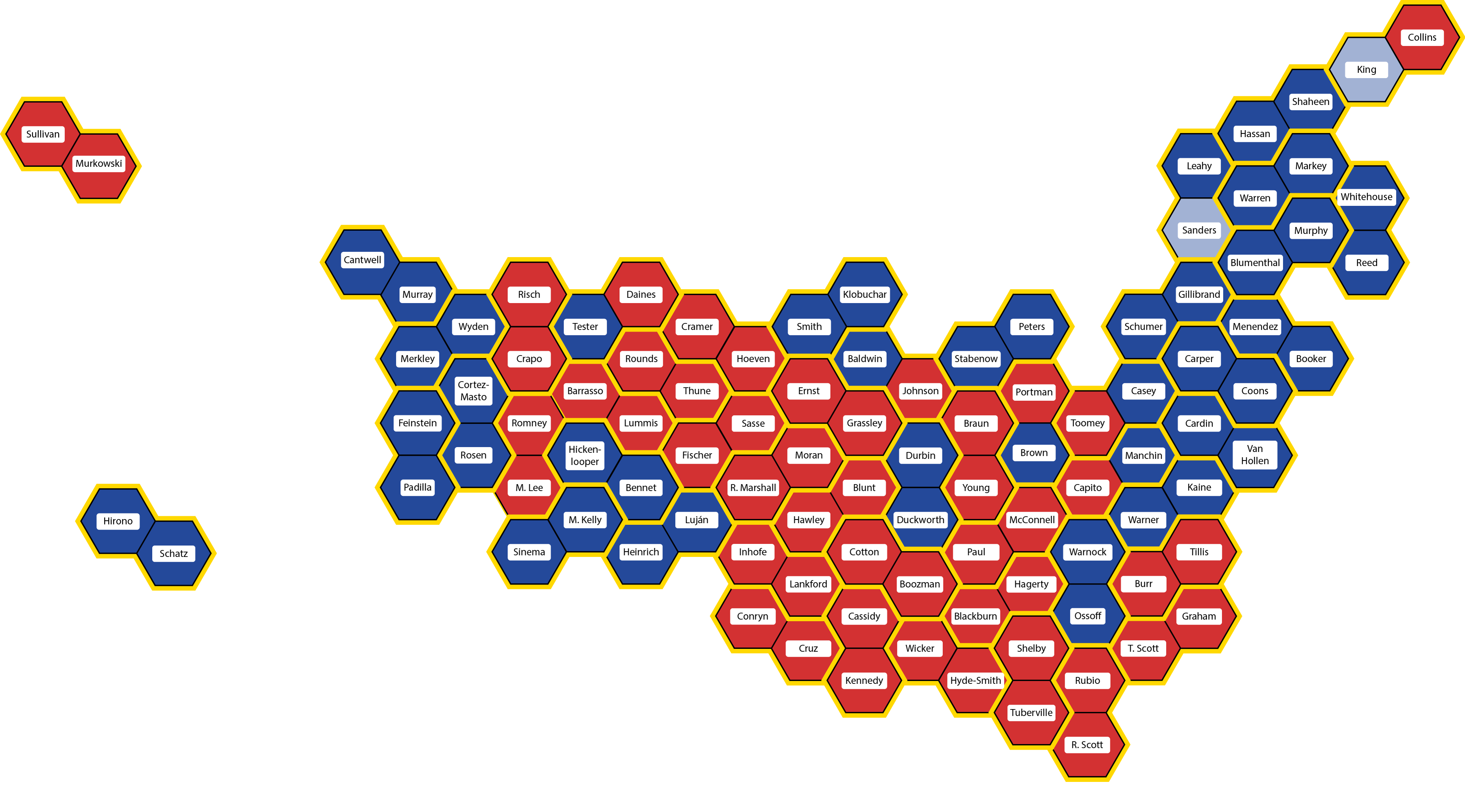
Like this (click to open a larger version in a new window):
Each hexagon represents one U.S. House member. States are in their approximately correct geographic positions, outlined in yellow, and each district is in approximately its correct place in the state. The colors are the same as before, and each hexagon is labeled with the name of that district’s representative.
Click on the map for a larger view – especially recommended this time so you can read the names of all the representatives
Each hexagon represents a single representative. The hexagons are color-coded, blue for Democratic, red for Republican, and white for vacant (Louisiana-2 is blue because the seat will be filled in a runoff special election on April 24th, but both candidates are Democratic).
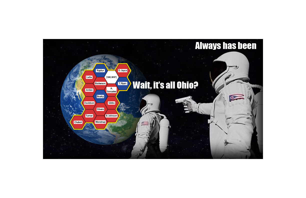
It’s all Ohio: Ohio’s 16 congressional districts (click for a larger meme)
As usual with images on this blog, you can click on the image to see a larger view, and in this case, I would definitely recommend it so you can read all the names. The linked image is quite large (3600 x 1996 pixels), so it may take time to load and you may need to scroll to see it all.
From now on, whenever I talk about the House, including in posts about future elections, I will use this map. I have some ideas about how to improve the map, and I’d love to hear yours.
So what’s next? As I alluded to above, real congressional districts are not hexagons. They are usually designed by state legislatures – and because state legislatures are partisan, districts can be drawn in a partisan way. And they are.
Democracy in the United States is not what it first appears.
There are many reasons for this, of course, but I am convinced that one of the reasons is that the maps we use to understand are democracy are misleading. Consider the U.S. Senate: two senators per state. Most depictions of the Senate that I have seen fall into one of two categories.
This:
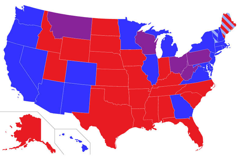
Senators by state: blue = two Democratic Senators, red = two Republican Senators, purple = one of each The light blue in Vermont and Maine stands for Independent Senators who work with the Democratic caucus
or this:
A more abstract map of the Senate: one dot equals one Senator. Red = Republican, blue = Democratic, light blue = Independent caucusing Democratic
Each of these views has advantages and disadvantages. The map view makes a clear connection with U.S. geography and shows which parties represent which states, but it the different sizes of states obscure the fact that each Senator, regardless of how much land area the state takes up, gets exactly one vote. The dot view makes it clear that states are equal, but at the price of making an abstract visualization that looks nothing like the United States.
Why not combine the advantages of both, and add some more information to the visualization?
Like this (click to open a larger version in a new window):
Each hexagon represents one senator. States are in their approximately correct geographic positions, outlined in yellow. The colors are the same as before, and each hexagon is labeled with the name of a Senator.
Click on the map for a larger view – especially recommended this time so you can read the names of the Senators
Each state, no matter how large or small, no matter how many or few people live there, is represented by two Senators. So in this visualization, each state has a yellow outline, and is placed approximately in its appropriate position and orientation. Maine is the tip of the mammoth’s trunk, Florida is its front hoof, Washington state is its tail, and so on.
Each state consists of two hexagons, one per Senator. Hexagons are color-coded by party: blue for Democratic, red for Republican, and light blue for the two Independent Senators who have joined the Democratic caucus.
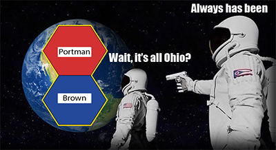
And that’s another advantage of this map compared to the first: Ohio is not represented by a Senator from the Purple Party, it is represented by Democratic Senator Sherrod Brown and Republican Rob Porter. Lastly, each hexagon is labeled with each Senator’s name.
All Ohio: Senators Sherrod Brown (D-OH) and Rob Portman (R-OH)
As usual with images on this blog, you can click on the image to see a larger view, and in this case, I would definitely recommend it so you can read all the names. The linked image is quite large (3600 x 1996 pixels), so it may take time to load and you may need to scroll to see it all.
From now on, whenever I talk about the Senate, including in posts about future elections, I will use this map. I have some ideas about how to improve the map, and I’d love to hear yours. And if you know anything about American democracy, you can probably guess what’s next.
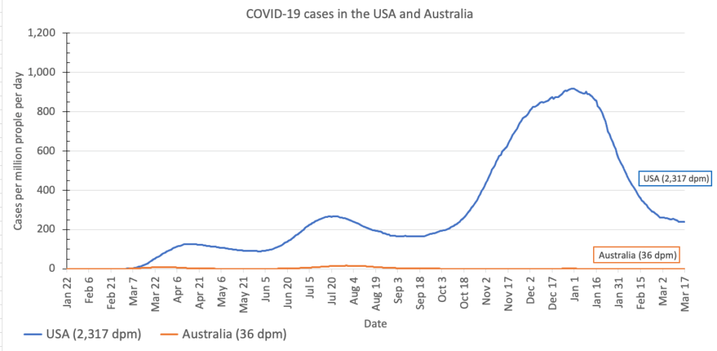
What has the state of the pandemic been like in Australia and in the United States? As always, a graph is worth a million words:
Newly-diagnosed cases per million people per day in the USA (blue line) and Australia (orange line)
The graph shows why Australians are beginning to get back to their normal lives, even though the vaccination rate in Australia is still lower than the vaccination rate in the U.S.
The short answer is that nearly everyone had the common sense, personal responsibility, and basic human decency to follow public health guidelines: stay home whenever possible, and when that is not possible, keep a 6-foot or 2-metre distance from others and wear a cloth mask over both your nose and mouth.
Of course, the vast majority of Americans have the common sense, personal responsibility, and basic human decency to follow the same public health guidelines – but one major lesson we have learned from this pandemic is that even “the vast majority” is not enough. It takes nearly everyone, no exceptions. (I’d love to be able to say something more quantifiable here, and I’m doing some research. As I learn more, I’ll add it here.)
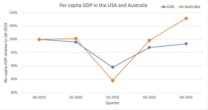
But you might say, what about TEH ECONOMY (TM)? Has Australia sacrificed economic growth, and therefore livelihoods, by adhering too strictly to public health guidelines? Maybe yes, maybe no.
The graph below shows the quarterly per capita gross domestic product (GDP) in the U.S. and Australia, relative to the fourth quarter of 2019 before the pandemic reached either country.
Gross Domestic Product in US Dollars for the US and Australia, relative to Q4-2019 values
All the social distancing did indeed cost the Australian economy – the economy contracted more than the US economy did in quarter 2 of 2020, at the height of the pandemic.
But here’s the thing: the pain was temporary. By the third quarter of 2020, Australia was already outperforming the US, and now the Australian economy is stronger than it was before the pandemic began.
Adding up all quarters, it’s not entirely clear whose economy has been healthier overall. But the more football tickets Australians buy and Americans don’t, the more clear it would become that Australia would come out on top.
And – let’s not focus on the economy so obsessively that we lose sight of actual human lives – it’s absolutely clear and obvious that in terms of lives lost to the pandemic, Australia is the clear and obvious winner.
If you’re going to say that the U.S. can’t learn from Australia, or you that can’t compare two different countries, I’m going to say: well, why?
Why is a constitutional federal republic of states with a bicameral legislature and a fiercely independent frontier spirit where the most popular sport is football so massively different from a constitutional federal republic of states with a bicameral legislature and a fiercely independent frontier spirit where the most popular sport is football?


